`Interior Watercolor Illustrations of Lakewold Gardens Renovations
Here are a couple of watercolor illustrations I did very recently for a place called Lakewold Gardens near Tacoma, Washington. I worked with the Architect Gerald Eysaman in developing the views shown here. He was the interface between me and the Friends of Lakewold, which had commissioned the drawings. With a lot of inside “sprucing up” and many other technical issues to address with this renovation, Gerald took the reins in figuring out the architectural design and also building a rough Sketchup model to work from on the perspectives. It’s a historical carriage house on a gorgeous property called Lakewold Gardens which contains much bucolic scenery with many native trees and plants in coastal Washington. 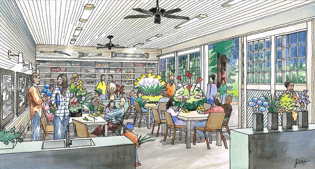 The first view shows the downstairs converted garage space with sliding doors to the outside. Added ceiling lighting and ceiling fans and wall sconces make the space more functional as a flex space, able to stage flower arranging classes or gardening talks, or the like. I suggested showing an evening flower arranging class on a crisp autumn eve–warm inside, but open to the great natural beauty outside the carriage doors. Work tables and chairs, a flower sink, art gallery wall on left, and restored cubbies on the back wall for display items and storing of supplies, garden tools, personal effects, etc…..People having a good time exploring their creativity and creating, talking….The second view we show is a much smaller, intimate space on the second floor that would be suitable for small groups gathering to hear from an author, or listen to an entomologist present, or maybe a poetry reading….The space is modest, but could be quite charming with natural cedar siding perhaps–an older wood floor sanded and finished…..A few exposed wood beams, ceiling fam, some new lighting, and again cubbies for books and personal effects storage….A large picture window is centered on the back wall with an LED screen to support presentations if desired….We wanted to show a diverse group of attendees involved in an intimate setting–in this case, maybe a butterfly specialist and discussion….I hope you enjoyed these renderings–they are fun to create and I enjoy the work immensely !
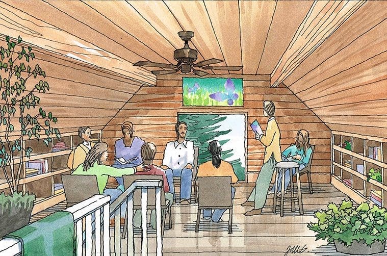
Watercolor of Brewery Scene by Jeffrey Michael George
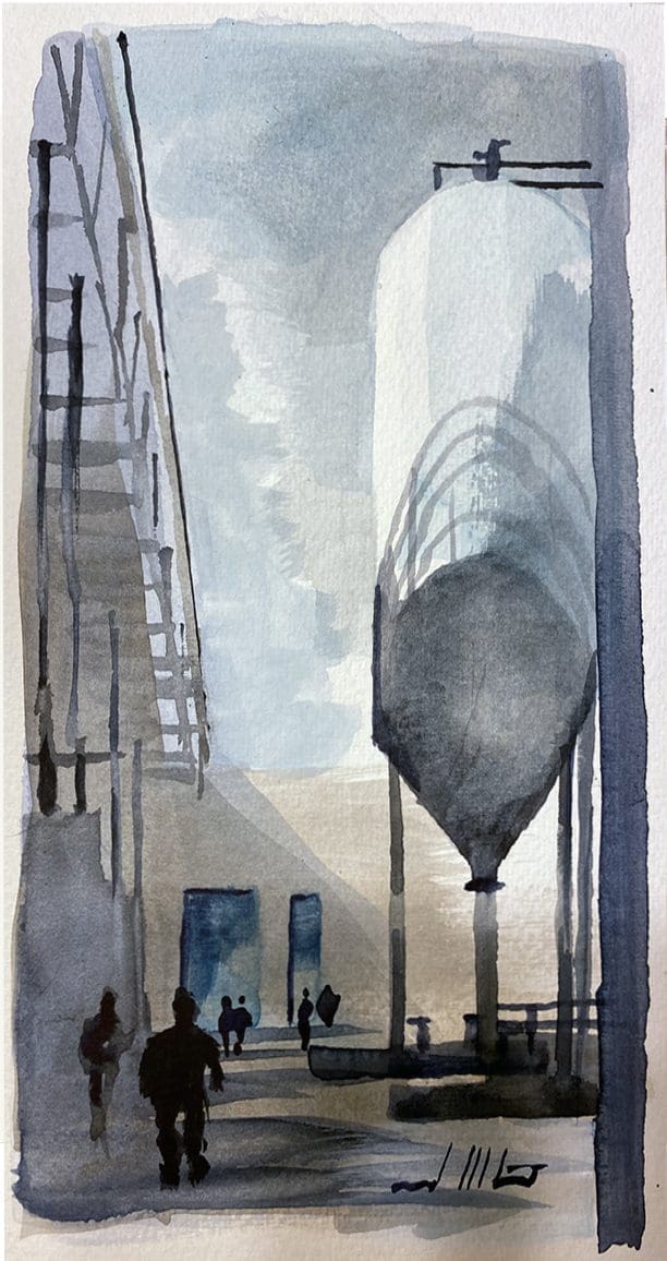 Fascinated by the machinery and visual imagery of a working brewery, I created this watercolor sketch….Keeping the color palette subtle and somewhat somber, I tried to capture a simple impression of the worker experience returning to the warehouse from break time….It’s part homage to the cold hard brewery itself and part homage to the hard-working folks that keep the machines and products rolling….They both work hard together toward a common goal–efficiency and production of their products….As for the elements in the painting, the large massing of a brewery consists of huge prismatic forms like cylinders, funnels, tubes, pipes, and rectangular buildings for the most part….Heavily determined by their function, the elements are largely unadorned and utilitarian….This painting is a rendering of sorts–instead of depicting a new building underway, this rendering shows an existing building and environment–not literally, but figuratively….And since I generally illustrate buildings yet to be constructed (with architects as my clients) it’s refreshing to draw and paint something different–more whimsical and imaginary, less defined and exact….As a watercolorist, I’m learning….lately trying to keep the shapes and strokes fresh, simple, and unencumbered….you have to fight yourself sometimes with that….sometimes deciding not to do more–to let it be….let it dry, and see what transpired with the medium….it can be a fascinating experience….and it gets more rewarding when you have done enough watercolor to predict the general outcome when you “let it go”….and, of course, you never really know, but there’s an excitement in that as well….I think watercolor as a medium is unique in that it’s almost like you are partners with the paint….You both contribute to the painting–the painter is leading the dance, but the paint itself is a silent partner that follows–one that adds tis own influence and nuance to the final artwork….
Color Architectural Illustrations for Oakland, California Project
The feature of this blog is a series of four color illustrations I did for an architect in 2020. Rick Williams is the architect and his San Francisco architectural firm is Van Meter Williams Pollack LLC. The project is a re-thinking of key areas of an existing college campus , Mills College, in Oakland, California. These renderings are conceptual in nature–and the content was derived mostly by Rick from his vision to enliven and update various spots in and around the campus. 
 I do not have significant input here, but occasionally I contribute a bit to the ideas and images–especially if asked to do so. Rick is particularly good at surveying the needs of a facility after touring the existing conditions. And these images are basically the result of what Rick believes to be the most important improvements the College could make. On the aesthetic look of these renderings, however, I do have a lot of input. I usually offer color pencil or watercolor as the techniques to choose. The architect and I usually are in agreement on which “look” is best for a particular project. Color pencil was the right choice for this project, and pretty loose in character. We just wanted to show an indication of scale and architectural style, without getting into too much detail because the details are not important at this point. The first rendering shows a modernist straight-line design with flat roofs, white stucco, and horizontal wood siding accents. The second rendering shows a contemporary farmhouse sensibility for the Growers Market and housing. The third rendering takes its architectural clue from the existing campus gate and more historical, Early California feel. The fourth rendering has emphasis on the “neighborhood feel” of the single-family houses for the faculty–and there are va
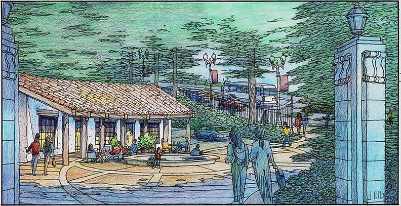
 rious styles shown therein.
Watercolor of Foggy Setting in Brookings, Oregon
This is a simple painting….
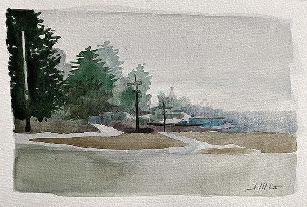
Brookings 1, Watercolor by Jeffrey Michael George, 2021
While waiting for a custom sweatshirt to be printed at a seaside shop, I was struck by the effect of the fog rolling in from the Pacific Ocean. To explain the simple approach to painting this scene, I would offer this: Nothing is “penciled in” or laid out, you just start painting. Light gray sky first with some rough tree silhouettes establish the composition and allow you to further refine the perspective. Next, some intermediate ground plane (brownish areas) to define the coastline. Throwing some gray on what’s left over in the foreground completes the scene–and since I’m standing in a parking lot, I’m not going to add detail to this area, because it’s inconsequential. The essential goal of this painting is to capture the fade-out effect of the fog in the atmosphere–the way it obscures more and more the further you look toward the horizon. Just as in reality, the painting shows the distant landscape and ocean horizon barely discernable. As trees, land forms and buildings get closer to you, they begin to gain slightly darker values, with the closest tree having the darkest value in the painting. Two brushes used: a wide flat and a pointed round. Ultramarine, sepia, phthalo green, a little manganese are the only paints. Size is 5″ x 8″. I like paintings such as this because the goals are simple….and the end effect is clear and true to the initial intent and inspiration…no need to accent with cars, colorful buildings, or any other extraneous detail–things that would detract from the essential point being made. Just an ode to the intrinsic beauty of nature in a tender moment. And as an artist, I could not explain the simple joy of painting a scene like this–it’s cathartic and soothing and makes you feel at ease!
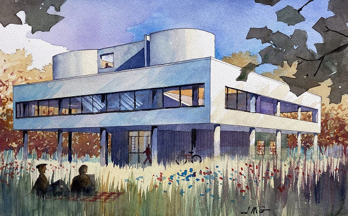
Watercolor Rendering of Villa Savoye by Architect Le Corbusier
Watercolor Renderings for Large Mixed Use Project Planned for San Jose
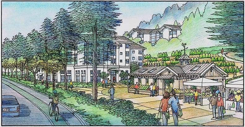
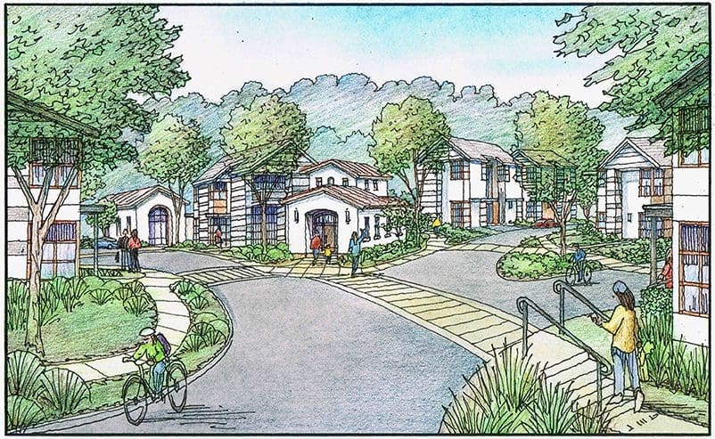
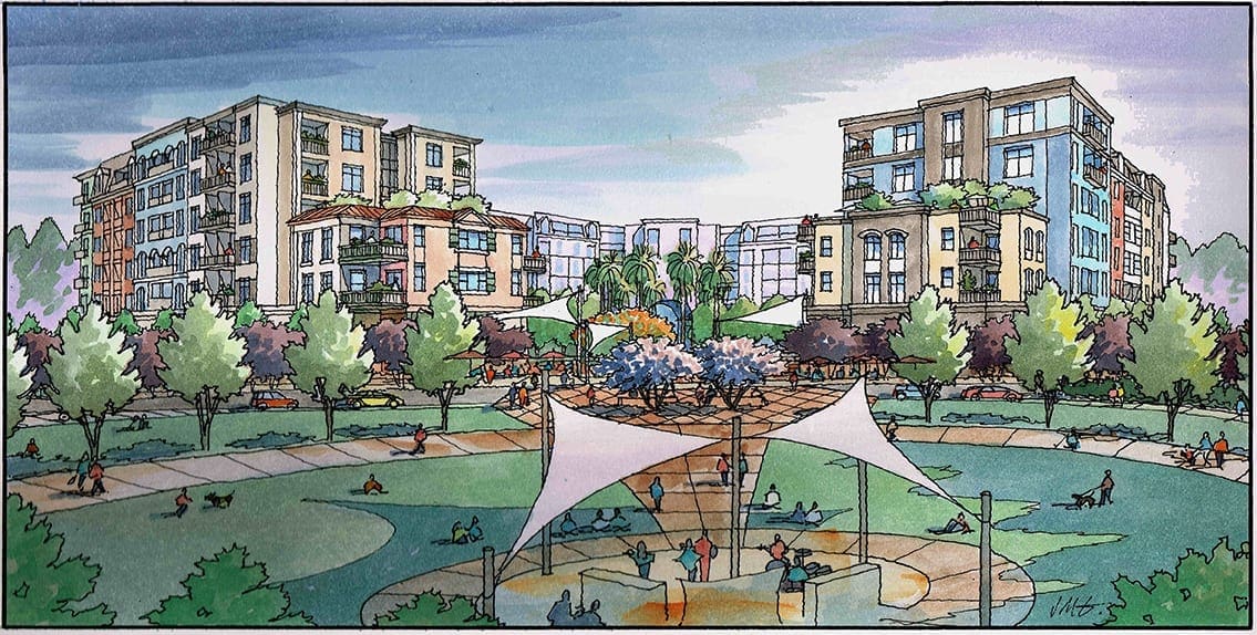
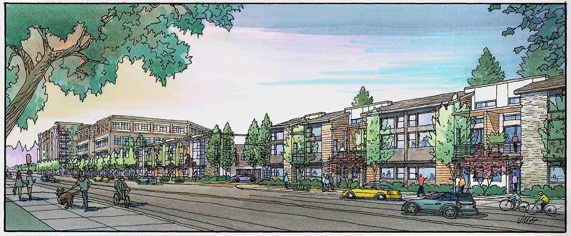
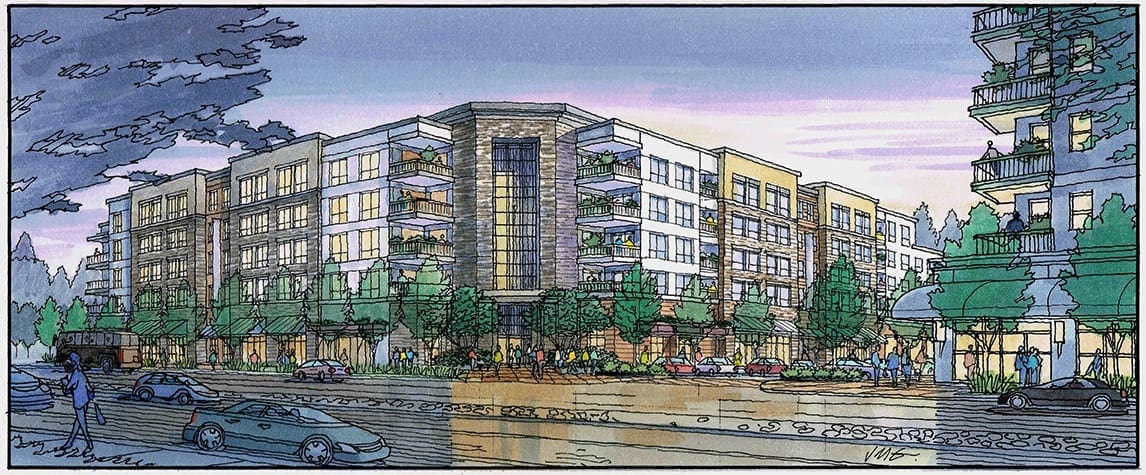
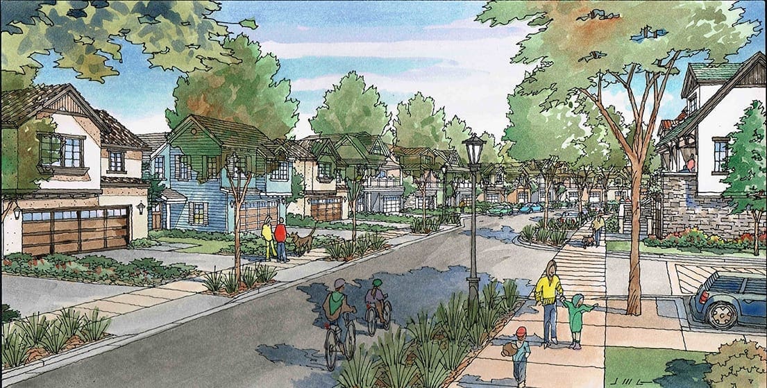
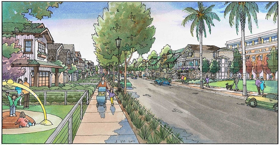
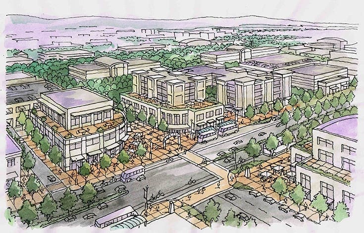
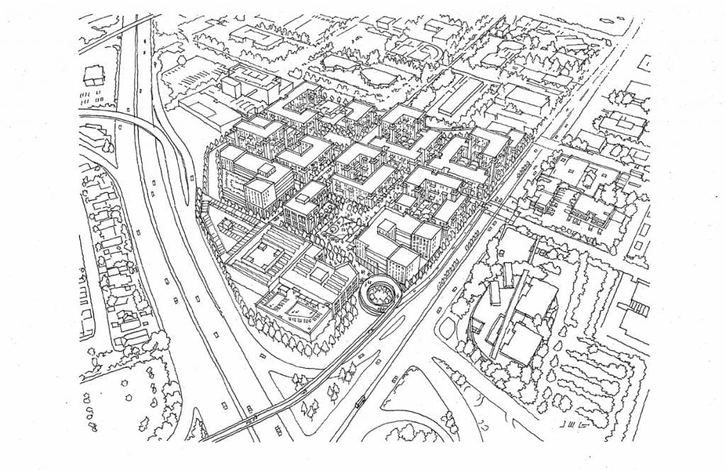
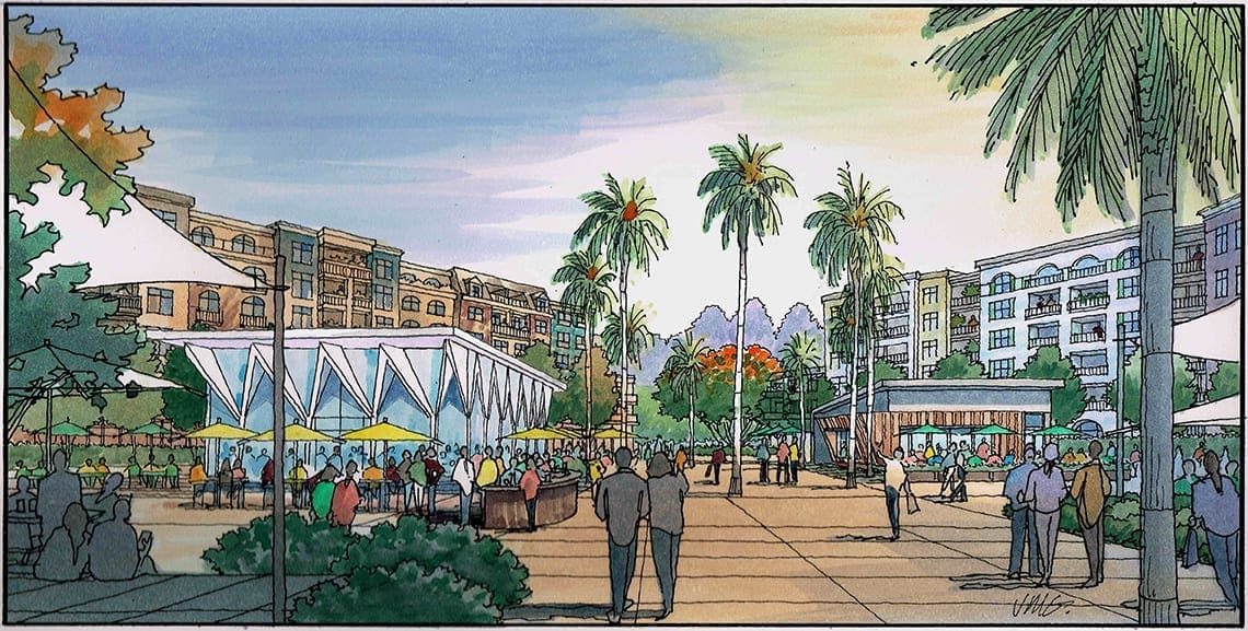 The subject of this blog is a series of eight watercolor renderings I did for a large mixed use project planned for San Jose, CA. designed by Ken Rodrigues + Partners of Mountain View, and KTGY Architects….Weingarten Realty is the developer of the 18-acre property, which is the current site of an older commercial shopping center named Cambrian Park Plaza….As the illustrations show, the project features many different building types including apartments, condos, a hotel, an assisted living facility, restaurants, and single family homes….Garnering lots of community input over the past four years, six acres of the site is dedicated to open space, including a large central park with bicycle and pedestrian walkways, fountains, an amphitheater, and a community plaza which defines the 6-story apartment buildings….The hotel is five stories, and the assisted living facility is 3 to 4-stories in height. All have underground parking. The plan is built for people with pedestrian paseos knitting the village together, including a central promenade running from the entrance to the village at the corner of Cambrian and Union through the community plaza and central park to the existing neighborhood to the east. The village plan is designed for people – not cars – with walking promenades connecting acres of public open space, including a central park with amphitheater next to a community plaza surrounded by small commercial shops, restaurants, and outdoor seating. There are housing opportunities for everyone with apartments over retail, townhomes, and single family houses along with four additional dedicated parks areas for a playground, fitness, dogs, and community gardening. As the artist who has drawn many of these architectural projects over the years, drawing and painting a series of renderings that are all done by hand, and that all relate to one another is the perfect way to showcase a project of this nature….Please enjoy the illustrations, and consider contacting me to create beautiful renderings like these for your project !
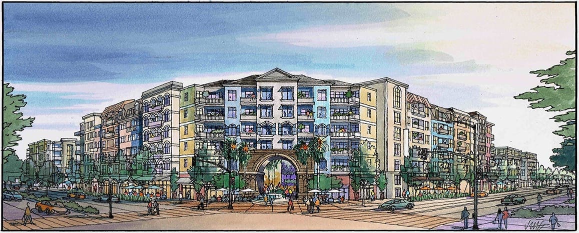

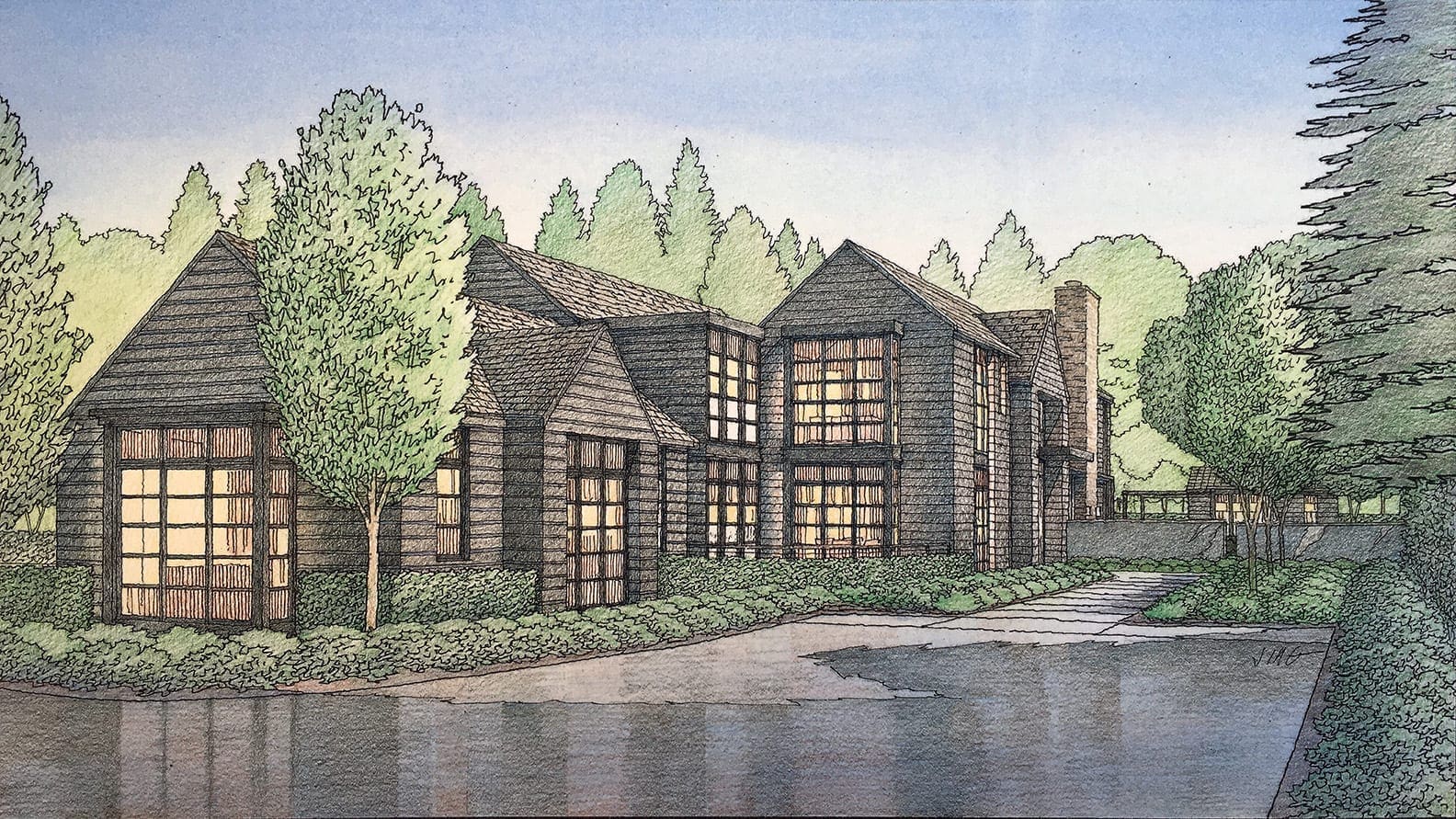
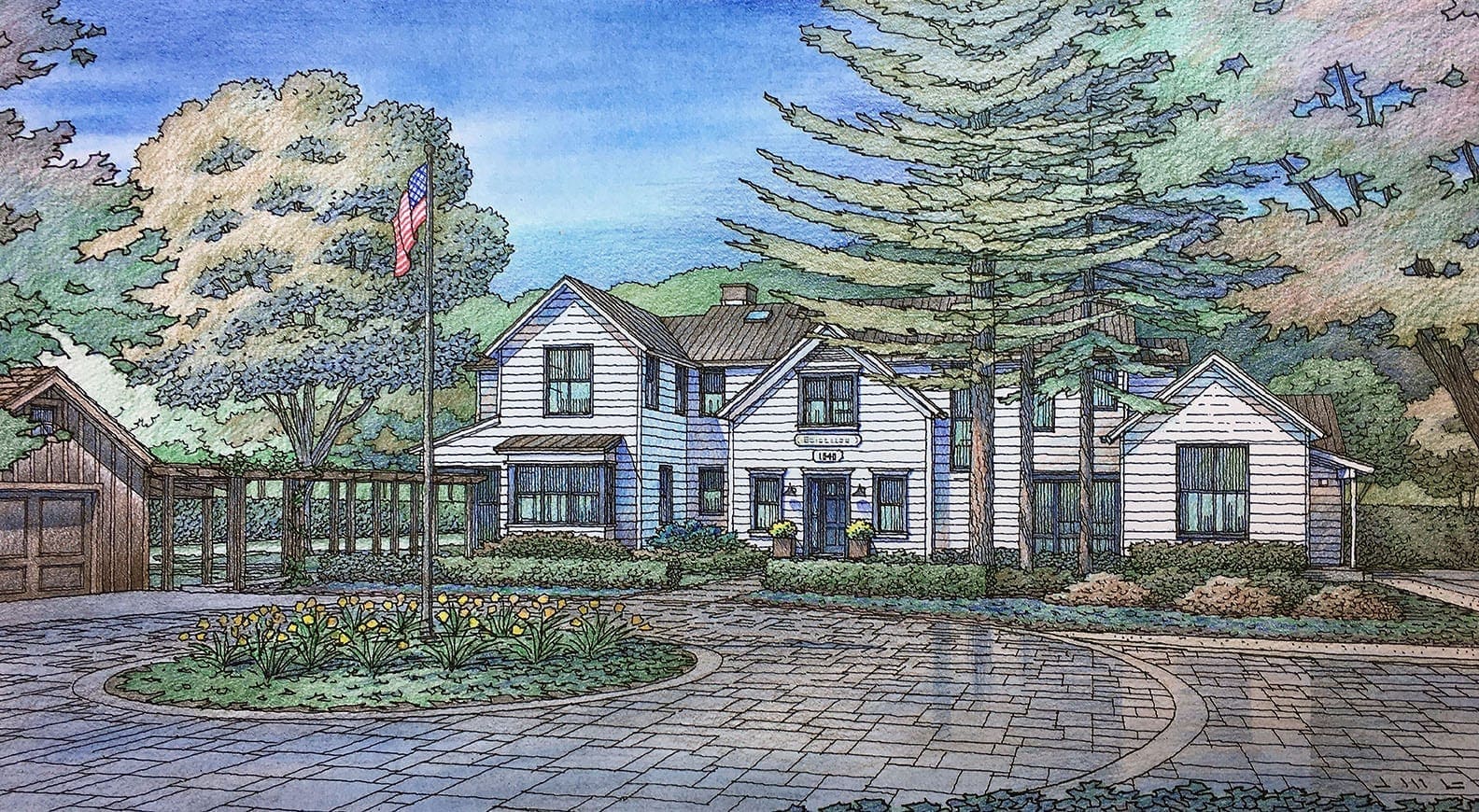
Color Architectural Rendering of Woodside and Atherton Residences
There’s nothing like a hand-drawn color illustration to describe your project and get the approvals you need ! Here are some of the renderings I have done recently for residential projects in Atherton, Woodside, and Los Altos Hills, CA…..Designed by Pacific Peninsula Architecture of Menlo Park, CA, each of these projects are in the development or construction phase….I am commissioned by the architect to create this artwork to show the City or Town what materials and colors are to be used in the final design….They can therefore review and comment on the design and the selection of materials if they choose to do so….I can work in several different capacities when producing these renderings….If necessary, I can generate the 3D perspective model which is developed in order to get this view of the proposed building….Once the architect gives me the design drawings–plans and elevations–I input that data into a Sketchup model, from which the perspective angle can be viewed….If the architect already has a 3D model of the home, I can start from that point, and don’t need to generate my own model….Usually these homesites have existing trees which will remain, so one of my tasks is to show these trees accurately with respect to the new structure….Google Earth, an illustrated site plan, or a site visit are the best ways to gather info on the existing trees….Then it’s part of my job to show the trees type, location, and character truthfully and accurately in order to demonstrate that the developer is mindful and responsible with regard to the existing trees and landscape….Aside from the fact that many of these cities and towns on the peninsula south of San Francisco actually require a color rendition of the proposed home design as part of a submittal, there is really no better way to portray the architect’s design….I have created a great many of these illustrations over the years for the communities of Atherton, Woodside, Los Altos, Portola Valley, Menlo Park, Saratoga, Los Gatos, and Los Altos Hills….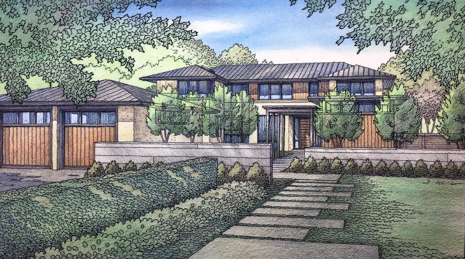
Architectural Renderings for San Francisco Projects
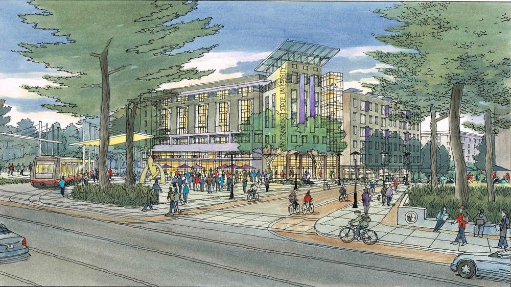 Today I am featuring many of the architectural illustrations I have done with the architectural firm of Van Meter Williams Pollack of San Francisco, California. And in particular, I am featuring the projects they have designed for San Francisco and the immediate environs. I think I started doing renderings for VMWP in 1992 or 1993, so it’s been a longstanding relationship. I work freelance as an illustrator, and this artwork shown here is all commissioned on a freelance basis, when they have need for my services. Most of the projects are multi-family residential in nature, sometimes purely market-driven, many times with an affordable housing component. When VMWP presents one of their current design projects to the public, either for disclosure, or for public input and comment, they usually include my artwork as a tool for describing their ideas. Shown alongside the plans and elevations, the perspective renderings I create tend to bring the design to life for the audience. Because the drawings show people, cars, streetlights, and landscaping, the public viewers are more engaged with these images. In a way, the renderings are easier to understand, and easier to relate to, than the more technical drawings that the architect displays. And although these perspective renderings can be produced digitally–what we now term computer-generated 3D imaging–the effectiveness of purely computer-generated images is often inferior. It depends on the project, but I think most architects would agree with that statement. I think that for presenting many architectural projects to the public, an architect can get by without hand-drawn perspectives, but if you really want to wow the viewers and get them on your side, there is no greater tool for presentation than artwork that is created by hand. It lends a human element to all the hard edges and lines that are the stock and trade of the plans and elevations. So, here are many of the watercolors, or color pencil drawings, I have done for VMWP for their projects either in San Francisco or nearby.
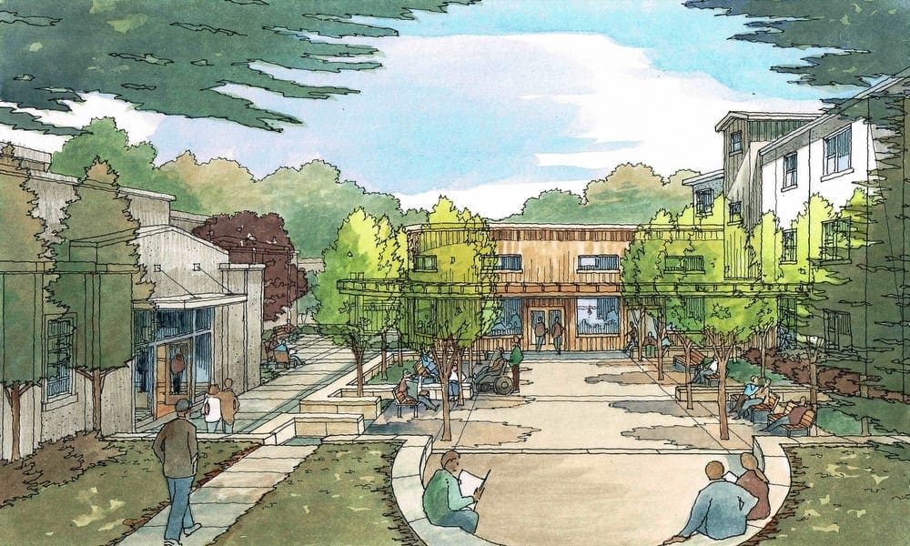
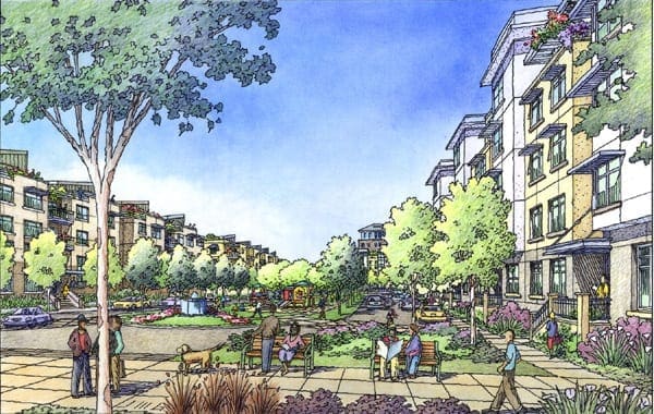
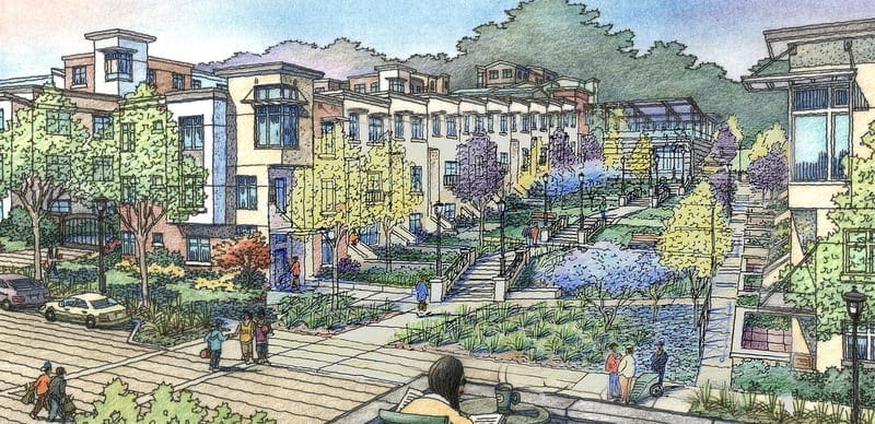
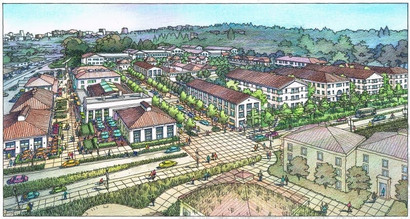
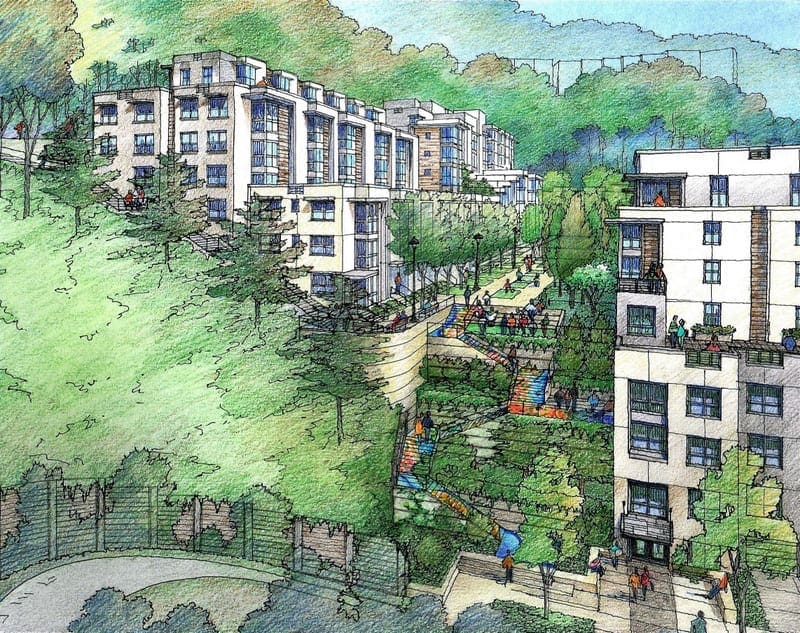
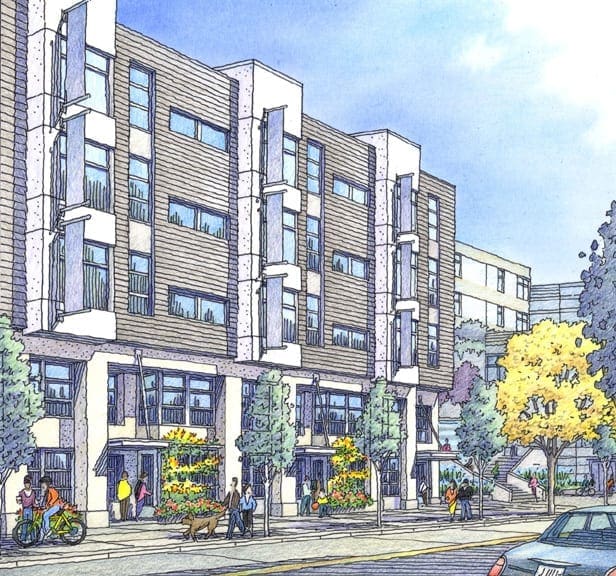
Illustration of Master Planning for Mountain View, California
 I am currently working on a master planning project for the city of Mountain View, California. My job will be to create an aerial perspective in color that will show the architect’s concept for a large, multi-block area for this community which is located in the Silicon Valley, about 45 miles south of San Francisco on the Peninsula. My client is Raimi + Associates, an architectural firm located in Berkeley, and they, in turn, are working with the City of Mountain View to envision the future development of this downtown area. Plans include a hotel, public square, several office buildings, a fitness center, movie theater, and a large amount of multi-story residential buildings. Over the years, Jeffrey has done many illustrations like this one, showing what future development will look like when it’s ultimately constructed. The illustrations, which are either watercolor or color pencil, are used to inform the public in a manner that is easily understood. The renderings Jeffrey does serve the purpose of engaging the public in a dialogue with the presenters regarding the project. There is often debate and lively discussion at these meetings, but nevertheless their role is a matter of disclosure and transparency regarding the planning ideas that are currently being considered for the city’s future. In the beginning of Jeffrey’s work, he is given a CAD perspective with minimal detail, but correct in scale. This serves as an underlay for a more detailed layout which Jeffrey generates, showing windows, trees, people, cars, buses, streetlights, crosswalks, etc.–all the elements that lend a sense of reality to the project (example included here). Then Jeffrey traces this layout on vellum, with freehand linework, in black and white, and sends to the architect for approval. With their approval, Jeffrey then adds color to the drawing, creating the finished artwork that will be used for presentation. Since this project is in process, I have included a color image of a similar project, since the black and white rendering has not yet been completed in watercolor.
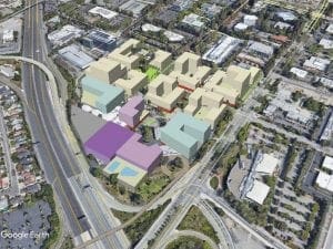
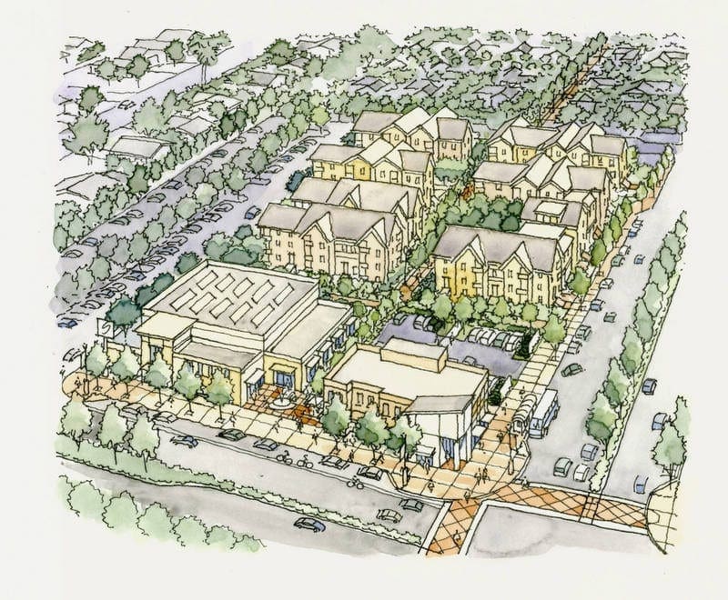
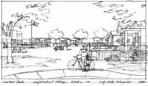
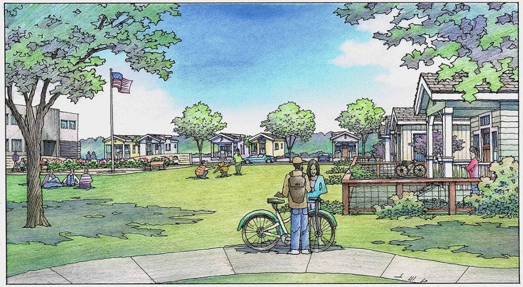
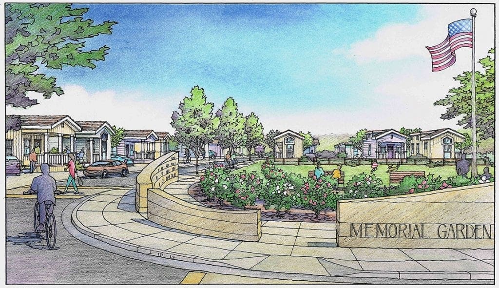
Renderings for Homeless Project in Visalia, CA
Last month I created two illustrations for a project that addressed the needs of people experiencing homelessness. The works were commissioned by an organization called Salt & Light located in Tulare County which is a beneficent group which aims to aid those in need in the area. The project itself was envisioned for a multi-acre site in Visalia, California, not too far from Highway 99 which runs through the Central Valley of the state. With a secure entrance and access roads circulating within, the living units are manufactured houses which are not mobile–but permanently situated on lots on the property. In order to generate the perspective views of the project from various points within, I built a quick Sketchup model, and identified several viewpoints that I thought were promising candidates to show what the project had to offer. I sketched five loose drawings in black and white to share with Adrianna Hillman at Salt & Light and also with my other main contact, Jose Flores of Self-Help Enterprises. I have included those sketches here. They chose two of the five candidates to actually draw as full color renderings. One of these views featured the large open area, or central park, that sits in the middle of the project, which would be accessible to the residents and their guests. The second view chosen shows the memorial garden which would commemorate the lives of those who were no longer with us. Much of the detail shown in these renderings was left up to me. I always try to visualize or channel the client’s intentions when I have an assignment like this one. The illustrations are done with a technique using color pencil over felt pen line work and are 11 x 17 inches. Within the last two years, I have done quite a few projects in the Central Valley communities of Fresno, Bakersfield, and Sanger, and Visalia.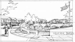

Recent Comments