Watercolor Painting of Gamble House in Pasadena By Greene & Greene
Completed a few days ago, my watercolor painting of the Entry Foyer of the Gamble House, built in 1908 in Pasadena, California….It’s a personal favorite of mine because I first saw it as a young man, and it made a great impression on me….This would have been in the late 1960’s, when I was a young teen, and very much interested in architecture….At that time, it was “an old house” already–dark and stodgy, old-fashioned–certainly out of step with the wild 1960’s scene outside….But there was no denying its originality both in terms of design and unique craftsmanship….What struck me was not only the aesthetics and beauty, but the novel ways the pieces of this architecture were put together….without nails basically–instead the builders used finely-crafted cuts and joints like dovetail and mortise and tenon….custom steel straps and fittings each made with care by artisans….leaded glass and custom light fixtures….hand-built furniture….clinker bricks were used extensively–which were the brick factory’s mistakes–something the architects saw as beautiful…. Built by the architects Greene & Greene, the house was designed as a winter residence for the Gamble family of Cincinnati–of Proctor & Gamble notoriety….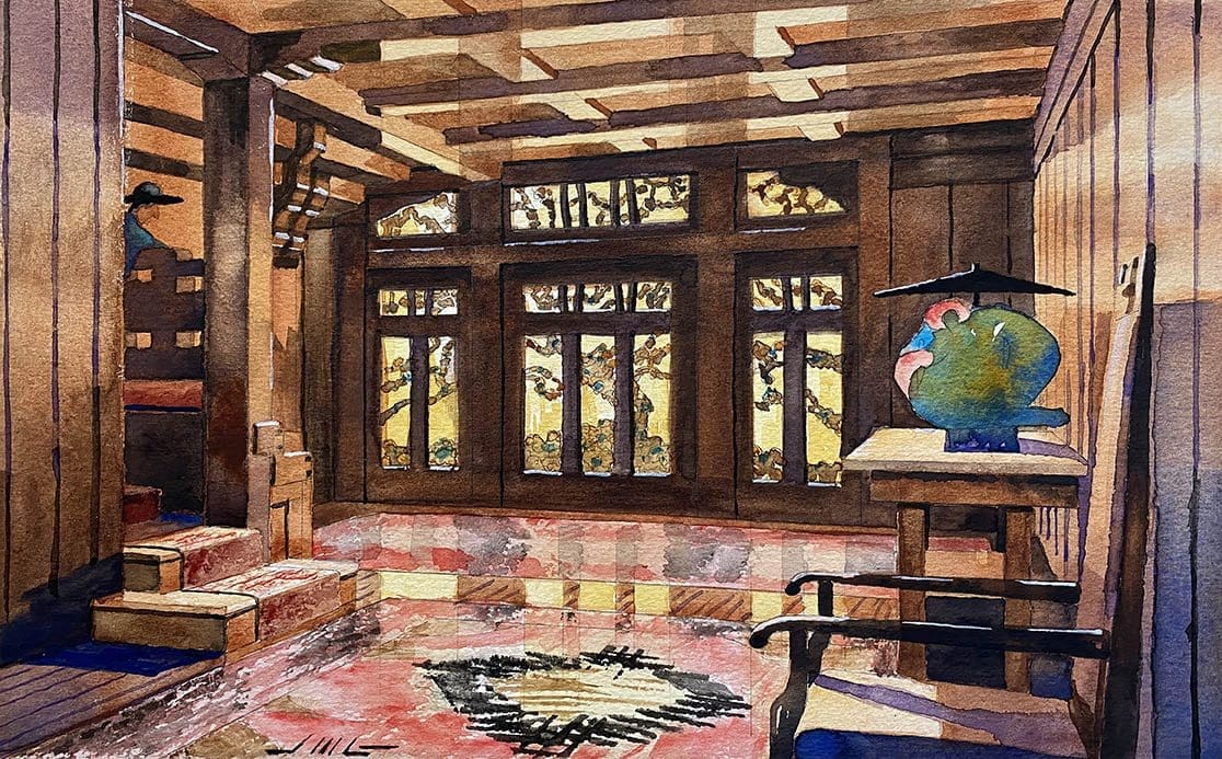 The following information is borrowed from the Gamble House website: “Charles Sumner Greene (1868-1957) and Henry Mather Greene (1870-1954) were brothers born in Brighton, Ohio, now part of Cincinnati. The boys spent part of their childhood living on their mother’s family farm in West Virginia while their father, Thomas, attended medical school in St. Louis, Missouri. The brothers developed a love of nature during those West Virginia years that would be ever-reflected in their art. Their father decided for them that the two should become architects, and at his urging, enrolled at the School of Architecture of the Massachusetts Institute of Technology. Then in 1893, their parents, who had moved to the “little country town” of Pasadena, requested that their sons move out to California and join them. The brothers did so, and the cross-country trip proved fortuitous: while passing through Chicago, they stopped at the World’s Columbian Exhibition and for the first time saw examples of Japanese architecture. Their immediate admiration of the style would become a strong influence on their later designs.” Charles was particularly infatuated with Japanese architecture–and it proved to motivate and influence him throughout his career….I enjoyed painting this view as a kind of tribute to the profound impression it made so many years ago….# 6 on my Top Ten List !
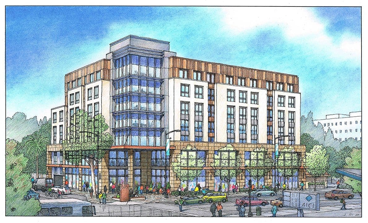
Architectural Rendering of Renovated Building Converted to Housing the Homeless
This episode will feature an architectural illustration I created a few weeks ago for a good client of mine, an architect in San Francisco, California….Van Meter Williams Pollack, LLP….But the project–the building shown here–is in San Rafael, California….It’s an existing building which will be repurposed as housing for the recently homeless population in the area….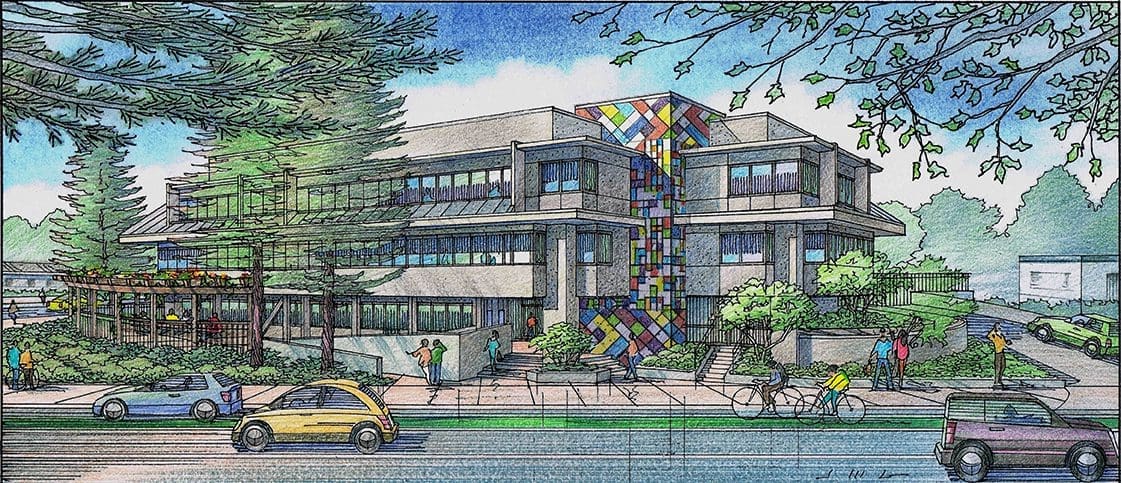 For this episode, I’d like to concentrate on the rendering from an artist’s standpoint….in other words, the challenges and goals that I faced as the illustrator, charged with creating an engaging image which would be utilized to show the developer what the finished project would look like when completed….For example the ribbon windows were located under a shade canopy, a situation which called for showing the glass in this area as reflective to give life and lightness to the rendering….it also helps to vary the colors and reflectivity to create visual interest….The solid parts of the building were a neutral gray, so it was especially important to show visual interest in the glass areas….I also chose to show the cars as fairly colorful in this view–as a counterpoint to the neutral grays of the building….As the artist, cars are one of those things of which you have ultimate control….if they need to be colorful to give the artwork balance, then that’s what you do….The human figures fall into that category as well….I generally place the most colorful folks place near a focus of the drawing–maybe an entrance to the building, or an outdoor water feature–something that I want the viewer to see first and foremost….Another challenge for me was the large evergreen trees in front of the building to the left in this view….In reality these redwoods are so dense with foliage, they would preclude any view of the building behind them….I took artistic license to show these trees in a semi-transparent fashion to show both the extent of the tree coverage and some semblance of the building behind since this is not a portrait of this building–but rather a visualization of a renovation project….I hope you enjoyed this episode–Jeffrey Michael George works with many California architects as a freelance illustrator, creating architectural renderings in color pencil and watercolor which bring their design ideas to life !
Watercolor Painting of Derby House Designed by Lloyd Wright
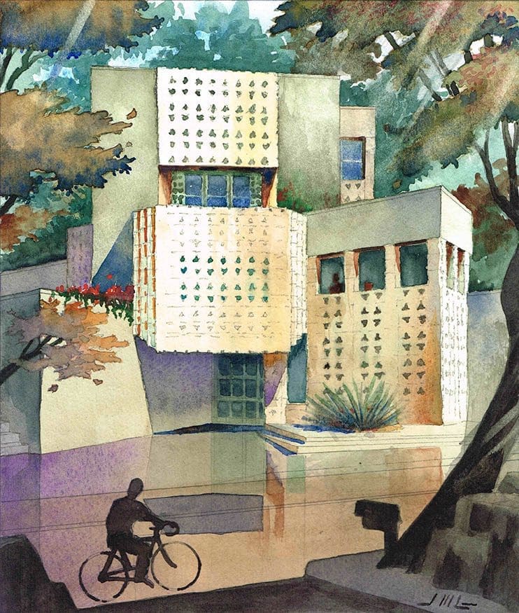
This is my watercolor painting of a home in L. A. designed by Lloyd Wright, architect….that’s right, I said Lloyd Wright–not Frank Lloyd Wright….I used to see this house while riding home from high school on my ten-speed bicycle….I was fascinated by it–and had no idea it was designed by a famous architect….In fact the house is the best-known work of Frank Lloyd Wright’s eldest son, known alternatively as Frank Lloyd Wright, Jr., or Lloyd Wright….I always wondered what it must have been like to be Frank Lloyd Wright’s son–no pressure, right ? Built in 1926, this residence showcases his genius of integrating nature and building; the garage gates, fireplace grates, French door grills, and closets are abstract renderings of the yucca plants growing on the surrounding hills and the pre-cast concrete ornamentation adorning this home is of Mayan inspiration–the preceding statement was quoted from the real estate agent which recently listed the property at $ 3.3 Million….The Derby House is on the National Register of Historic Places. The Mayan Revival–style residence is clad in ornamental concrete textile blocks cast in sand from the nearby Chevy Chase Canyon….The 3,281-square-foot home was commissioned by businessman James Derby for his family, but he and his wife separated before the home was completed, so only she and their children ever lived there…. I would have been riding by from about 1966 to 1973, since I started driving back and forth to Glendale High School in my senior year (1974)….It was always a great mystery, and a great source of inspiration for a blossoming architectural student….It’s been a pleasure to paint my “portrait” of this home so many years later….This painting is my fifth in a series of watercolor paintings to explore any talent I may have with this medium….All the subjects of these paintings are works of architecture that were meaningful to me as a young architect–kind of a Top Ten for me personally, if you will.,…Thank You, –Jeffrey Michael George, Architectural Illustrator
Color Pencil Illustrations for Shopping Center in Grass Valley, California
Here are two color perspective renderings I did earlier this year for Siteline Architecture of Nevada City, California….I have done a few illustrations for Siteline over the years, and it was good to work with them again on this project….The subject of these renderings is an existing shopping center in Grass Valley which will be revised and updated per the designs of Siteline….who in turn is commissioned by the property manager of the shopping center, Mesa Management of Newport Beach, California….So as a freelance consultant, I primarily worked with Cort Ensign of Mesa Management, and Christopher Gage of Siteline Architecture….As is fairly common, these illustrations were done over a long weekend, basically….Due to a highly-anticipated meeting on Tuesday of the following week, I was given the go-ahead on the previous Friday morning….I start by adding landscaping, trees, cars and people of my own design, then tracing all with a freehand line work in felt pen….Then I print these two black and white drawings on heavy stock, and apply color pencil and chalk pastel, building up the values and color saturation until they are finished….I scan the renderings on an 11 x 17 color scanner, and save the scan files at a high resolution….I send these scans via email–and Voila ! I generally keep the originals, since the client usually does not need them…..The scan files can then be included in the client’s digital presentation, or printed as a handout for their meeting….What we are showing in these illustrations are the modifications to the existing storefronts, and the trees and landscaping proposed by the landscape architect, Karin Kaufman of Nevada City, California….
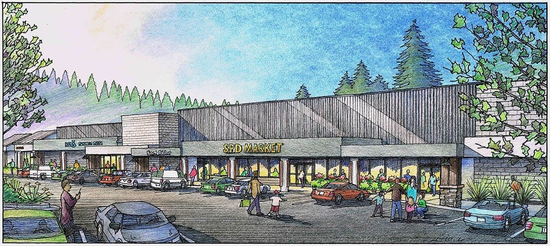 The mood of the architecture is kind of “Gold Country Industrial”….and that’s my description, but I think it projects a definite modern industrial feel, while achieving the objectives of greater height and curb presence as seen from the street, and the approach on foot….Jeffrey Michael George works with many architects in California and worldwide to bring their designs to life in form of architectural renderings….clicking on any of these images will take you to Jeffrey’s website, where you will see many more examples of his work….
Three Watercolor Renderings for Project in Kauai, Hawaii
Last month I created these three watercolor illustrations for a project located on the island of Kauai, Hawaii….The site is the existing Mahelona Medical Center near Wailua, Kauai on the east coast of the island….On some of the vacant land available at the facility, the medical center is considering building more housing and commercial space for the community….My client was the architect: Van Meter Williams Pollack of San Francisco, California….Rick Williams was the designer, and Rick proposed three ways of developing the site….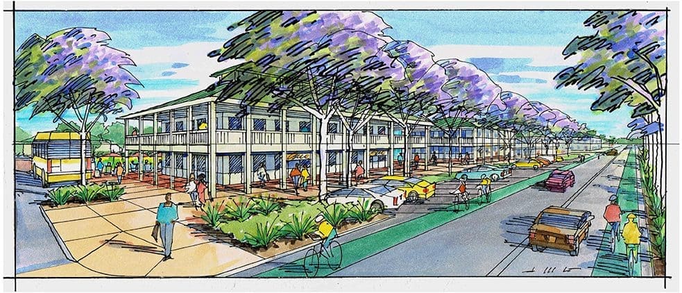 The first scheme was the “Main Street” concept (shown first here) which would create a new 2-story Town Center with commercial retail businesses on the ground floor, and private offices on the second floor….Pushed out toward the street, the building would be conspicuous and convenient with parking, bike access, and bus transit part of the scheme….The second image shown here represents the “Village Green” concept, which pushes the buildings back from the street, playing a supporting role to the generous open green space for maximum public use and involvement….an active space for active local Hawaiians enjoying the outdoors….Lots of lawn, walkways, arbors, benches with room for walkers, cyclists, dogs, and bus riders….
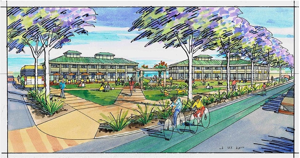 The last scheme was entitled “The Bluff”, and the concept was to feature the magnificent vista from this spot (see Image #3 below)….With long-term care in the immediate foreground, one can look at the ocean through a public park which leads down towards the ocean….Again, activity and greenery, with walking paths leading to an amphitheater in the distance….As the artist and creator of these watercolor illustrations, I used fresh, clean tropical colors–with the building colors chosen by the architect to blend with the landscape….As suggested by the architect, the architectural design style was “traditional Hawaiian”–simple, conventional geometry with green metal hip roofs, with some cupola elements as seen historically on the Islands….I hope you enjoyed these illustrations–and you can always see many more examples of my work by searching Jeffrey Michael George, Architectural Illustration, or visiting my website at https://finearchitecturalillustration.com
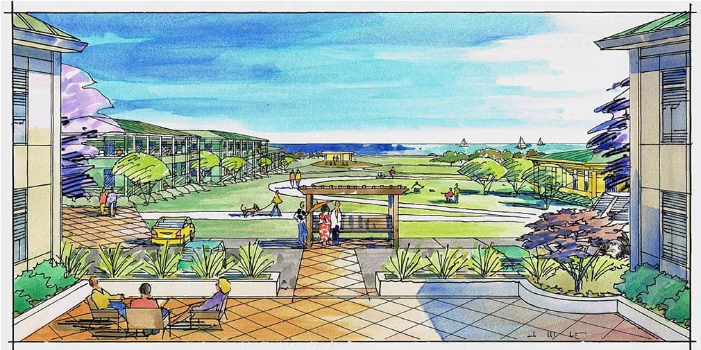
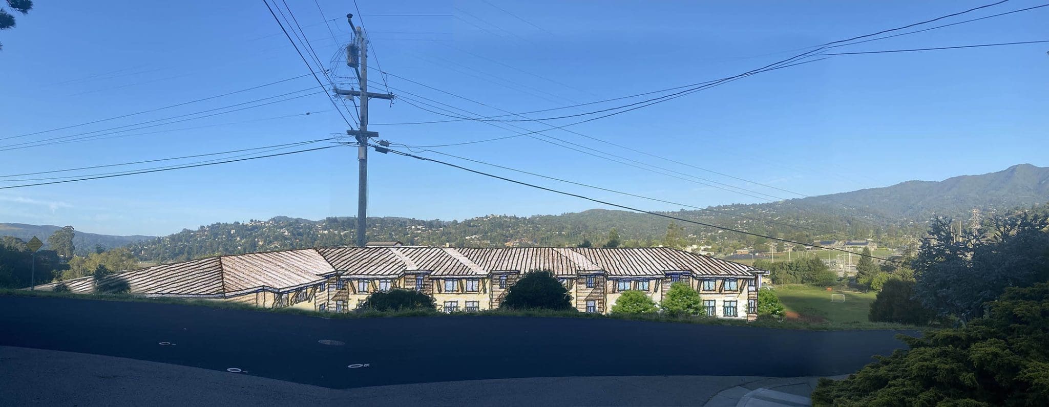
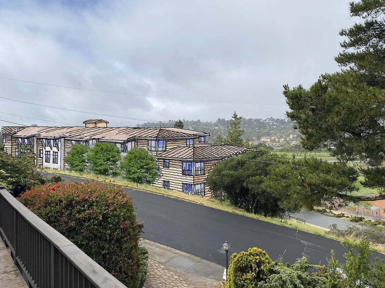
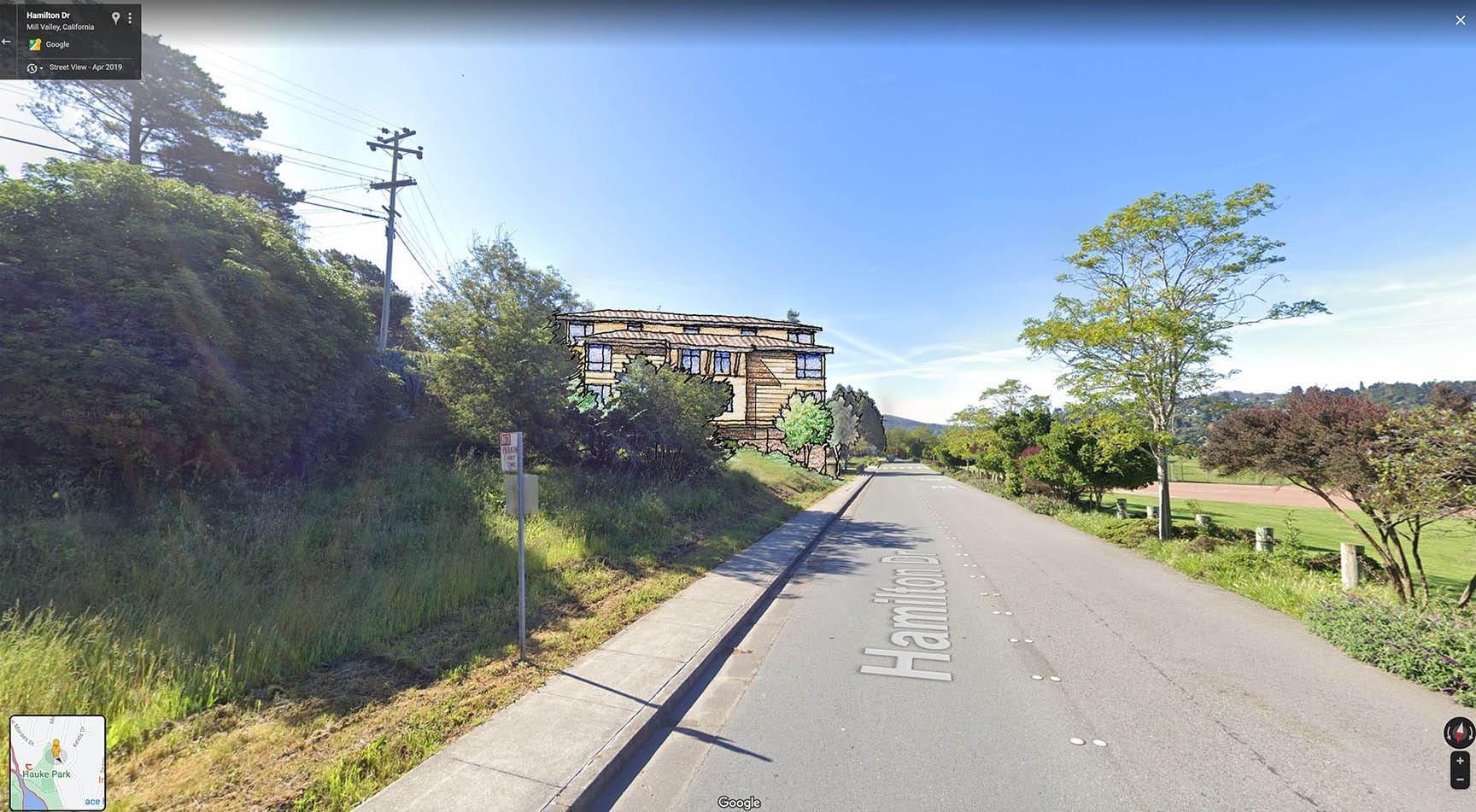
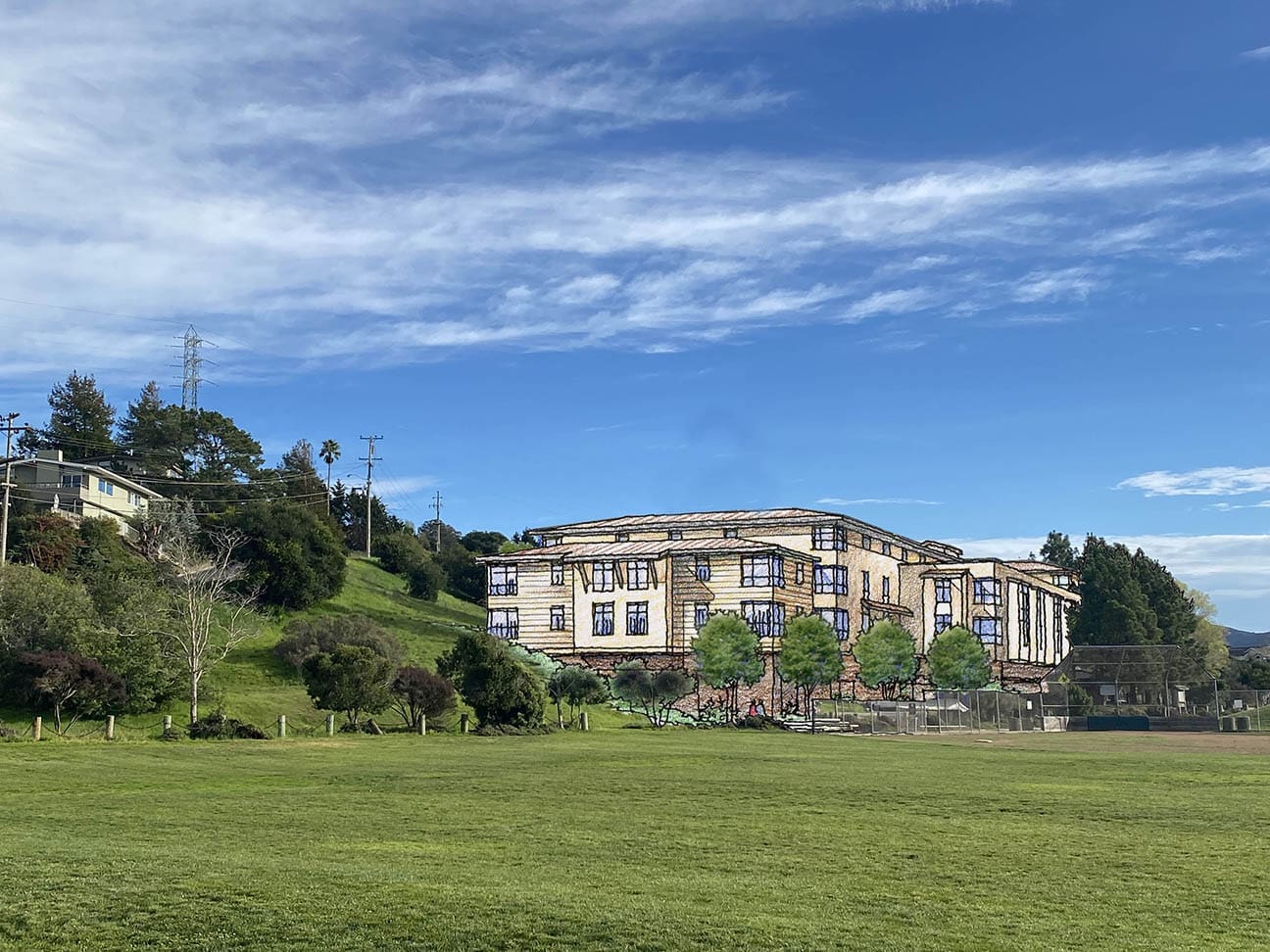
Architectural Renderings for Mill Valley, California Residential Project
I’ve been doing some different things lately in illustrations….I think at times one needs to respond to changes in the industry–and changes to what is asked of you as a consultant….So in the spirit of collaboration and in response to a request from a very good client, I have now done a series of images which are not entirely drawn by hand….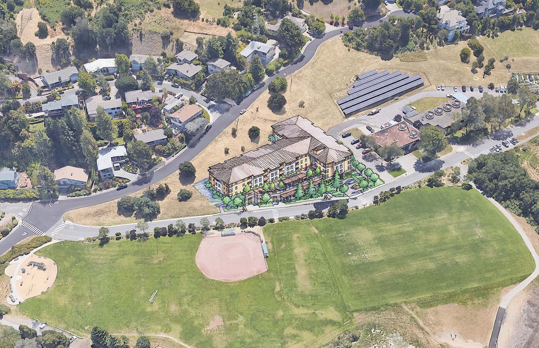 They are photo montages, wherein the conceptualized building design is drawn by me in perspective–then merged digitally with a photograph of the existing site and context….using Photoshop….The end result is kind of interesting–and I think it works well for this purpose, which at this point is to give the neighboring residents options and to get some feedback from those living nearby….The architect, Rick Williams of VMWP Architects in San Francisco, conceived of two different design schemes to meet the requirements put forth by his client, an affordable housing company….The site is very challenging in that there is a very steep slope to it….it’s basically a triangular site that drops precipitously from one edge to the other….The silver lining is that the existing residential neighborhood is located above the high side of the site, so if the new building is limited to two or three stories, the neighbor will only see a little bit of the new building….some roof, some building, but not much, really….Some clever placement and massing by the architect results in a much less impactful project….And since the design is in its initial stages, these photo montages serve very well to convey these conceptual ideas for a building without too much fanfare or detail–just a concept….giving the public options and input….If you have a development project that could benefit from this type of presentation, you should think about this approach–because it strikes that difficult balance between what an existing neighborhood wants, and what the developer wants to build !
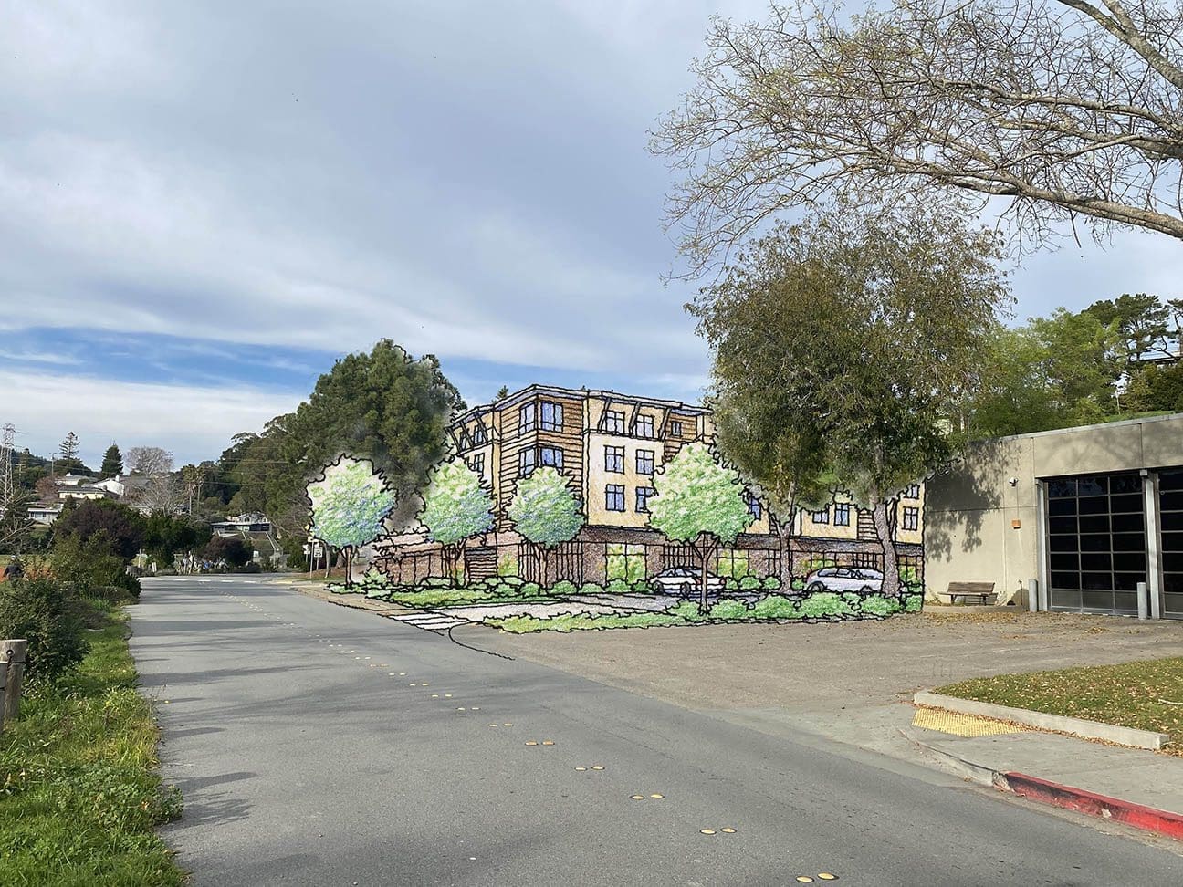
Color Architectural Renderings in Twilight
Architectural Renderings that portray twilight lighting are both fun to do, and challenging….The stock in trade of most architectural renderings are the strong shades and shadows that are created by sunlight from above….At twilight, the sun-if it’s present at all-is near or below the horizon, which limits its effect on architectural forms…..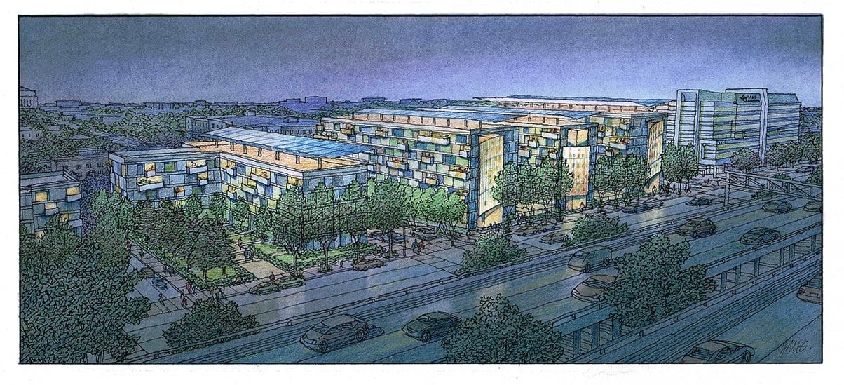
 And what takes its place are the other light sources, such as backlighting, interior lighting, lampposts, signage-all kinds of secondary forms of light that begin to give form to the subject building….As an illustrator, this can actually be somewhat liberating because you’re no longer confined to the very predictable effects of sunlight on the building….You can think and act more like a photographer, placing the light where you want it, to accentuate certain elements or features of the architecture and surroundings….For example with a daylight rendering of a building, you may want to draw attention to the entrance, and the best way to do that would be to use the darkest values and the greatest contrast in that area-so it pops and becomes a focus….In a twilight or night view the main building might be fairly dark and monotone, but you will reserve the brightest and maybe the most colorful hues for your treatment of the entry, so the eye goes there first….Another example of how daylight and twilight renderings differ would be this….When drawing a daylight rendering, the illustrator often chooses to light one side of the building with sunlight, leaving the other side as the dark side….Once you’ve made that decision as the artist, it’s difficult to say too much of anything about the dark side or any special feature it may have….Great for playing up the sunlit side, not so good for the darker side….When creating a twilight view of a building, you can always take the liberty of casting light from other sources anywhere you may want them, in order to create focus on specific details you choose…..Enjoy these twilight renderings I have drawn or painted recently for my architectural clients !
Watercolor Painting of Philip Johnson’s Glass House
Here’s a watercolor I just finished….It’s my rendition of Philip Johnson’s Glass House in New Canaan, Connecticut. Built in the 1949 it is the quintessential glass box–architecture pared down to its simplest modern essence. A metal and glass rectangle–the only privacy concession is a circular brick element within which houses a bathroom. 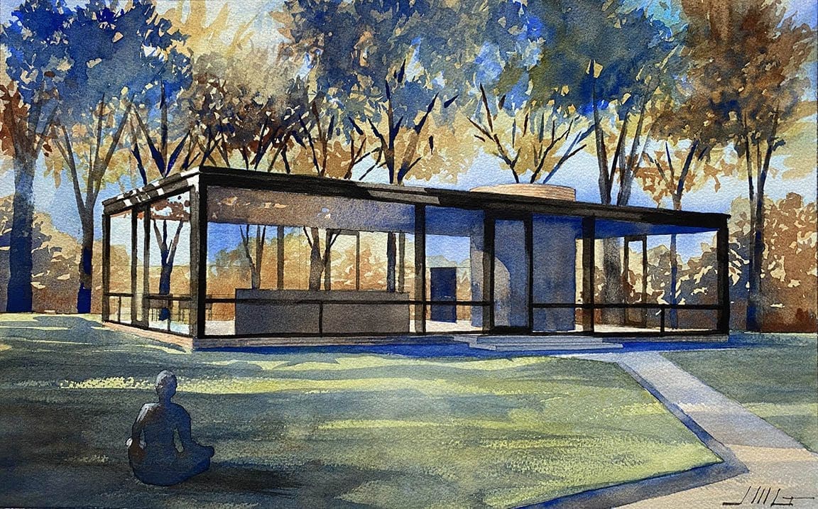 Pretty crazy stuff–but I love it ! Imagine living there with the trees, grass and nature on full display just outside the glass–the peaceful nature always right there seemingly at arm’s length ! There’s something both shocking and inspiring about this pure and simple structure. You can hear people say: “I couldn’t live in that fishbowl !” “Natural light and lots of glass–I love that part, but totally impractical to live in”….Why not ? I guess that’s the architect and purist in me–I don’t see a big problem. I love it, and I could imagine myself being very happy living there….This is one of my favorite works of art….It’s one of a dozen or so architectural works that are most inspiring to me–and were very formative in my early passions for architecture….The watercolor painting was fun to do also….it’s a simple palette: Cadmium Yellow, Ultramarine, Burnt Siena, and Black….That’s it ! I chose to backlight the house because it shows off the transparency and the oneness with nature. Dappled light from the surrounding trees and s few white highlights here and there to accentuate the geometric clarity of the metal-framed box. The glass has some transparent and some reflective qualities, but is largely neutral. Kind of a meditative mood about it–it’s a peaceful and quiet architectural thought put into reality by the architect. I’m not a huge Philip Johnson fan, but with this particular house, I think he nailed it….for me, the best work he ever did….Thanks for reading this–and for enjoying the watercolor !
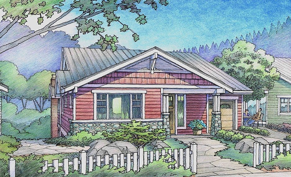
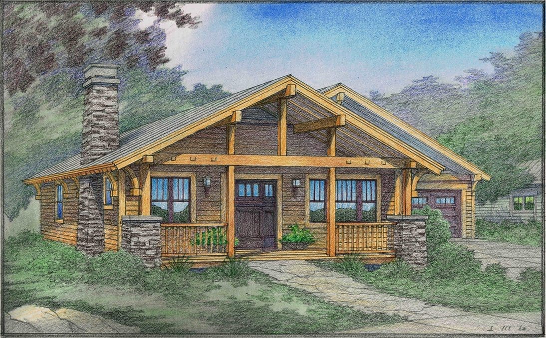
Color Renderings of Cottages and Small Houses
Of the subjects that I love to draw, small houses and cottages are right up there at the top….They can be charming–architecturally and in all other ways….Small, unpretentious, but with personality and style would describe most…. These illustrations shown here were all commissioned by good clients of mine, mostly architects, but also by owners and developers….The design of the homes is almost always provided to me in for form of plans and elevations….I take that information and translate it into a 3D perspective view like you see here….The colors and materials are usually given to me as well, but occasionally I am given artistic license with those decisions….Paint and color can be a critical factor in the overall success of each image….and usually these images are marketing tools, so this makes color even more important….I believe these cottage designs benefit from a strong color scheme–bright colors, contrasting trim colors, landscaping to soften, materials that are comforting and accessible, details that provide interest without being elaborate….Craftsman Style is a popular choice among most people….it seems to capture a good architectural vibe, and has a familiar feel for most West Coast homeowners….My understanding is that the Craftsman aesthetic has its origins in the early 20th Century with the design work of Bernard Maybeck of the Berkeley, California area, and to a certain extent, the early work of Frank Lloyd Wright in the Midwest….One hundred years later, its popularity remains strong….I think part of its appeal is that it is straightforward and simple, but retains an element of style–modest, but with a little something special about it….Front porches are an important element, because they invite entry, and promote social interaction….Roof slopes are not steep, but nearly flat, since they are not in a snowy area–enough slope to shed the rain is sufficient….The great majority of the renderings shown here were commissioned by Carol Young of Auburn, California for her project Rincon del Rio….Since I enjoy drawing these homes and cottages so much, you should consider commissioning me to draw some of your designs….
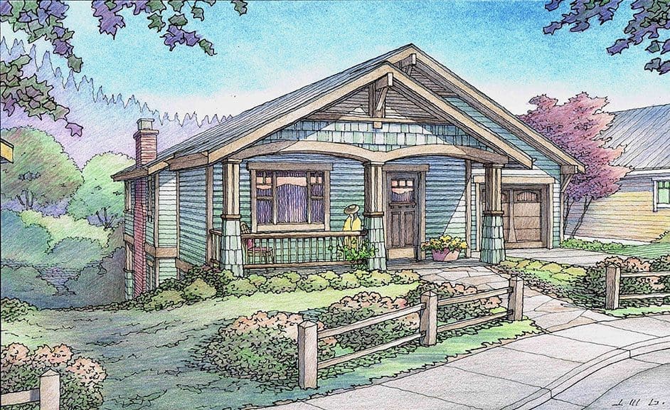
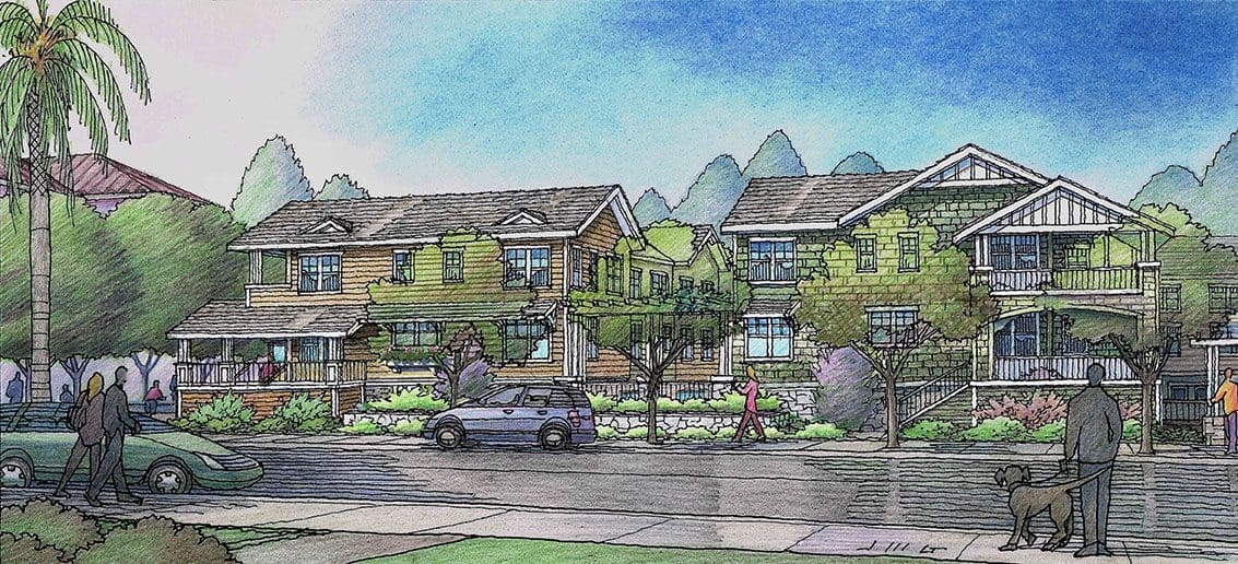
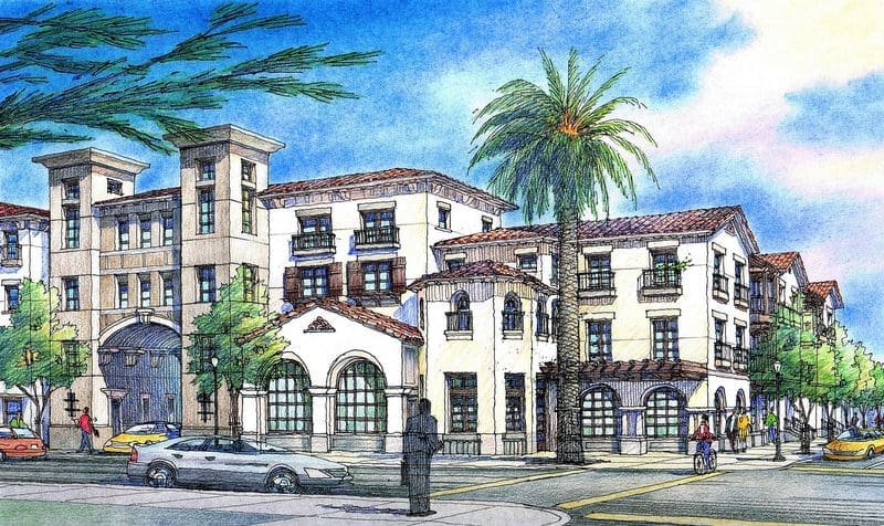
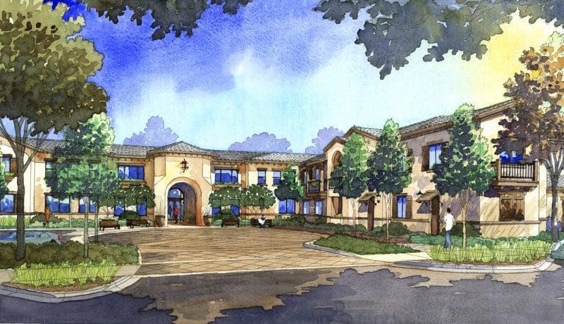
Color Renderings for San Jose Architectural Firm
Today I am featuring some of the many renderings I have done in recent years for VTBS Architects located in San Jose, California….Most of these architectural projects are in and around the San Francisco Bay Area, with the occasional Sacramento project location….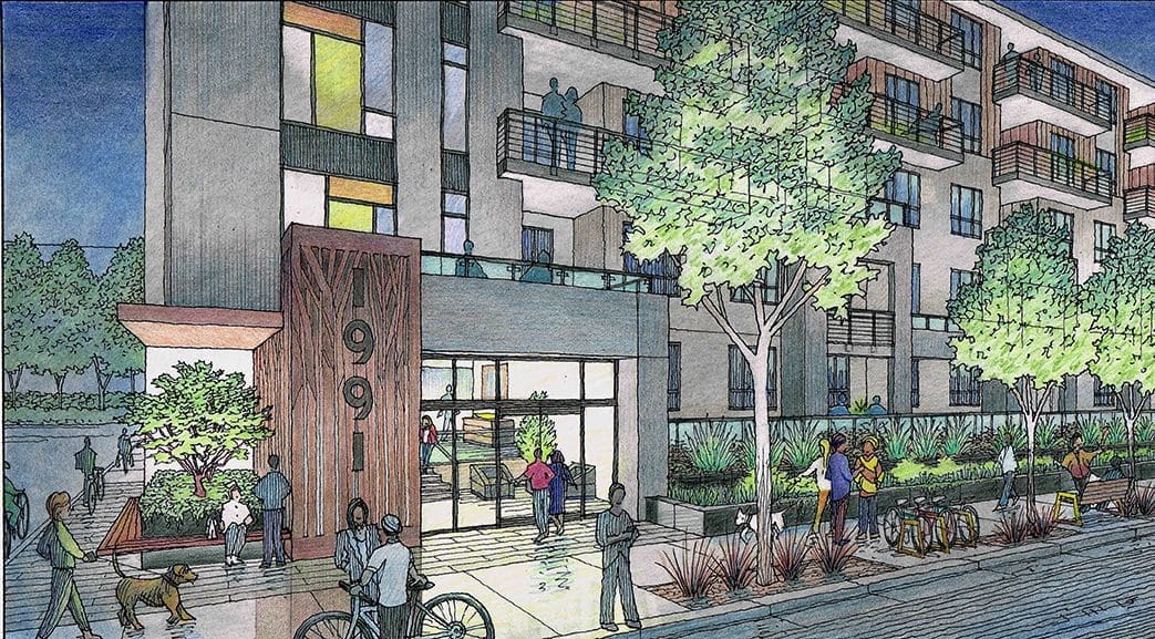 Working in the techniques of watercolor or color pencil alternatively, these illustrations usually show large residential structures designed by VTBS staff….I always work with Jim Yee, an architect who has many years of expertise in the design field….I first met Jim over 30 years ago in the San Jose area, and we have been working together on a freelance basis ever since that time….He has an appreciation for the effectiveness of hand-drawn illustrations when presenting architecture….Jim has a way of allowing his consultants the freedom of autonomy, but offers input at the right time and in the right way, which benefits the process and enhances the rendering’s effectiveness ultimately….You have to be able to “do your own thing” as a freelance artist, but you also need reviews and approvals during the process at various stages by the architect….That way, the architect gets what they need as a presentation tool, and the artist is pretty much free to express the qualities of sunlight, liveliness, color, texture and materials that make a successful rendering….Shadow lines, dark recessed areas, lighter sunlit faces, canopies and awnings, base materials, glass reflective qualities, and even details like score lines and joint lines are all important to include in an illustration….These are the elements and considerations that an architect spends a lot of time and effort to include….and they need to be conveyed effectively in the rendering to truly communicate all the work that the architect has done….I’ve learned the importance of these graphic communications over the years of creating architectural illustrations–actually I began learning their importance at Cal Poly San Luis Obispo when I was receiving my degree in Architecture many years ago….I feel like we speak the same language–architects and illustrators–we just do different things during the course of our work day to day….

Recent Comments