Illustrations for Urban Design Concepts in Minnesota
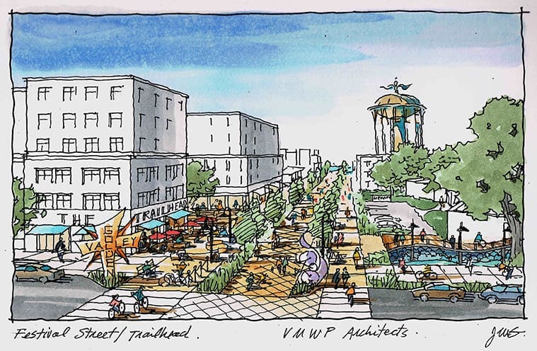
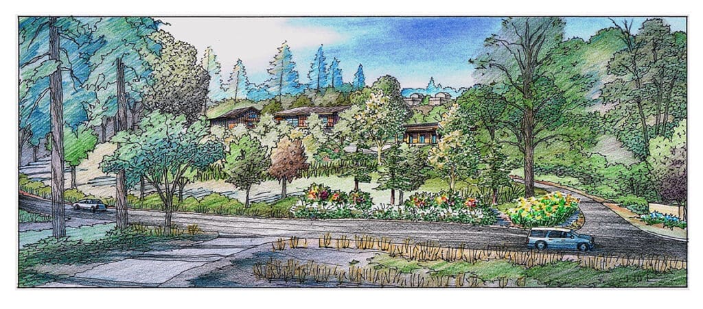
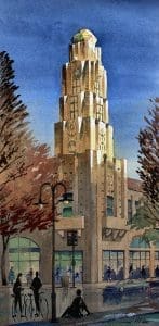
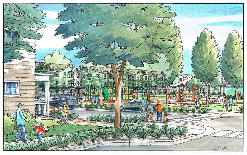
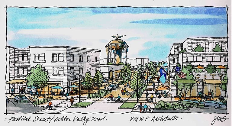 I am showing two urban design renderings in this article that I created recently. I was commissioned by Van Meter Williams Pollack Architects in collaboration with the Hennepin County Planning Grants Program of Minnesota. These are the kind of drawings that attempt to capture a designer’s intentions without the benefit of having the time to work out all of the details. In the architect’s own words: “In order to effectively communicate proposals for complex urban design vision, vibrant and easily-understandable imagery is necessary. The challenge is that there is not much solid content for the render to use as a foundation. Jeffrey works with minimal guidance and answers to a few trenchant questions to produce detailed images evoking the exact sense of place that we are attempting to achieve in our work. “Of course, if the project is funded, then the design work begins in earnest, and the project–and the architect’s design–moves from mere concepts to actual buildings and public spaces. So for the preliminary drawings you see here, a simple SketchUp model is used to generate the perspective, and the rest is “sketched over” by me, using general directions from the architect/urban designer. The water tower and some of the buildings shown here are currently there on the site. The idea was to dress up the water tower with painted graphics and special lighting elements. Some other existing buildings either remain as they are now, others are re-purposed to better serve the community. Much of what we are trying to convey with these renderings is the street and sidewalk life, wide walking and biking paths, street trees, lampposts, outdoor dining and seating, streets that share limited driving with pedestrians, etc. The bottom view shows a generous connection with and existing Trailhead that’s popular with the public now. The whole idea is to revitalize a small urban area that is not living up to its potential presently. I have created many of these conceptual images over the years for many communities across the U. S.
“Return to Bidwell Mansion” Watercolor Painting
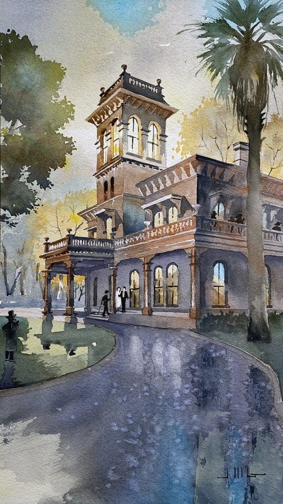
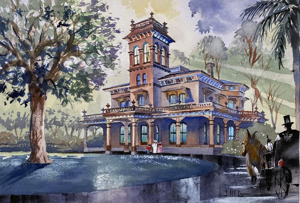 Now that the historic Bidwell Mansion has been destroyed by fire, it seemed like a particularly good time to create this watercolor painting entitled “Return to Bidwell Mansion”. Bittersweet indeed–like many Chico residents, I viewed the Bidwell Mansion, built by John and Annie Bidwell in 1865 as the most significant landmark in our city. We thought it would always be there, as a visual example of the early days of settlement in the area–something we could always go visit and tour with friends and loved ones. As if to prove that you can take nothing for granted, it disappeared from our view early one December morning late last year. In the hours following the massive fire, all prints (and the original) of my first watercolor painting of the mansion were completely sold out at the art gallery in a rush (image of my first Bidwell Mansion watercolor shown below). That was a testament to the importance of this landmark to the people of Chico–in case there was any doubt. It’s unclear at this time whether there will be a successful effort to rebuild Bidwell Mansion. No doubt Chicoans will want to rebuild it, but much depends on budgetary concerns, logistical concerns, methods of funding, etc. It is a California State Park, and a registered State landmark, so there is reason for optimism. My new painting is an effort to commemorate and maybe recapture some of the building’s glory and dignity. And hopefully serve as a kind of “bridge” to a brighter day….I sincerely hope that one day the Mansion stands on the Esplanade once again. Fine Art Prints of “Return to Bidwell Mansion” are currently for sale at Chico Paper Company–and I will be contributing 20% of my personal proceeds from any sales toward the organized effort to rebuild this historical gem.
Color Illustrations for Proposed Craft School
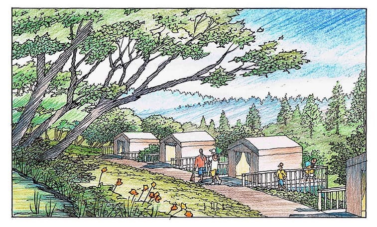
 A new vision for a Craft School has emerged in the Sierra Foothills of northern California. These illustrations were done to portray the current design ideas and character of this project which is in the early phases of design. The brainchild of Leslie Barbazette and Jay Morgan, the Wolf Craft School and Collective is for people who enjoy woodworking, blacksmithing, ceramics, and handcrafts. Located in the beautiful countryside between Grass Valley and Auburn, the 16 acre parcel upon which Barbazette and Morgan reside currently, would have outstanding views of the local hillsides, ponds, waterways, oak trees, and just enough simple structures to support the school’s functions. Millennium Engineering of Nevada City, California, has done the land planning and designed the required structures to sit comfortably on the largely wooded piece of land. These small classroom buildings and compact studios are designed to blend in with the natural landscape, using earth tones and non-combustible materials. There are also modest tent cabins on raised wooden platforms, each having their own air conditioner, shower, and bathroom. Near the tent cabins is a respite area with shade oaks, picnic seating, and a food truck–maybe a movie screen for late summer evenings. Any new landscaping will be mostly native and drought resistant plants, with an area for raised bed vegetable planting for on-site consumption. The color renderings shown here were done recently by Jeffrey Michael George to describe the conceptual design to the public. The image above shows the overall site from Wolf Road with proposed buildings and landscaping. The other three illustrations below show various aspects of the design–the ceramics studio, the classrooms, and the tent cabins, as they are set into the landscape of the foothills. Jeffrey is a professional architectural illustrator who brings to life the designs of many architects, engineers, and builders all across America.


My Watercolor of Kendall Hall, Chico State, California
“Today Decides Tomorrow” is above the entry to this building at Chico State University….It’s one of the most recognizable structures on the campus and is called Kendall Hall…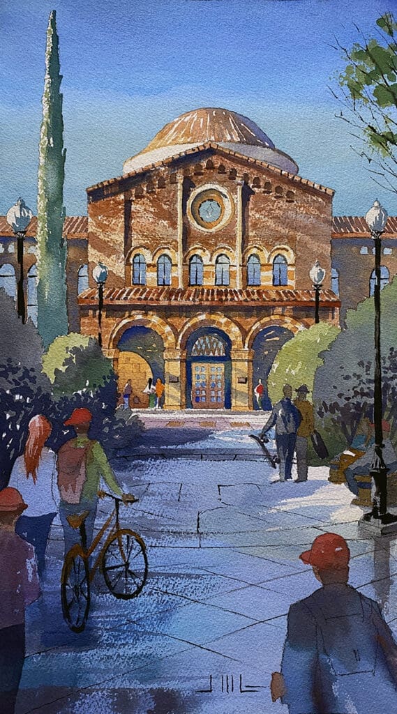 When the heat of the summer sun hits these old brick buildings, you can feel the warmth and personality of the architecture….That feeling is what I wanted to capture with this watercolor painting….Trying to depict the intricate brick textures of this building’s facade was one of the challenges….There is a lot of subtlety within the massive forms due to small reliefs and projections….Architecturally this gives the building a less imposing and more approachable personality….The following description of the building is taken from the California State University Chico website: “The administration building was built on the site of the Normal Building, which burned in 1927. The original cornerstone was incorporated into the building along with a new one. Chester E. Cole designed it in the Romanesque style, to match Laxson Auditorium and Trinity Hall which were built at that period. It is a two-story building with a rotunda in the middle. It is constructed of brick with a Spanish tile roof and decorative columns and arches. Although the exterior has had only minor changes, the interior has been remodeled to contain more offices and the utilities have been upgraded. In 1964 a spiral staircase was added under the dome of the rotunda. There is a central hanging globe in the dome representing the earth. The underside of the dome was created to represent heaven so as you climb the spiral staircase you ascend past the earth towards heaven. The motto “Today Decides Tomorrow” is above the central arch leading into the entrance” This is a watercolor painting by Jeffrey Michael George, Architectural Illustrator. Jeffrey works and lives in Chico, California and produces illustrations for many clients, mostly architects, located in California and beyond. Some of his work is shown and sold at Chico Paper Company, an art gallery located in downtown Chico, California.
Watercolor Painting of Stansbury House in Chico, California
I recently finished this watercolor of the Stansbury House which is a local landmark in my hometown of Chico. 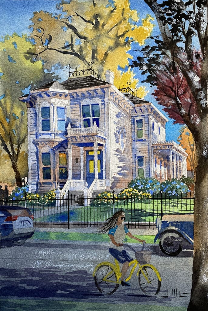 When I posted this image, some people thought the house was in New Orleans due to its historical character and detail. Nope–it’s right here in Chico, California. My wife and I took a tour of the interior about a week ago, which was a great way to see and learn more about the 1880’s and 1890’s local scene, all provided by an excellent and knowledgeable docent. As stated on the landmark’s website: “The Stansbury Home is a Victorian home built by Dr. Oscar Stansbury in 1883. The home was listed on the National Register of Historic Places in 1974 and in 1991 was listed as supporting the South Campus Historic District. While the home is now the property of the City of Chico, the Stansbury Home Preservation Association helps to fund and maintain the 19th-century historic residence. The house was designed by Sacramento architect, A.A. Cook, and is a classic example of Italianate Victorian—a style patterned after the sturdy square manor houses of the Italian countryside. The exterior of the house incorporates beautifully molded and arched windows accented with carved rosettes at their peak, angled bay windows flanked by colonettes; entrance porches rippled with slender fluted columns; carved balustrades and decorated pediments, all topped by bracketed cornices. Centered on the roof is a low decorative wrought iron fence accentuated by a fleur-de-lis design. The quarter block on which the home was built was purchased for $1,000 and the 10-room house was constructed for just under $8,000. The home remained in the Stansbury family from the time it was occupied in 1883 until the death of the Stansbury’s oldest daughter, Miss Angeline Stansbury, on Christmas Day, 1974.” The watercolor painting is by Jeffrey Michael George, an architectural illustrator who lives and works in Chico. Jeffrey shows and sells his artwork at Chico Paper Company in downtown Chico, California.
Watercolors by Jeffrey Michael George at Chico Paper Company
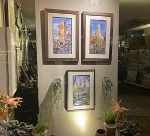
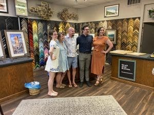
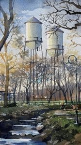
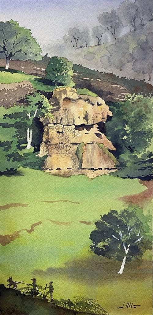
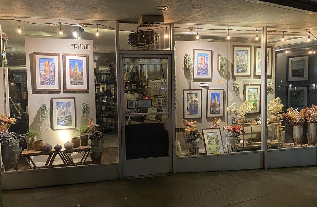 Currently on display in the storefront windows of Chico Paper Company, five watercolor paintings tell the story of five Chico landmarks. These hand-painted illustrations by Jeffrey Michael George chronicle the well-known sights of Bidwell Mansion, Monkey Face Rock, the Senator Theater, Bidwell Presbyterian Church, and the Chico Water Towers. The gallery, Chico Paper Company, at 345 Broadway in downtown Chico, offers a limited number of high-quality prints for sale, as well as the framed originals. Jeffrey feels honored to be an artist at the gallery, and enjoyed a warm, welcoming Artist’s Opening Reception in July of this year. It was great to be introduced to the Chico art community and to have the opportunity to show artwork on the same walls as the other excellent artists affiliated with the gallery. The entire experience has been inspirational, and Jeffrey has since been busy creating new watercolors of other Chico points of interest–such as One Mile Pool, the Diamond Hotel, Salmon Hole, and the Saturday Farmer’s Market. Jeffrey has enjoyed a lifetime career as an architectural illustrator, which has taken him from New York City to San Francisco and now to Northern California, with many clients all over the country. Jeffrey has enjoyed his new hometown of Chico since moving here in 2018 with his wife Susan. Their adult sons Matt & Jim have been longtime residents of Chico and it’s been great re-connecting with them on a much more frequent basis. So here are some photos of the gallery display, and the Opening Reception–and the five watercolors themselves. If you love Chico and share an appreciation for its unique characteristics and landmarks, you should visit Chico Paper Company in downtown Chico and see the art in person in a gallery setting. In addition to supporting the local art scene, you will also be supporting a local business that helps make downtown Chico a treasure in itself !


Color Rendering of Marina Boat Storage in South Carolina
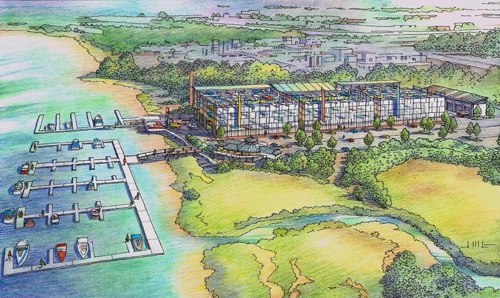 Here is a color pencil rendering I just finished last month for an architect in South Carolina. It was a fun one to draw, since it involved boats, waterways, a restaurant, and brand new storage structures–all viewed from the air. Having done another rendering for Sean Murphy, one of the architects for this project, he recommended me to his colleague, Rhett Morgan, an architect in Charleston, South Carolina. I worked on a tight timeline with both Sean and Rhett to produce this image. Starting from a Google Earth background taken from this aerial viewpoint, I sketched in the new proposed boat storage buildings and traced the existing context. There is an existing waterfront restaurant right in the center of this view, and some docks which will be improved as I show them here. The remainder of this view shows an existing marshy area in the foreground, and existing heavy industrial areas behind the site toward the horizon. The boat storage works in an interesting fashion: Boats are stored in multi-story storage structures that have screens to camouflage the boats themselves. When you want to take your boat out in the bay, a forklift gets your boat from storage, delivers it to the launch area, and a boat valet brings your boat around to the dock for you. There are nine of these storage buildings clustered together in close proximity with alleys to access the boats. It’s pretty clever, as you can store an enormous number of boats in a relatively small area. I enjoyed portraying the marshlands in the foreground of this view, using photos of the local flora as reference material. I hope you enjoyed this illustration in the color pencil technique by Jeffrey Michael George. Jeffrey creates many architectural illustrations for projects all across the country, including Louisiana, Florida, South Carolina, and California.
Hand Drawn Color Pencil Renderings of Los Altos Hills Project
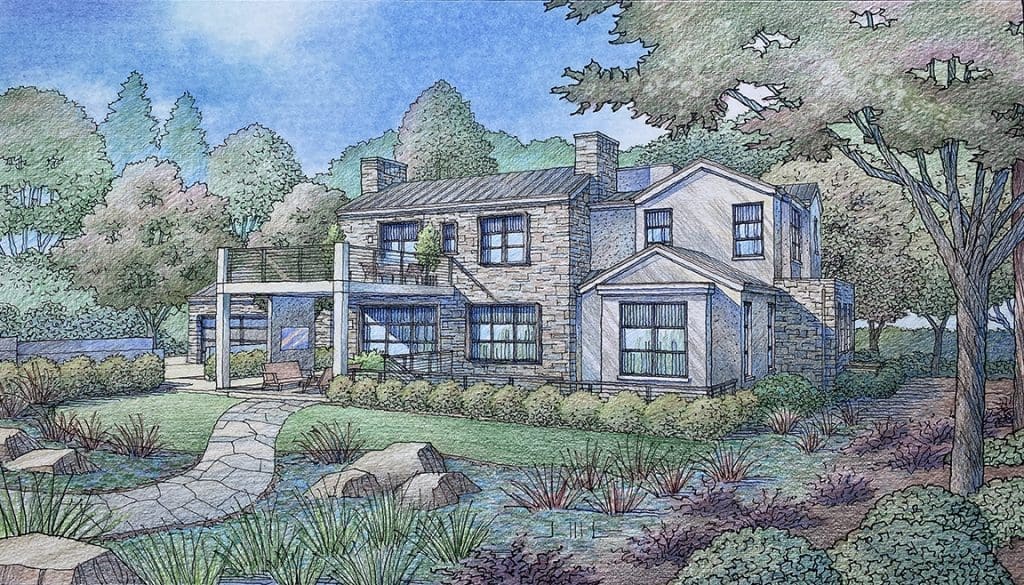
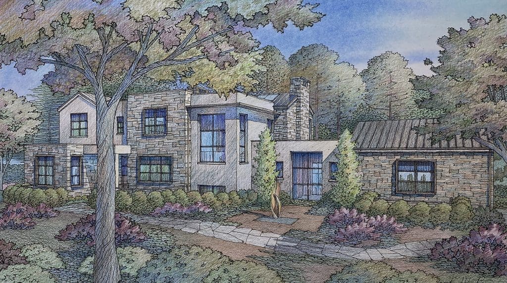 Here are a couple of architectural renderings I finished recently for a proposed residential project located in Los Altos Hills, California. It’s a single family home on a beautiful lot with mature oak trees and redwoods. The architect is Pacific Peninsula Architecture of Menlo Park, California. I worked with Eric Peterson, the project architect and designer at Pacific Peninsula to develop these illustrations. Eric puts together the submittal to the City, which is a complete description of the project, including the renderings. We decided on these two view angles–as the first one shows what you see from the street, the second view shows the actual front of the house, which faces away from the street. The exterior materials include natural stone, cement plaster, steel window frames, and a metal roof–all in warm neutral tones. The house is a speculative venture–one of many created over the years by Pacific Peninsula. My role in these projects is to bring the architect’s design to life, showing the materials with a sense of light and shadow, along with landscaping which is both existing and proposed. In this case there was only a preliminary landscape plan as reference, so much of what you see here is my suggestion of what the landscape would be. Almost all of the trees shown are existing, and they usually frame the architecture pretty well on their own. But the landscape really helps to visually set the building into the land and give it a “lived in” look. I hope you enjoyed these hand-drawn images or “architecture-to-be”. These illustrations are hand-drawn and colored in the color pencil technique by Jeffrey Michael George, Architectural Illustration. Jeffrey creates many architectural illustrations for projects located in the San Francisco area, including San Mateo, Palo Alto, Menlo Park, Woodside, Portola Valley, Atherton, & Los Altos Hills.
Watercolor Paintings of Chico by Jeffrey Michael George
 I was thrilled to have the opening of my watercolor paintings of Chico yesterday at Chico Paper Company, 345 Broadway in downtown Chico, California. It was quite an event with wine and cheese being served, and lots of friends and family stopping by to celebrate the occasion. It’s been quite a whirlwind leading up to this event, which marks the beginning of my work being offered for sale at the gallery. I will now have my paintings available to view anytime during gallery hours. Since starting these paintings late last year, I concentrated on completing five watercolors by Spring 2023. With these paintings in hand, I could go to the gallery with a body of work completed–to see if they were interested in my work. The gallery loved the paintings I did, which made me feel so happy and encouraged. I met with Eric Metcalf, the owner of the gallery and several of his assistants. We decided that a limited edition of ten prints should be made of each of the five watercolors. I was very pleased to find the services of Pixel Perfect Printing in Chico to make these high-quality prints for us. I worked with Elizabeth Kuiper, the very talented owner and printmaker. Once the prints were made and delivered to the gallery, both the original watercolors and some of the prints needed to be framed for exhibition and sale. Chico Paper Company, in addition to being an art gallery happens to be an excellent art framing shop, doing everything from design to manufacturing of the frames, matting and glass. Once the framing was complete, we could have our Introductory Artist Opening which happened yesterday, July 15, 2023. It was a great occasion–not only enjoying family and friends, but I also got the chance to meet several of the other artists who show at the gallery. Please come by the gallery and see these new watercolor paintings celebrating Chico treasures like Monkey Face, Bidwell Mansion, the Senator Hotel, the Chico Water Towers, and Chico Presbyterian.
Here is a link to the Gallery for more info:
http://www.chicopapercompany.com/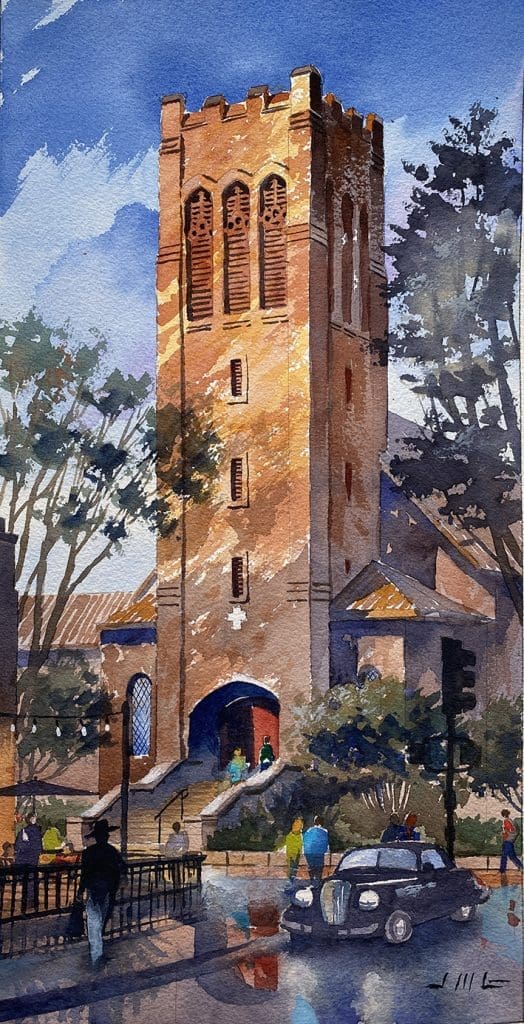


Color Renderings of New Housing Community for Palmdale, California
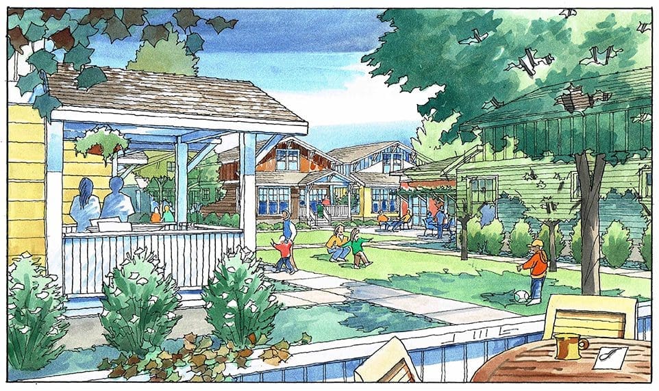 Earlier this year, I had the opportunity to work with a very good client on their project planned for the community of Palmdale, California. The client is Van Meter Williams Pollack, an architectural and urban planning firm located in San Francisco. I worked with John Doyle at VMWP, a very talented architect, in developing these three perspective views. Each of the views had a specific purpose–one to show the generous park space proposed, one to show how the project looks from across the street, and a third view to capture the character and scale of the cluster homes portion of the master plan. John has a good hand at drawing also, so I feel fortunate to be asked to create these illustrations. Luckily for me, my clients are usually so busy designing and creating architecture, they often don’t have the time to do their own renderings. It’s a relationship that has been developed over many years–and I know there is a level of comfort when we work together, even on a tight schedule. I can count on them to deliver the information I need, and they can count on receiving the finished illustrations in time to incorporate into their presentation. Although these illustrations are watercolors, I also work in a color pencil technique, depending on which “look” is best for each project. Watercolor is good for capturing mood and can be more evocative….color pencil can be best for representing materials, textures, and colors perhaps more accurately. When I get a chance to review a project at the outset, the project itself usually suggests one technique or the other. So, please enjoy looking at these renderings of this recent housing community proposal for Palmdale….These illustrations are hand-drawn and colored in the watercolor technique by Jeffrey Michael George, Architectural Illustration. Jeffrey creates many architectural illustrations for projects located in California and across the U.S., including the San Francisco area, San Mateo, Palo Alto, Menlo Park, W
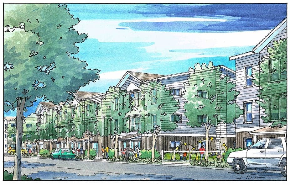 oodside, Portola Valley, Atherton, & Los Altos Hills.

Recent Comments