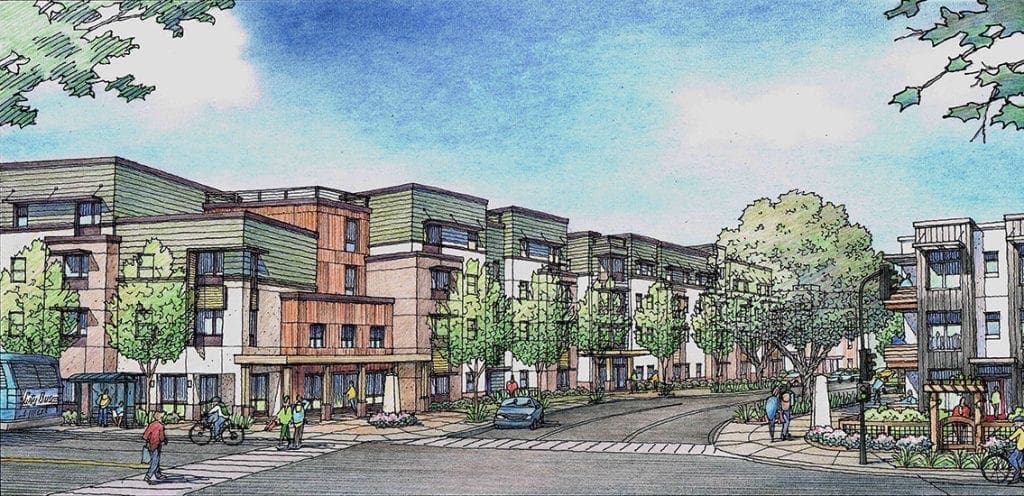
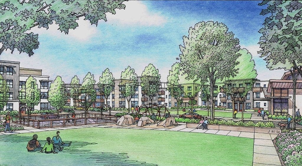
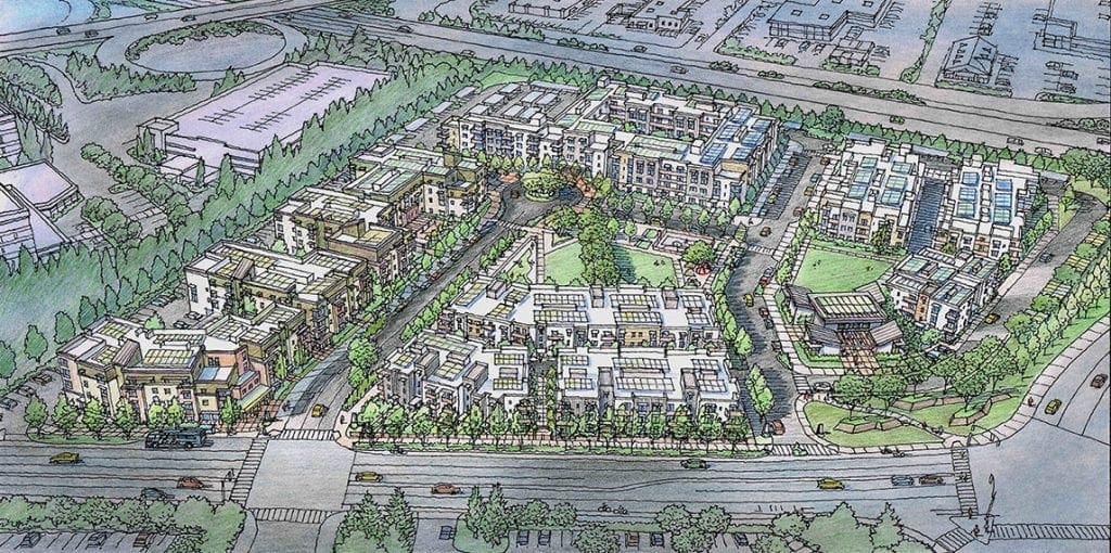
Four Watercolor Illustrations for El Paseo de Saratoga Project
Here are four watercolor illustrations I did late 2020 for an aging retail center called El Paseo de Saratoga. Bounded by Quito Road, Saratoga Avenue, W. Campbell Avenue, & Prospect Road, this shopping center would experience a major revitalization with these plans.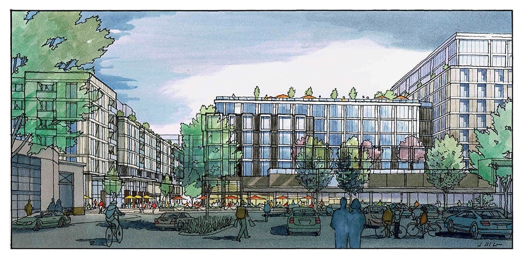 The Architect for the retail element of this project is Kenneth Rodrigues + Partners of Mountain View, California. and he partnered with KTGY Architects of Oakland, California for the design of the office and residential floors above the retail. The perspective views we chose showed the overall project from some key locations–attempting to describe the architectural character that KTGY had in mind for the project. The first view shown here looks at the project from the existing parking area. The idea is to create a living community with full services right there, making day to day life more convenient and less dependent on transportation. Much of the space above the retail is offices, so within this development, you would have a school, restaurants and shops, offices, and residences. We showed not only general massing of the floors above the retail, but even more detail than the previous round of illustrations showed, since more design work had been done at this point. The second view shown here is closer in to the retail corridor, with the Whittle School and bridge shown beyond. As an artist I have tried to use lighting techniques to emphasize the parts of the rendering that I want the viewer to see. These are still preliminary designs, and it’s important to keep the “preliminary feel” in the illustrations. My approach is to show just enough detail that one can understand the scale and character of the building’s design, without going into extraneous detail, which serves only to distract the viewer with issues that can be decided later in the process, when the big picture has been established.
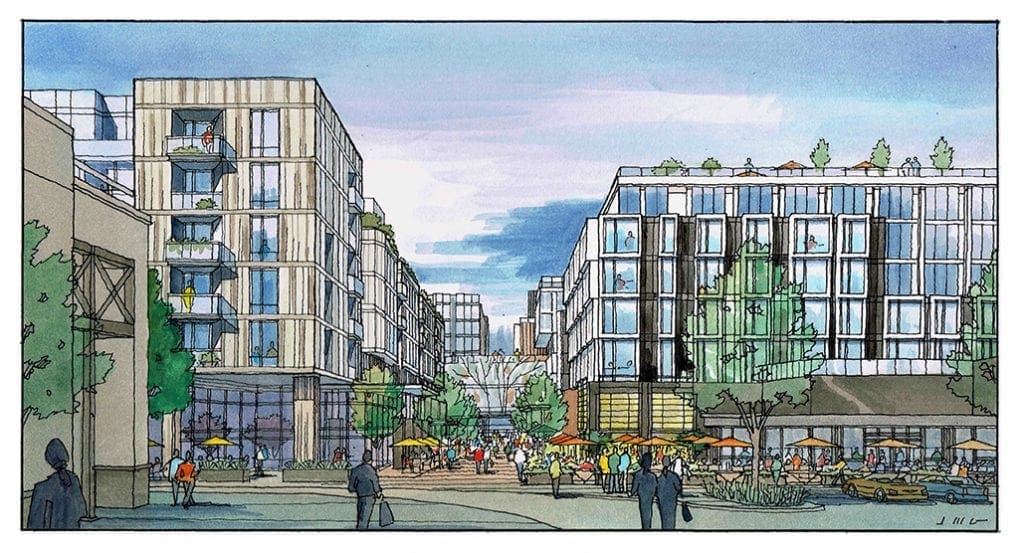
Continuing Watercolor Painting of Frank Lloyd Wright’s “Falling Water”
Since I am currently working on a watercolor painting of this Frank Lloyd Wright house, I am continuing to share the progression toward the finished artwork.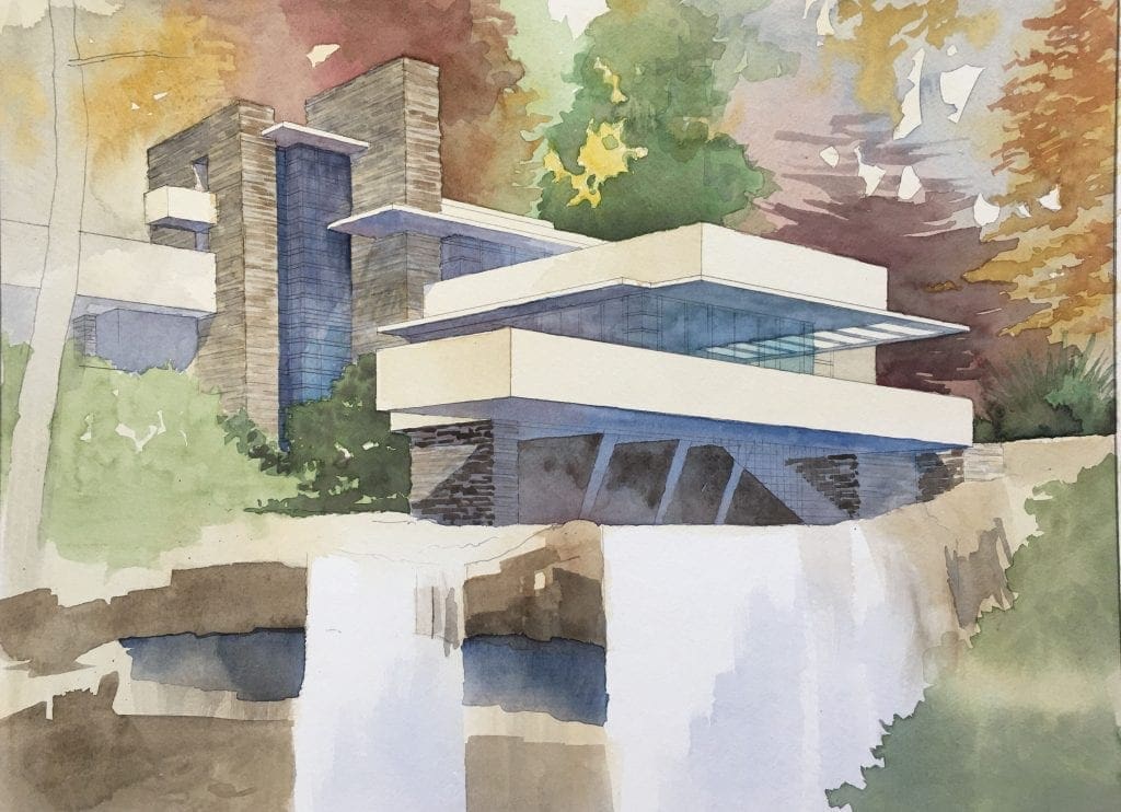 Included here are two more images of the rendering in progress, showing snapshots at various points in the process. I am now getting into the medium tones or mid-tones, basically going from light washes I showed earlier, to somewhat darker (medium range) colors–both warm and cool. None of the colors I am using are pure strong colors, but are blends of greens, reds, yellows. To the greens I am adding brown and gold. To the yellows, I am adding browns and reds, To the blues I am adding a little red. The only pure white areas left are in the waterfall itself–and that is intentional so that in the end, the water falling will be the star of the show. This is consistent with Wright’s convictions that nature is always the most important and most impressive source for any work of art–architecture included. He believed that a house should never sit on top of a hill, but instead sit below the hilltop, serving reverence to the greater beauty of nature at all times. For Wright, nature provided great inspiration–it was not something to be dominated or challenged with one’s work. So in keeping with that, the colors I am choosing are more naturalistic, and the subject of this painting (the house) will not shine as brightly as the natural landscape within which it rests. Nature is the star of this show. In the second image here, you can see I have given more life and detail to the waterfall, using the colors of the rocky cliff behind the water to softly illustrate the falling water in motion. The window frames are a bright red which I have started to indicate here, giving the artwork the next level of detail. Next will be the addition of darker values and colors, so stay tuned for further progress postings.
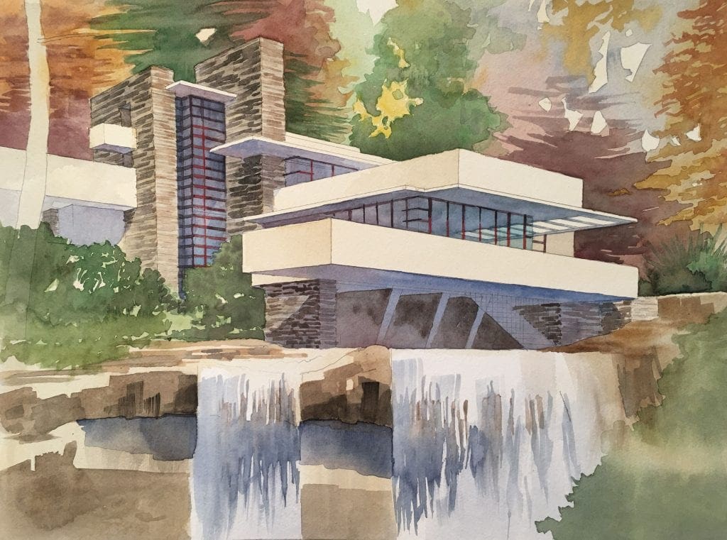
Journey’s End Project to Create Housing for Santa Rosa, California
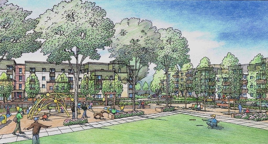 Named for the site of a mobile home park which burned in the 2017 fire in Santa Rosa, this project would provide much-needed housing for the area. Comprised of 370 market-rate apartment units and an additional 162 apartment units for low-income seniors, some displaced by the Tubbs fire, this project encompasses 13.3 acres along Mendocino Avenue. My job was to create the artwork shown here to present the project to the public and the city of Santa Rosa, California. The architect is Van Meter Williams Pollack (VMWP) of San Francisco, California and has been a good client of mine for 30 years. I work as a freelance illustrator when needed for VMWP and many other architects most of whom are located in California. Having a Bachelor’s of Science Degree in Architecture helps me greatly in my work. The ability to read architectural plans and elevations, the ability to do CAD work in 3D programs, and the artistic ability to create color images of unbuilt designs are all parts of my stock in trade. In addition to those skills, one needs to work well with others and be a good team player with other members of the design and presentation team. I feel lucky to be able to do this work for a living–and to have done it for so many years. After being an architectural draftsman, an architectural model builder, and then a drawing assistant to an architectural illustrator–all in the space of 3 years, I began my career as an architectural illustrator on my own in 1983. Much has changed over these years regarding how the work gets done, but much of it remains the same. Whether you are working with a brush or pencil in your hand–or with a mouse and keyboard, you still need an artist’s eye and the ability to work successfully with people to succeed. I hope you enjoy these images I created for the future benefit of Santa Rosa !
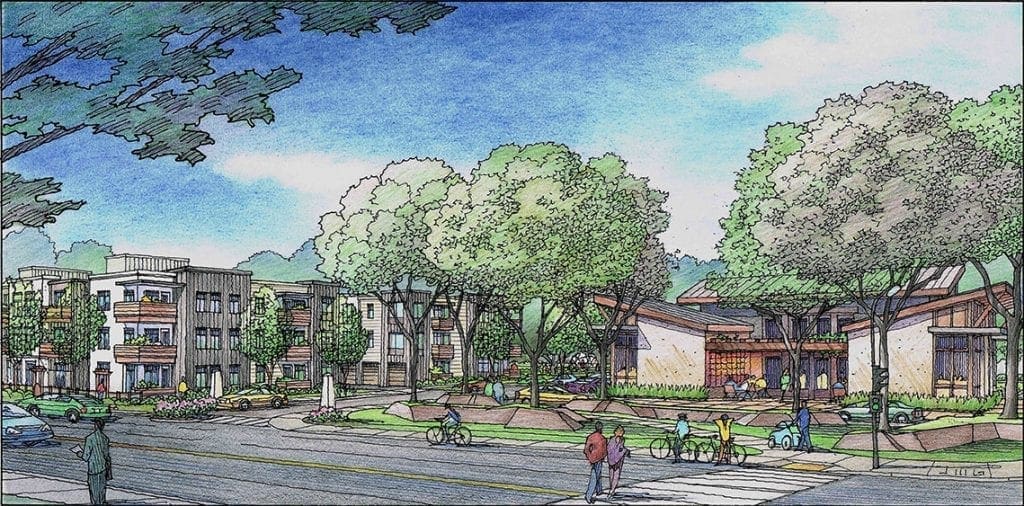
Beginning of Watercolor Painting of Frank Lloyd Wright’s Falling Water
I am starting a new watercolor painting of one of my favorite works of architecture from the 20th century–“Falling Water” by Frank Lloyd Wright. It’s a great work. It is the culmination of Wright’s architectural visions for many years before it was formally designed on paper and built. I know this from reading his book. Wright tells the story of how the client for the house was two hours away when he called and asked about how the house design was coming along. Wright told him that he should start driving now if he wants to see the ideas he had ready to present. But nothing had been started except what Wright had in his head. Wright quickly summoned the help of his interns to create the drawings based on his direction over the next two hours. Two hours later when the client arrived, this masterpiece was revealed.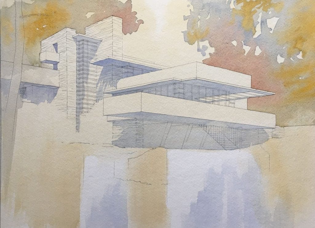 As an architectural artist I will attempt to capture the spirit of this great work. Watercolor is a sequential medium where values and colors are layered and built up over time. I would like to add “screen shots” of my progress on the painting to show how the process works along the way. So the first image is the genesis with some preliminary values filled in to begin to define the house and environs. Limited palette, sprinkling warm or cool color around in a balanced application to serve as underpainting. Most of these areas will be overpainted at a later time, but not all. The second image shows further areas of underpainting–the more white areas get painted, the greater emphasis is put on the white areas that remain. I see the flowing waterfall as the primary element that will ultimately stay white. I also want to use the same colors in the house and use them in the landscape in order to confirm Wright’s vision of organic architecture that springs from the earth naturally.
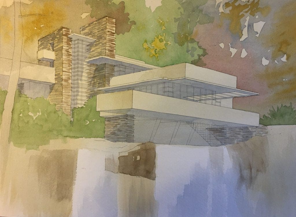
Rendering Two Design Schemes Using Photoshop
The subject today is a rendering project envisioned for Redwood City, California by the San Francisco architectural firm of Van Meter Williams Pollack LLP. Completed within a couple of weeks this past summer, we needed to show a potential housing structure in two different ways, as there were two design schemes under consideration by the architect and client. Based on a perspective view which the architect supplies, I first draw a freehand line drawing of Scheme 1.  This gets color applied, creating one complete rendering representing the Scheme 1 version of what’s being considered for the site, set within the existing site context.
 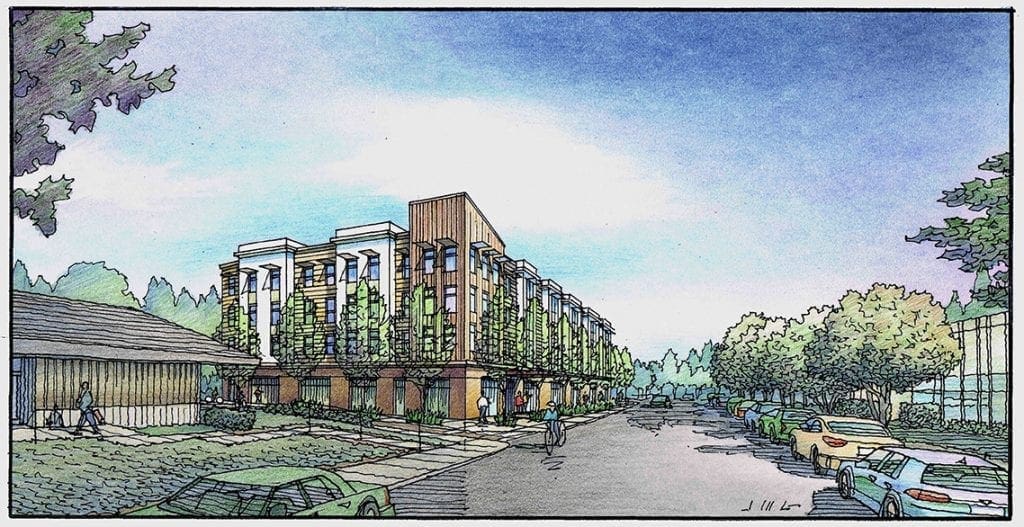 For Scheme 2 which is a larger building, I begin by drawing the Scheme 2 building in black and white, then color that building–scanning it when it’s fully colored. Using Photoshop, I paste the Scheme2 building over the Scheme 1 building in the first rendering, saving this as a new version.
 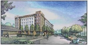 As it turns out, the client had issues with the design of Scheme 2, and a third design was developed. So I drew a new version of Scheme 2 which I titled Scheme 2 Take 2.
 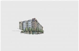 Once that building was independently colored similar to the previous, it was scanned and superimposed onto the site–over the previous buildings. Obviously you make the process more efficient by always drawing the smaller of the design scheme buildings first and making that your first rendering, upon which the subsequent renderings are based. In the end you have two complete renditions (or in this case three really) that can be shown to the audience for description, comparison, and review. Since the entourage and context surrounding the buildings is always the same, you are certain that the audience is comparing apples to apples, as we like to say. The last full image shown here is the finished rendering representing Scheme 2 Take 2 in full color.
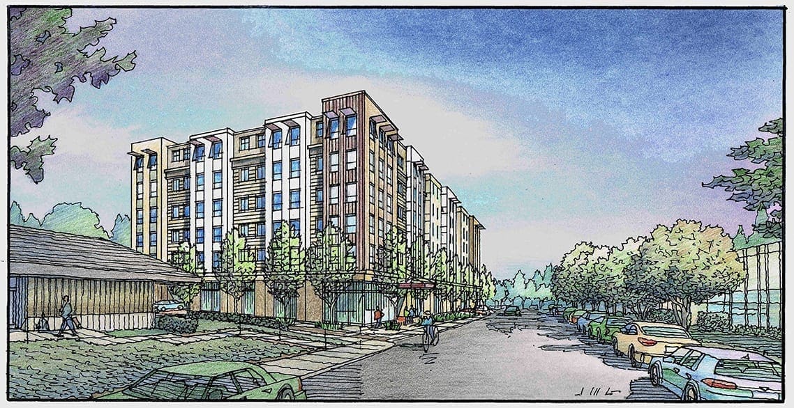
Color Pencil Rendering of Bakersfield California Homeless Center
A rendering I did last month for the community of Bakersfield, California….A facility for the homeless in the region….
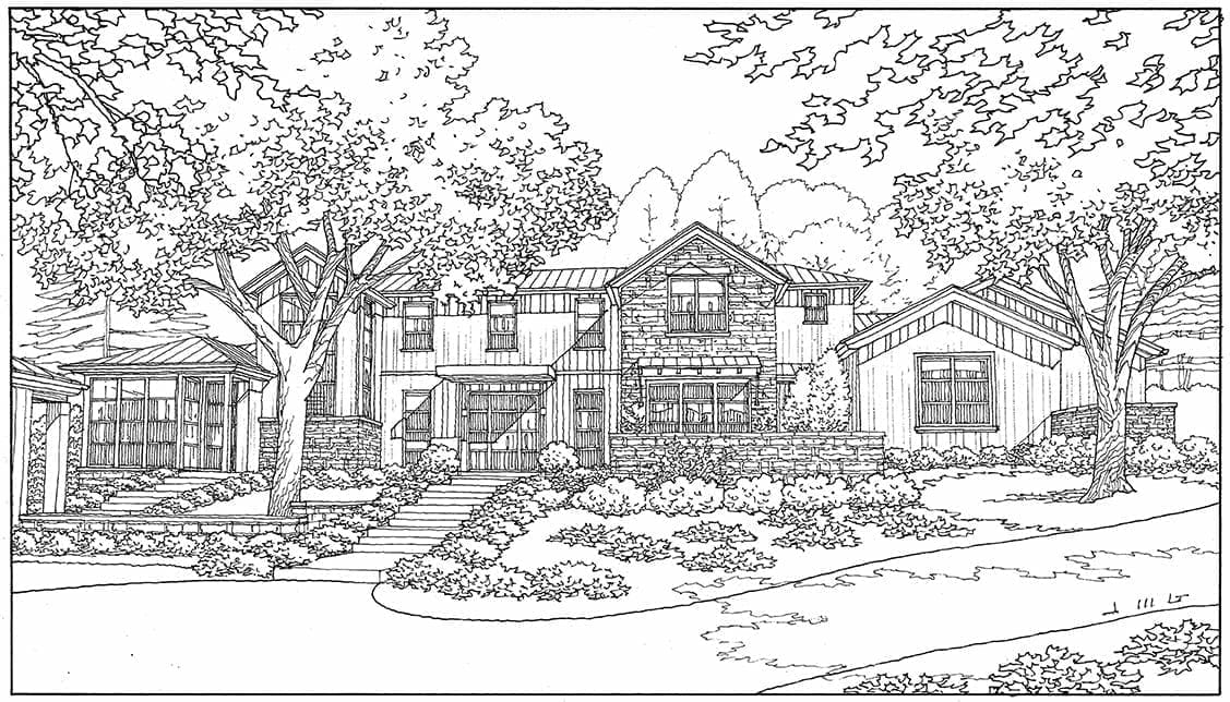
Freehand Line Drawing of Custom Home in Los Altos Hills, California
Just completed yesterday, this is a new custom home design planned for Los Altos Hills, California….Freehand felt pen on vellum, 11 x 17….Color won’t happen for a few months most likely…..
Watercolor Rendering of Daly City Project designed by San Francisco Architect
Here is a project for which I have done quite a bit of drawing over the past few years. It’s a large facility and event center for Duggan’s Serra Mortuary located in Daly City, California. They are considering a major renovation and enlargement of their existing facility, and they have commissioned Van Meter Williams Pollack of San Francisco as their architect. VMWP is a long-time client of mine for my illustration business, and as the design has developed over the recent years, I have been asked to portray the most current design in perspective to the client and the surrounding neighborhood. As an illustrator, when the architectural design changes, but all things around it remain the same, it makes sense to keep the background and context of the rendering, and simply draw a new building, and use PhotoShop to paste it into the previous image. 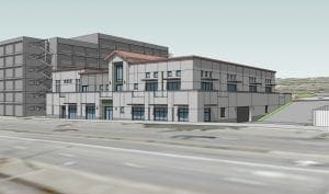 So when the architect gives me a new CAD perspective plot of the current building design, I start by adding an overlay of people, cars, and landscape in and around the building. Then a black and white tracing of the building and entourage.
 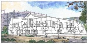 Once approved, I paste that black and white version of the building over and into the existing color rendering. I apply color to the black and white building–in this case in watercolor. Then I scan the color rendering of the building and “cut and paste” it into the old rendering.
 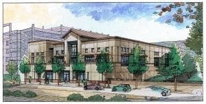 This takes some basic PhotoShop skills and some patience-but it saves us from having to recreate an entire rendering when it’s not entirely necessary, and it saves the client money over the redraw alternative. As an artist the fun part of this exercise is twofold: 1) Rendering the building through the entire color phase without the benefit of its adjoining context, and 2) Utilizing your digital skills in the blend of the two disparate images.
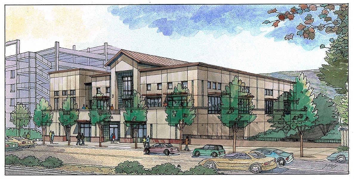
Freehand Line Drawing of Renovated Home in San Jose, CA.
My first rendering of 2020–finished in January, this line drawing of a cute house undergoing renovations in Naglee Park-an older neighborhood in downtown San Jose, California….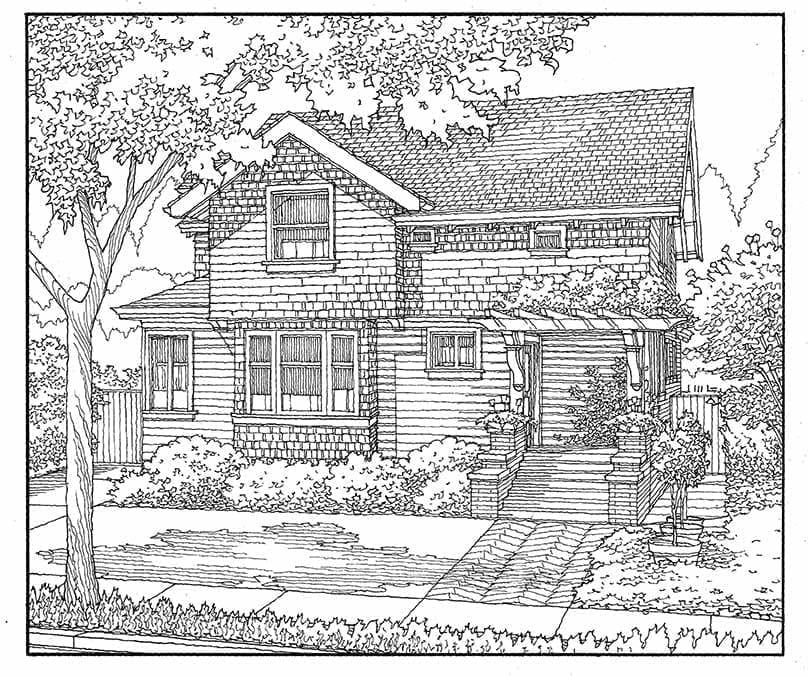
Two Conceptual Renderings for Retail Project in San Jose and Saratoga
Here is a proposal for renovating an older existing shopping center located in San Jose, California. Named El Paseo de Saratoga, it stands at a major crossroads in the South Bay, straddling the boundaries of San Jose and Saratoga. Bounded by Quito Road, Saratoga Avenue, W. Campbell Avenue, & Prospect Road, this aging retail center would experience a major revitalization with these plans. The Architect for the retail element of this project is Kenneth Rodrigues + Partners of Mountain View, California. I worked with Ken closely in the conceptual stage of the design in February 2020 to produce these first two color renderings. The perspective views we chose basically showed the main retail corridor-a walking street-from both ends. 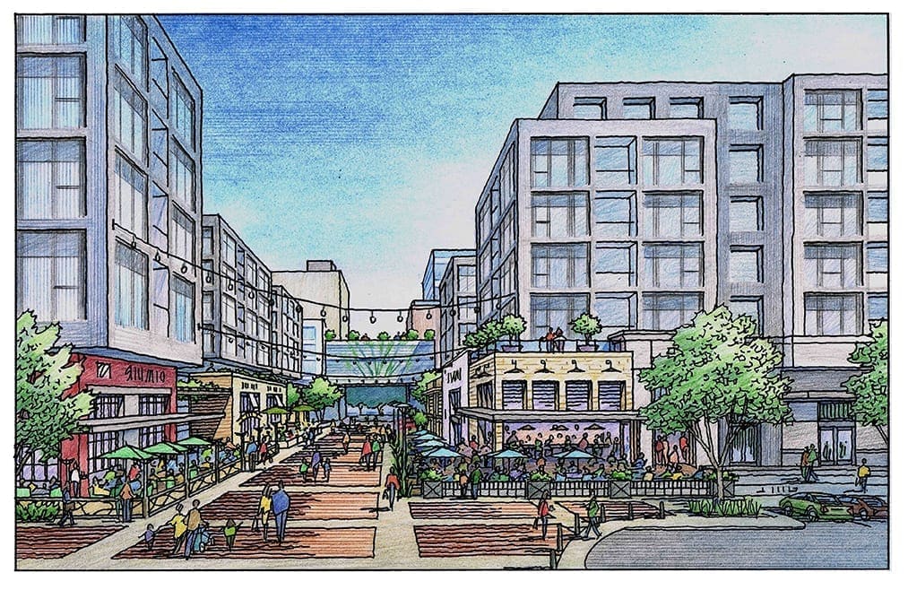 The first view shown here looks through the retail corridor which has an overhead bridge about midway which separates the commercial and retail from the institutional element beyond in the view-the west coast Whittle School, which is a private K-10 educational facility with an established campus on the east coast in Washington, DC. The idea is to create a living community with full services right there, making day to day life more convenient and less dependent on transportation. Much of the space above the retail is offices, so within this development, you would have a school, restaurants and shops, offices, and residences. Ken and I chose to show lots of variation and interest in the retail storefronts with different heights, textures, and colors-and lots of outdoor dining, lighting, and landscape. The architecture of the offices above, on the other hand, was a mere suggestion at this point. This approach works because although accurate in scale and number of stories, the exterior design was not fully worked out yet by the associated architect for that portion of the project.
 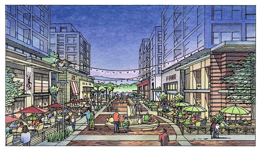 The second view shown here is the companion rendering, which shows the project from the other direction, with the Whittle School and bridge just behind us and not visible. The artistic license was taken even further here by showing the project at twilight, when there would be an even greater emphasis on the lively restaurant and retail atmosphere, and less on the offices above. Interesting how the upper stories seem to almost dissolve into the twilight sky-that’s the fun part of being an artist !

Recent Comments