Since I am currently working on a watercolor painting of this Frank Lloyd Wright house, I am continuing to share the progression toward the finished artwork.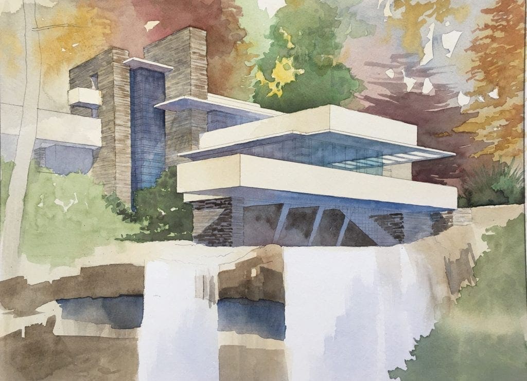 Included here are two more images of the rendering in progress, showing snapshots at various points in the process. I am now getting into the medium tones or mid-tones, basically going from light washes I showed earlier, to somewhat darker (medium range) colors–both warm and cool. None of the colors I am using are pure strong colors, but are blends of greens, reds, yellows. To the greens I am adding brown and gold. To the yellows, I am adding browns and reds, To the blues I am adding a little red. The only pure white areas left are in the waterfall itself–and that is intentional so that in the end, the water falling will be the star of the show. This is consistent with Wright’s convictions that nature is always the most important and most impressive source for any work of art–architecture included. He believed that a house should never sit on top of a hill, but instead sit below the hilltop, serving reverence to the greater beauty of nature at all times. For Wright, nature provided great inspiration–it was not something to be dominated or challenged with one’s work. So in keeping with that, the colors I am choosing are more naturalistic, and the subject of this painting (the house) will not shine as brightly as the natural landscape within which it rests. Nature is the star of this show. In the second image here, you can see I have given more life and detail to the waterfall, using the colors of the rocky cliff behind the water to softly illustrate the falling water in motion. The window frames are a bright red which I have started to indicate here, giving the artwork the next level of detail. Next will be the addition of darker values and colors, so stay tuned for further progress postings.
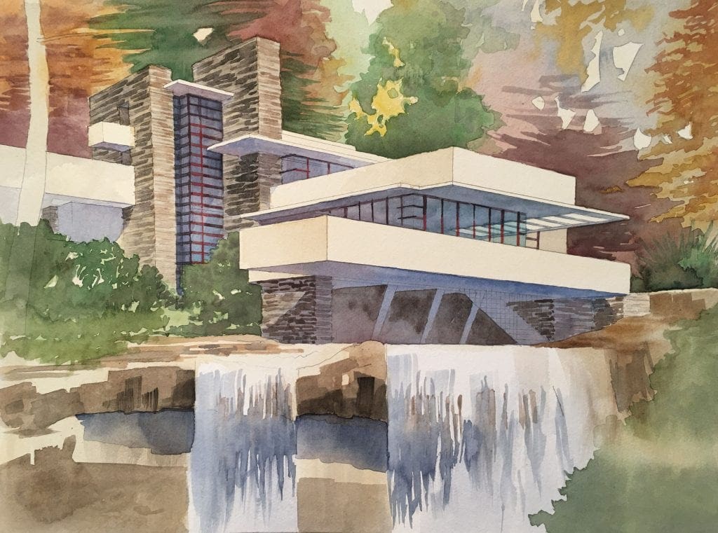
Recent Comments