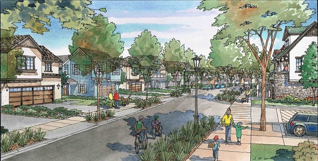
Architectural Renderings for San Francisco Projects
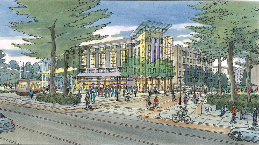 Today I am featuring many of the architectural illustrations I have done with the architectural firm of Van Meter Williams Pollack of San Francisco, California. And in particular, I am featuring the projects they have designed for San Francisco and the immediate environs. I think I started doing renderings for VMWP in 1992 or 1993, so it’s been a longstanding relationship. I work freelance as an illustrator, and this artwork shown here is all commissioned on a freelance basis, when they have need for my services. Most of the projects are multi-family residential in nature, sometimes purely market-driven, many times with an affordable housing component. When VMWP presents one of their current design projects to the public, either for disclosure, or for public input and comment, they usually include my artwork as a tool for describing their ideas. Shown alongside the plans and elevations, the perspective renderings I create tend to bring the design to life for the audience. Because the drawings show people, cars, streetlights, and landscaping, the public viewers are more engaged with these images. In a way, the renderings are easier to understand, and easier to relate to, than the more technical drawings that the architect displays. And although these perspective renderings can be produced digitally–what we now term computer-generated 3D imaging–the effectiveness of purely computer-generated images is often inferior. It depends on the project, but I think most architects would agree with that statement. I think that for presenting many architectural projects to the public, an architect can get by without hand-drawn perspectives, but if you really want to wow the viewers and get them on your side, there is no greater tool for presentation than artwork that is created by hand. It lends a human element to all the hard edges and lines that are the stock and trade of the plans and elevations. So, here are many of the watercolors, or color pencil drawings, I have done for VMWP for their projects either in San Francisco or nearby.
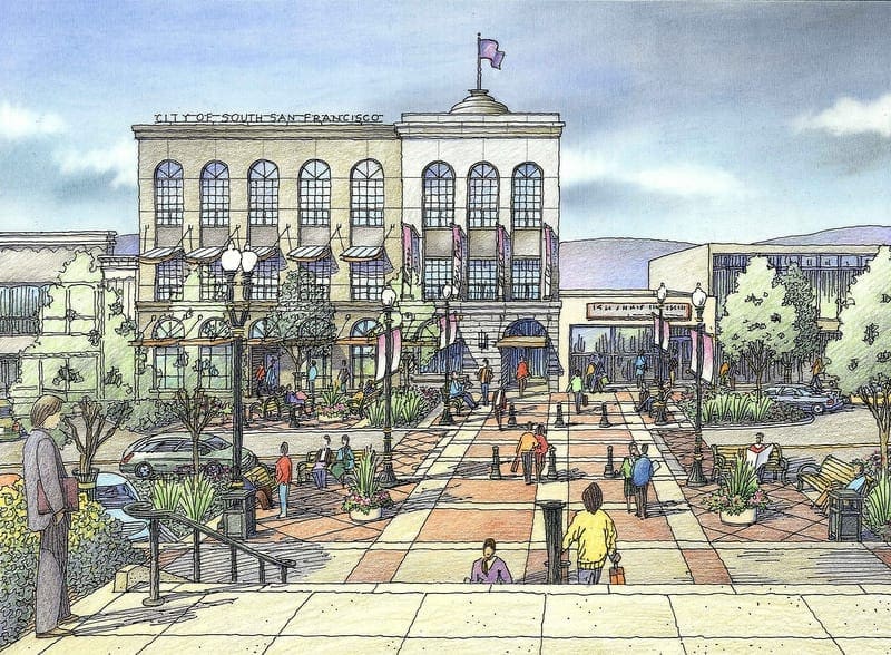
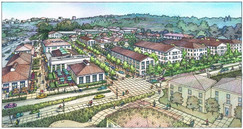
Illustration of Master Planning for Mountain View, California
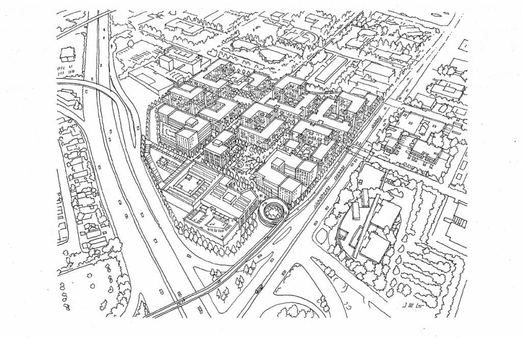
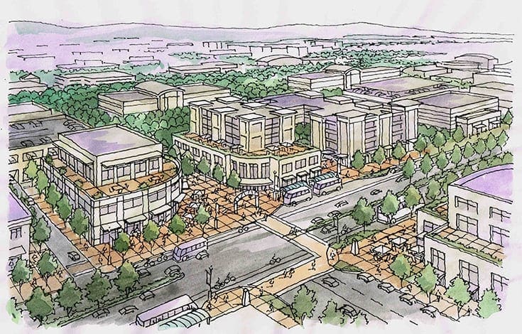 I am currently working on a master planning project for the city of Mountain View, California. My job will be to create an aerial perspective in color that will show the architect’s concept for a large, multi-block area for this community which is located in the Silicon Valley, about 45 miles south of San Francisco on the Peninsula. My client is Raimi + Associates, an architectural firm located in Berkeley, and they, in turn, are working with the City of Mountain View to envision the future development of this downtown area. Plans include a hotel, public square, several office buildings, a fitness center, movie theater, and a large amount of multi-story residential buildings. Over the years, Jeffrey has done many illustrations like this one, showing what future development will look like when it’s ultimately constructed. The illustrations, which are either watercolor or color pencil, are used to inform the public in a manner that is easily understood. The renderings Jeffrey does serve the purpose of engaging the public in a dialogue with the presenters regarding the project. There is often debate and lively discussion at these meetings, but nevertheless their role is a matter of disclosure and transparency regarding the planning ideas that are currently being considered for the city’s future. In the beginning of Jeffrey’s work, he is given a CAD perspective with minimal detail, but correct in scale. This serves as an underlay for a more detailed layout which Jeffrey generates, showing windows, trees, people, cars, buses, streetlights, crosswalks, etc.–all the elements that lend a sense of reality to the project (example included here). Then Jeffrey traces this layout on vellum, with freehand linework, in black and white, and sends to the architect for approval. With their approval, Jeffrey then adds color to the drawing, creating the finished artwork that will be used for presentation. Since this project is in process, I have included a color image of a similar project, since the black and white rendering has not yet been completed in watercolor.
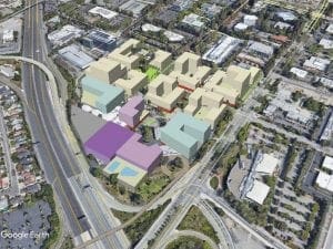
Renderings for Homeless Project in Visalia, CA
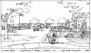
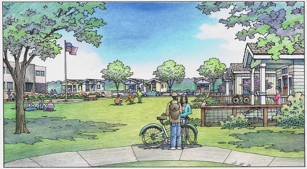
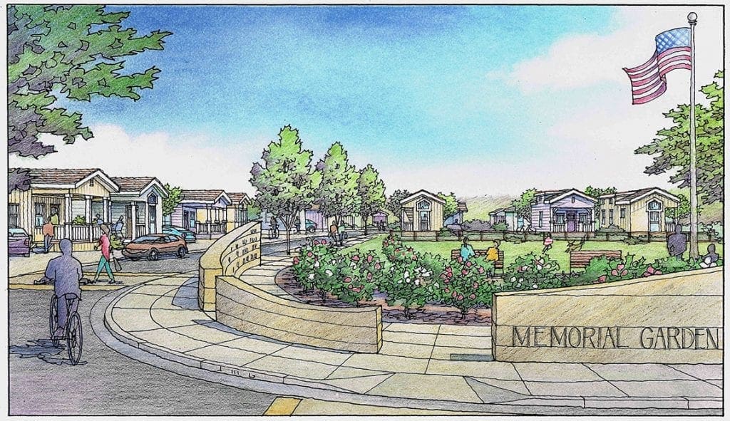
Last month I created two illustrations for a project that addressed the needs of people experiencing homelessness. The works were commissioned by an organization called Salt & Light located in Tulare County which is a beneficent group which aims to aid those in need in the area. The project itself was envisioned for a multi-acre site in Visalia, California, not too far from Highway 99 which runs through the Central Valley of the state. With a secure entrance and access roads circulating within, the living units are manufactured houses which are not mobile–but permanently situated on lots on the property. In order to generate the perspective views of the project from various points within, I built a quick Sketchup model, and identified several viewpoints that I thought were promising candidates to show what the project had to offer. I sketched five loose drawings in black and white to share with Adrianna Hillman at Salt & Light and also with my other main contact, Jose Flores of Self-Help Enterprises. I have included those sketches here. They chose two of the five candidates to actually draw as full color renderings. One of these views featured the large open area, or central park, that sits in the middle of the project, which would be accessible to the residents and their guests. The second view chosen shows the memorial garden which would commemorate the lives of those who were no longer with us. Much of the detail shown in these renderings was left up to me. I always try to visualize or channel the client’s intentions when I have an assignment like this one. The illustrations are done with a technique using color pencil over felt pen line work and are 11 x 17 inches. Within the last two years, I have done quite a few projects in the Central Valley communities of Fresno, Bakersfield, and Sanger, and Visalia.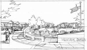
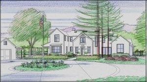
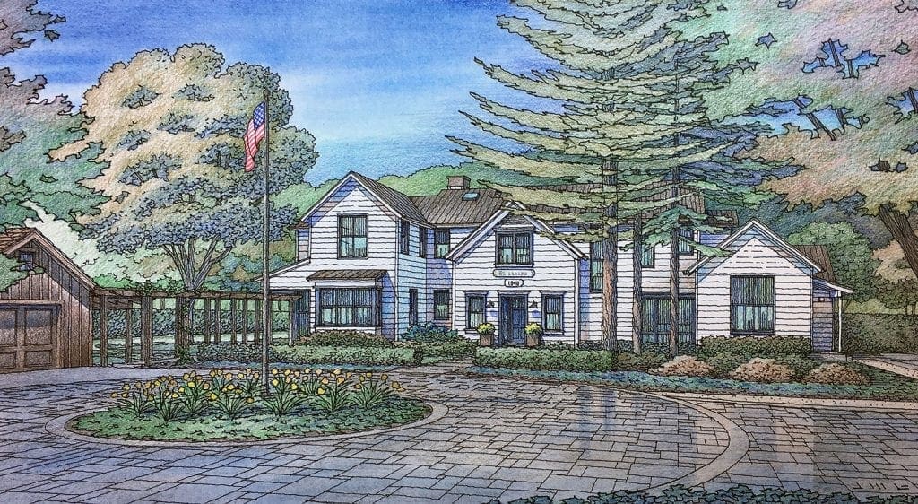
Color Rendering of New Home Designed for Woodside, California
This residence is being proposed for the community of Woodside, California. The precise location has to be confidential, but it’s going to be a wonderful addition to the area, which is known for its love of horses, ranches, and beautiful properties. Designed by Pacific Peninsula Architecture of Menlo Park, California, the residence has a classic farmhouse vibe–almost historic or preservation-oriented in its attitude. It is of course new construction but the design reaches out to traditional structures built years ago in the area, bridging the gap between the existing and the newly-constructed. Mainly composed of siding and trim, all is painted white, with window trim and doors of a rich dark blue-gray as minimal accent to the white. The detached garage is a departure from that scheme–but again reaching out to traditional building in the area with its weathered, natural wood–as if it is a barn which has been there for years. Landscaping plans are being developed by Thomas Klope, with layered planting, interlocking pavers, and maintaining many large existing trees on the site. The redwoods in front of the house in this view are all existing and will remain. As an architectural illustrator, I have been working with Pacific Peninsula for about 25 years. Their designs are always thoughtful and responsive to the clients wishes, when required, as not all of PPA’s projects involve a specific client. A certain amount of their residential work is speculative, meaning that it is built to be sold in the open market, without a specific client in mind. To an architect, those are two very different mindsets-but PPA is adept at both approaches and that’s one of many reasons they have been so successful over the years. As for me, I am hoping we continue this good relationship, and I look forward to many more projects together in the years to come !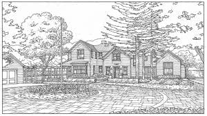
Two Watercolor Renderings of Large San Jose Mixed Use Project
 These two architectural renderings are the last two of a series of eight illustrations for this project. It’s a large mixed use project envisioned for the City of San Jose (Cambrian area). Cambrian Park Village designed by Ken Rodrigues + Partners of Mountain View, California and KTGY Architects of California, is located at a major intersection of Camden Avenue and Union Avenue, which is currently the site of an older shopping center. The overall project includes a six-story apartment building, a five-story Hotel, a five-story Assisted Living Facility, two-story condominiums, and some single-family houses. Although I have done many renderings for all of these elements, today I am featuring the single family homes. Mostly two-story with some three-story residences, these homes comprise a residential neighborhood of tree-lined streets. There’s a neighborhood park and a tot lot, walkable sidewalks, and some traffic-calming features within the design. The idea is that you could walk to work within this overall development since there are so many varied types of buildings and functions within the same neighborhood–each located next to one another. For example in one of these views we see the edge of the park as it gives way to the houses. But that same park, if you take a different path or direction would lead to the apartment building, hotel, or assisted living facility. So, possibly there is no need for a commute to work. Or maybe the park is a lunchtime retreat for parents bringing up children and health care workers alike. This is the kind of social interactivity that urban designers have strived to achieve for years with their designs. And these designers rely on renderings such as these to express their ideas and communicate the concepts to the public. An architect can show plans and elevations while presenting in a public forum, but the audience lights up when they see hand-drawn renderings that capture the spirit of the design.
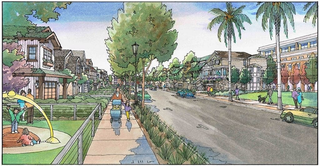
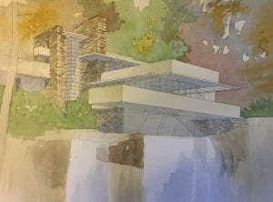
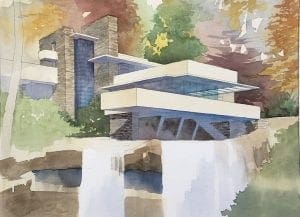
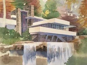
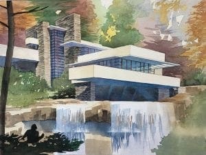
Finished Watercolor of Falling Water by Jeffrey Michael George
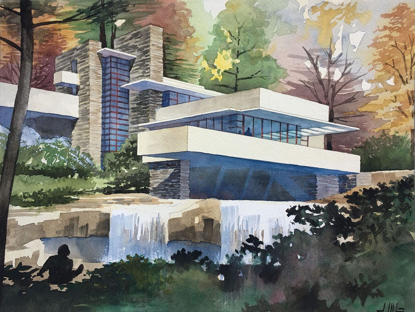 Here is my finished watercolor painting, along with the progress shots along the way, of Frank Lloyd Wright’s Falling Water” residence….Since my architectural illustration practice usually involves deadlines and time crunches, it’s nice to paint something that doesn’t need to be done at any particular time….and I enjoy the subject matter immensely….Actually this painting is the second in a series of watercolor paintings I have planned that feature the great works of architecture of the 20th Century….I enjoy exploring a new medium, and playing around with the possibilities….as with anything, the more you do it, the more comfortable it is, and the more comfortable you get with trying new methods–basically having more fun with it….There’s a greater sense of freedom because this is not a commissioned work–I’m just doing it for my own amusement….As an artist, the goals are to use a full range of values, to use complementary colors, and when the work is finished, it should have a focus–a place for the eye to go comfortably and effortlessly. Since this painting features a Frank Lloyd Wright design, I wanted to tie the architecture to the natural setting quite closely, by using the same color palette as much as possible in both architecture and landscape. Wright was a proponent of “organic architecture” as he called it–the idea being that buildings spring into the imagination by the greatest teacher–Nature itself….and you are honoring Nature by paying great attention to it and not copying it, but instead learning its principles, appreciating it, and then expressing your own unique designs which are inspired by it….One way I tried to convey that in this painting was to treat the horizontal elements of the building similarly to the horizontal ledges of the waterfall below the house, as if the house has been formed into the same shape as the stone of the waterfall–by nature….
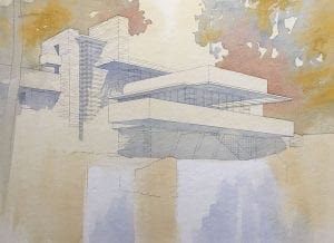
Architectural Rendering of Church Property
 This color rendering I recently completed for an existing church in Southern California is another example of how to illustrate proposed changes to a property. My client for this project is Shelter Architects of Pasadena, California. They did the architectural design for the property, which involves renovating older buildings on the site, and building some new buildings in order to upgrade and modernize the facility. The church occupies most of a city block in an urban area of Los Angeles, so an overall view from above the site seemed to be the best angle to describe the architect’s design. But what’s interesting about the rendering itself is that we decided to color only the church property–and leave the surrounding neighborhood context uncolored. Obviously, the church property becomes a focus for the viewer, due to the color. As always there is a black and white original drawn of the rendering prior to applying the color, which I have included here. Normally I would intentionally tone down the coloring of the surrounding area in the rendering, and accentuate the church property with clearer, brighter colors to distinguish it from the background. But in this instance we achieved the same effect by coloring only the subject of the drawing, and leaving the surroundings in black and white. There is economy of time and effort with this method, too. Once the black and white drawing is finished and approved by the client, that’s all that’s necessary for a good portion of the rendering. I have also included a copy of the CAD perspective which the architect provided in the beginning. Could they have simply used this CAD drawing to show their ideas to the church audience ? Of course, but that brings up the question of how well a technical drawing engages the audience–and the answer is, not very well. Something hand-drawn with people, trees, and landscape always engages the audience to a much greater extent than a purely technical, digital image.

Quick Color Sketches in Architectural Presentation
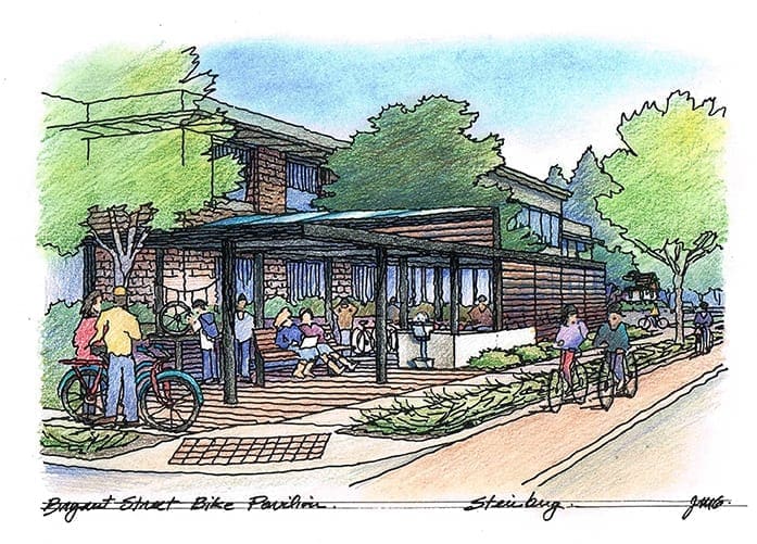
 Usually I am asked to provide detailed, refined architectural renderings for my clients. But occasionally I am asked to provide mere sketches as the finished product. I’m going to include some examples of these quicker, looser illustrations today in this blog. When a client calls me and has a project in mind, but no design drawings, I often go this route. The process is kind of like “storyboarding” in the movies. Based on a verbal description, or maybe a photograph or two provided by the client, I start sketching what comes to mind that will help put into pictures what the client has in their mind. It’s fun for me as an artist, and clients really love these sketches. I often describe it as “making something from nothing”. It’s a lot like the “napkin sketch” that one makes in a bar while meeting with someone, and enjoying a beer, and realizing that a quick doodle on the napkin is going to be better than mere words. But of course, my sketches are based on what my client envisions–and what they convey to me in a conversation. And we don’t have to be sitting in a bar, although that sounds kind of good actually. More likely we talk by phone or trade emails, but basically I take their verbal descriptions and create quick sketches in felt pen, occasionally throwing a little color over them to make them a little prettier. Could one do this kind of thing on the computer ? Probably….but I’m still more comfortable with a felt pen and a piece of paper (or a napkin) than I am with a keyboard or a mouse (even though I am using my computer to create this blog episode. I say “an artist is an artist” whether they use the computer or a set of brushes. So, enjoy these few samples I have here, and give me a call if you need something for which “a picture is worth a thousand words”. You can have a beer and tell me about it, and I’ll start sketching in my napkin….
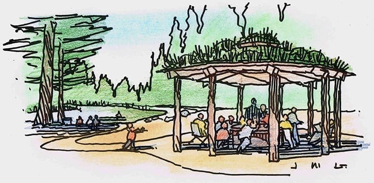
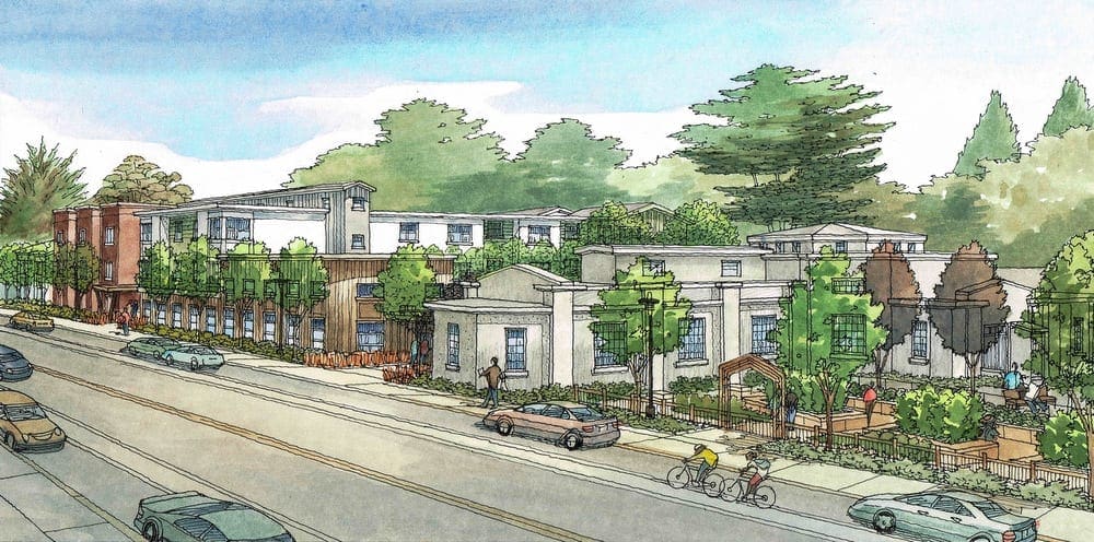
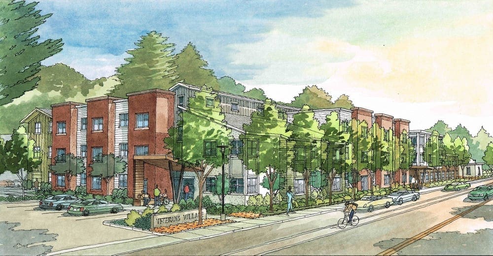
Watercolor Renderings of Veterans Village in San Francisco
These illustrations work well in describing an architect’s ideas to the public. I’ve been told many times that hand-drawn artwork is more successful engaging the public than purely digital representations. There is more of a human element to the hand-drawn artwork than can be achieved with digital 3D modelling and rendering. Today I am featuring four color illustrations I did in 2016, before the project was built.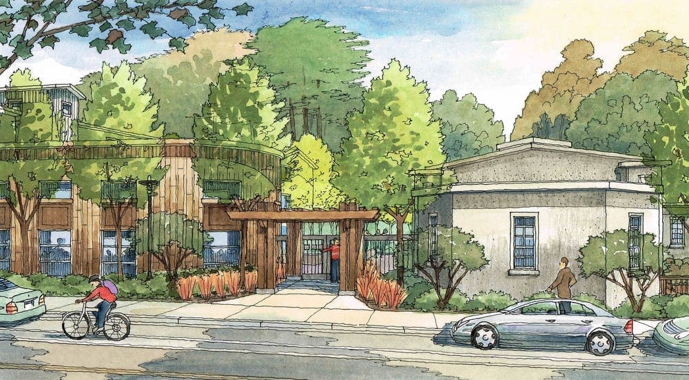 Opened in August of 2019, this is Veterans Village located along Mission Road in Colma, California, which is just south of San Francisco. It’s a veterans facility that has 65 units of housing for vets in their 30’s to 60’s, many of which are transitioning from homelessness. My client was Van Meter Williams Pollack of San Francisco, who designed the entire project back in 2016, and, in turn, their client was Mercy Housing California. The first rendering shows the main entrance to the facility on Mission Road between Cypress Lawn and Holy Cross cemeteries. The gray building on the right in this view is existing and will be renovated and reused. The fun part is showing the people in the renderings–like the shadows of the people inside the building on the left. The second view is of the courtyard looking back at the same two buildings but from the rear of the courtyard–which is what the entrance in the first rendering leads to. This courtyard view shows an enclosed area outside where vets can gather, or just enjoy some quiet time in a safe environment. The third view is what you would see along Mission Road as you approach the facility. This gives the audience an idea of what they will see from this perspective once the project is constructed. There are three buildings overall–one existing, and two new buildings. The fourth and final view shows the housing element of the new facility, which sits along Mission Road, and has parking and its own entrance on the far end, away from the main entry shown earlier.
Watercolor Renderings for CCA in Oakland
Here is a series of watercolor illustrations I did in 2016 for Van Meter Williams Pollack Architects of San Francisco, California. These images show the architect’s ideas for adding more housing to the California College of the Arts campus in Oakland. This first view is along Broadway, one or the major streets adjacent to the campus.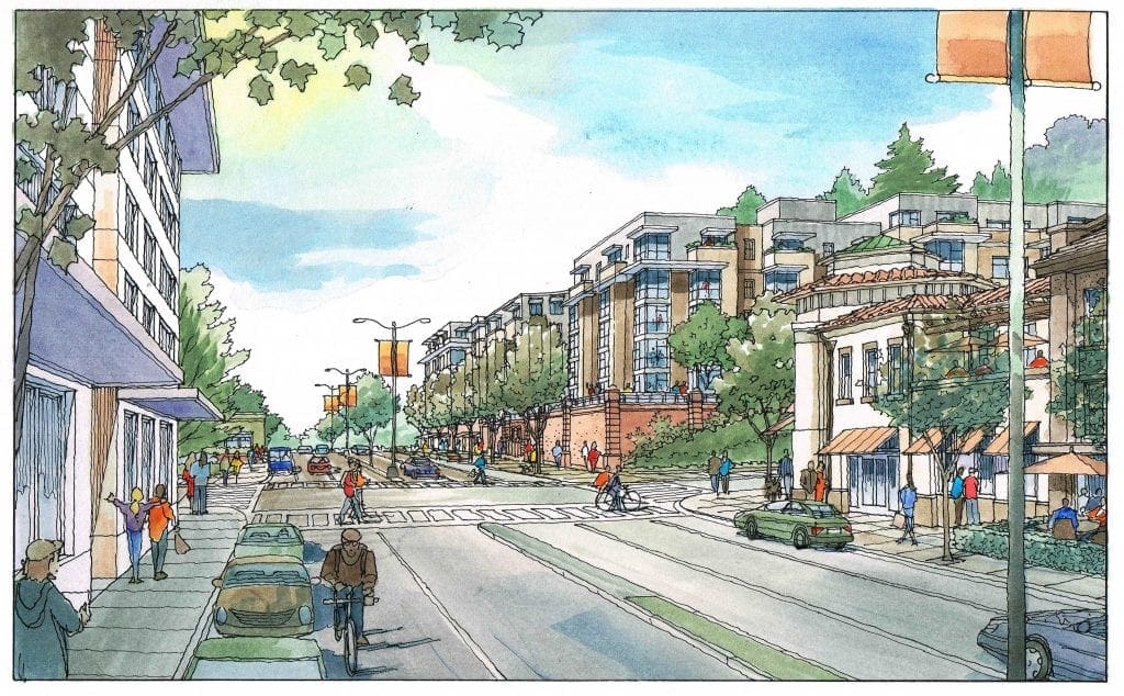 These renderings are intended to show the new buildings and additions in some detail, but mainly to communicate the overall scale and massing of the architect’s design, while including existing buildings and features that are recognizable to the audience–essentially to show a future snapshot if the project were actually built. It’s difficult for the audience to look only at an architect’s plans and elevations, and come away with a clear understanding of how the project would fit in with the neighborhood. So, these renderings serve as a valuable tool of explanation. The second view is also along Broadway, but it taken looking down the major thoroughfare in the opposite direction, from the far corner of the new housing shown in the center of the first rendering. Again there is shown existing context to explain the location, size, and massing of the new building with respect to the existing, with which most are very familiar. The third view is taken from a side street to the building, but a prominent location from which the new addition will be visible–and this rendering shows that clearly. The fourth view is taken from a balcony of one of the new housing units, looking down toward a couple of fine older houses which are a cherished part of the campus. As the artist I try to use a light touch with these illustrations. In the end, the architect (who presents the artwork in a public forum) tells me that they are quite effective. When presented with hand-drawn artwork like this, the audience is receptive, and becomes engaged in a dialogue about the project–something that often does not happen with digital imagery. Purely digital artwork fails to engage the viewer much of the time, giving the audience the mistaken impression that the project is decided already–and I don’t like what I see, particularly the details. Hand-drawn artwork lends the correct impression–that the project is a work in progress, and that we should all talk about it and come to an agreeable conclusion on it.


Recent Comments