Watercolor Sketch of Building in Gold Rush Country
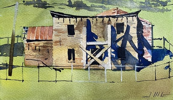 Every once in a while I like to paint a small, quick watercolor which is more like a sketch or study. In this case the subject is an old stone building under renovation sitting on a hilly grassland in the Sierra Foothills. It was something I saw across the roadway from our trailer spot just south of Angels Camp, California. Something about it intrigued me–the structure was rough, definitely old, and in disrepair to say the least. The metal roof and its supporting framing members were missing, and there was a heavy timber scaffold out front to aid in the renovation. It was an opportunity to show a stark, brutal historic structure in its bare-bones state, with its roof collapsed, and some of its stone eroded and missing–but nonetheless on its way back to better times. The window openings were black as coal, and the shadows very strong in the mid-morning sunlight. As a painting, there were basically three components–the structure, the field, and the fence….The shadows would define the spatial relationship between all three. There was an abstract nature to the setting, because the hilly grassland was homogeneous and without much definition, due to the young, vibrant growth of the early spring grasses. I painted that first, then the structure, then the fence. Tried to keep it simple and true to its initial impression when I originally spotted this house on the hill. There’s a simple flatness to the overall composition, and to each area of the painting–very minimal differentiation within the grassy field, or the stone walls, just enough to describe the material and convey some human scale to the image. The original is 5″ x 8″ on watercolor paper and took about an hour and a half start to finish. This artwork is hand-drawn and painted in the watercolor technique by Jeffrey Michael George, Architectural Illustrator. Jeffrey lives in Chico, and creates many architectural illustrations for projects located in northern California and the San Francisco bay area.
Color Renderings of Youth Center Interior
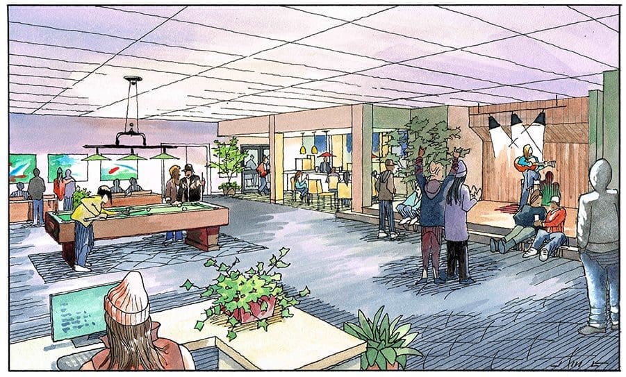
 Toward the end of last year I was commissioned to create these illustrations for a youth center in Grass Valley, California. Previously called NEO, this after-school youth organization is now Bright Futures for Youth, serving Nevada County youth. It’s an existing space on Litton Drive in Grass Valley that is going to be renovated with the improvements shown in these interior views I completed in December. Pool tables, a small stage, a cafe, and video gaming lounge. The architecture and space planning was done by Siteline Architecture of Nevada City, California, which is just a few miles from the site. I was given a Sketchup model as a starting point. With that digital model we were able to choose a couple of perspective view angles that would help highlight the improvements. My next task was to add lots of teens and a staff member or two inside the space–enjoying the various activities that are happening. The first view shows what you would see standing near the entry, looking into the space with the stage on the right, a small administration desk in the immediate foreground, pool table in the center, with cafe on the right and video game area at the back of the space. The second view is more or less the opposite–looking back with the gaming area in the immediate foreground, cafe beyond, etc. As an artist, I particularly enjoy creating the scene as the individual teens are interacting, playing video games, taking selfies, talking trash, playing 8-ball, or maybe enjoying their friend’s music. Of course, you still need to render the selected materials, surfaces, and light fixtures correctly, too. But I think what really makes these kind of illustrations successful is the human element–if you can portray the kids well, including the way they dress and wear their hair, those details go a long way toward making a successful drawing…..These illustrations are hand-drawn and painted in the watercolor technique by Jeffrey Michael George, Architectural Illustration. Jeffrey creates many architectural illustrations for projects located in the San Francisco bay area, the Sierra foothills, Sacramento, as well as his hometown of Chico, California.
Color Renderings for Revitalizing a Louisiana Healthcare Facility
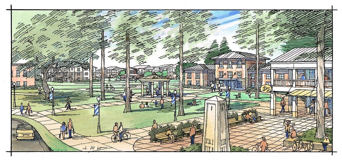
Village Center
In November 2022 I was asked to create these six color renderings involving an existing state mental health facility located in Pineville, Louisiana. The request came from a good client of mine, Rick Williams of Van Meter Williams Pollack, Architects of San Francisco, California. These illustrations show Rick’s ideas for revitalizing and supplementing what is already there on this large site. Many buildings would remain, others would be added to the mix, in order to create lots of on-site housing, but also, some retail and commercial buildings. The interior circulation system would emphasize and encourage walking and bike-riding, and there would be ample opportunities to gather in small or large groups within the public spaces of the new development. Rick’s concept is that, with these additions and renovations, a new, fresh live/work community would emerge, complete with many new housing units and a village center with the shops and services required. Many housing options would be available, from single-family (attached and detached) to townhomes to apartments. These illustrations are in the watercolor technique by Jeffrey Michael George, Architectural Illustration. Starting from a Sketchup background, landscaping and entourage are added as an overlay. Then with client approval of that, Jeffrey creates a freehand pen line drawing, combining all architectural and entourage elements and submits this for approval. Ultimately, color is added to the line drawings with watercolor washes and the finished rendered images are sent to the client for their use. One of the things that clients like about working with Jeffrey is that, with limited information and input from them, he can create images that capture their intentions. In Rick Williams words:
“The Pineville renderings show just how powerful JMG’s sketches are, in capturing the essence and character of a place, when speaking to a community vision. These sketches were able to replace thousands of words, and as the client said, “Now I’ve got it!”, “I understand what you’ve been talking about”…. I say “invaluable”! ”
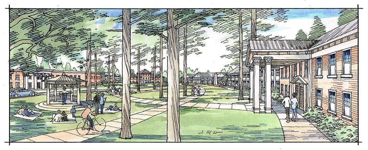
Public Paths/Gathering
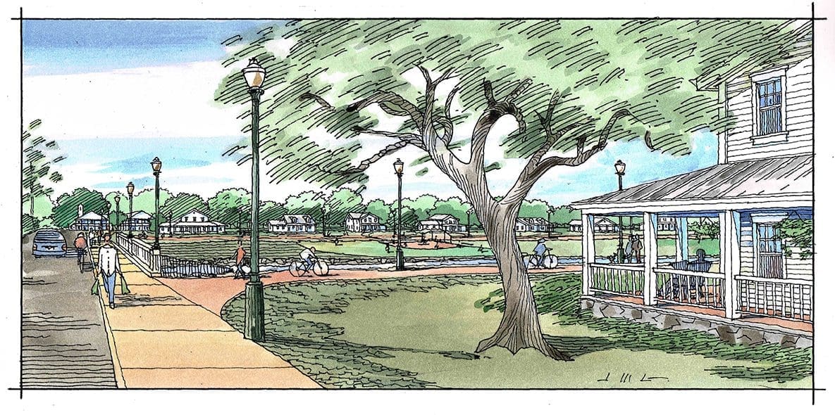
Single Family Homes with Walk/Bike Paths
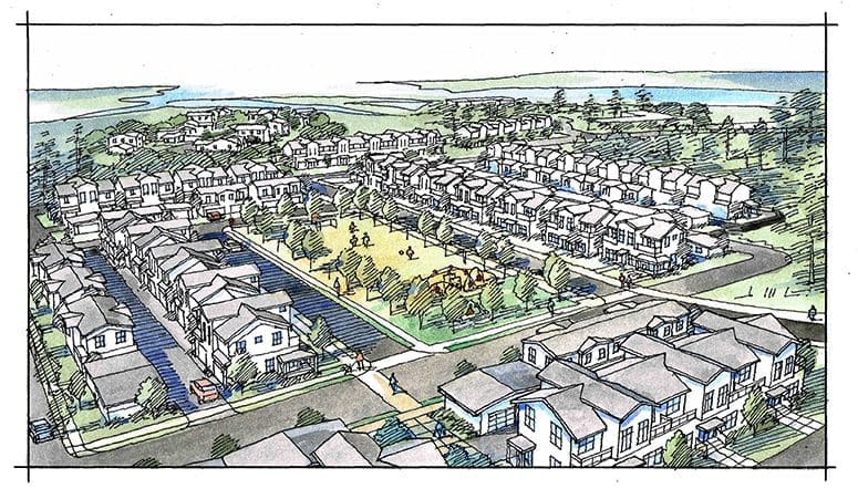
Townhomes with Neighborhood Park
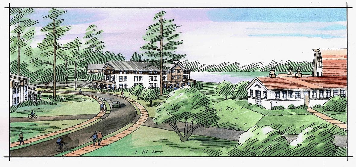
Administration Center
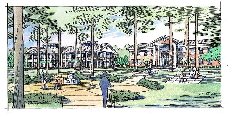
Commercial-New and Old
Jeffrey creates many architectural illustrations for projects all across the country, including Louisiana, Florida, and California.
My Watercolor Painting of Bidwell Mansion, Chico, California
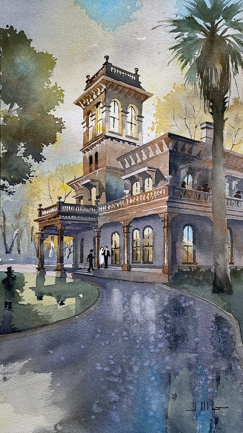 I just recently finished this watercolor painting of the Bidwell Mansion in my hometown of Chico, California….I chose to paint it in backlight–in other words with the sun behind the building, shining through the cupola at the third story….a challenge, but glad I did it….there’s a certain abstraction that happens under these lighting conditions….which allows the artist to emphasize certain elements and characteristics of the structure, while ignoring others–not something the artist can do with most commissioned renderings because the architect or builder usually wants you (the artist) to show all the details possible….But in this case, it’s strictly my painting–so I can do what I want….liberating ! More on the building from website of Bidwell Mansion State Historic Park: “Bidwell Mansion State Historic Park is a beautiful, three-story, 26 room Victorian House Museum that stands as a memorial to John and Annie Bidwell. John Bidwell was known throughout California and across the nation as an important pioneer, farmer, soldier, statesman, politician and philanthropist. Annie Ellicott Kennedy Bidwell, the daughter of a socially prominent, high ranking Washington official, was deeply religious, and committed to a number of moral and social causes. The Bidwell’s were married April 16, 1868 in Washington, D.C. with then President Andrew Johnson and future President Ulysses S. Grant among the guests. Upon arrival in Chico, the Bidwell’s used the Mansion extensively for entertainment of friends. Some of the guests that visited Bidwell Mansion were President Rutherford B. Hayes, General William T. Sherman, Susan B. Anthony, Frances Willard, Governor Stanford, John Muir, and Asa Gray. When constructed, Bidwell Mansion featured the most modern plumbing, gas lighting and water systems. The overall style of the three-story brick structure is that of an Italian Villa, an informal, warmly romantic style. The building’s exterior is finished with a pink tinted plaster.” Hmmm….Pink tinted plaster–another reason I chose to treat the building with backlighting….. This illustration is hand-drawn and painted in the watercolor technique by Jeffrey Michael George, Architectural Illustration. Jeffrey creates many architectural illustrations for projects located in the San Francisco area, including San Mateo, Palo Alto, Menlo Park, Woodside, Portola Valley, Atherton, & Los Altos Hills as well as his hometown of Chico, California.
Watercolor Painting of Dana Adobe, Nipomo, California
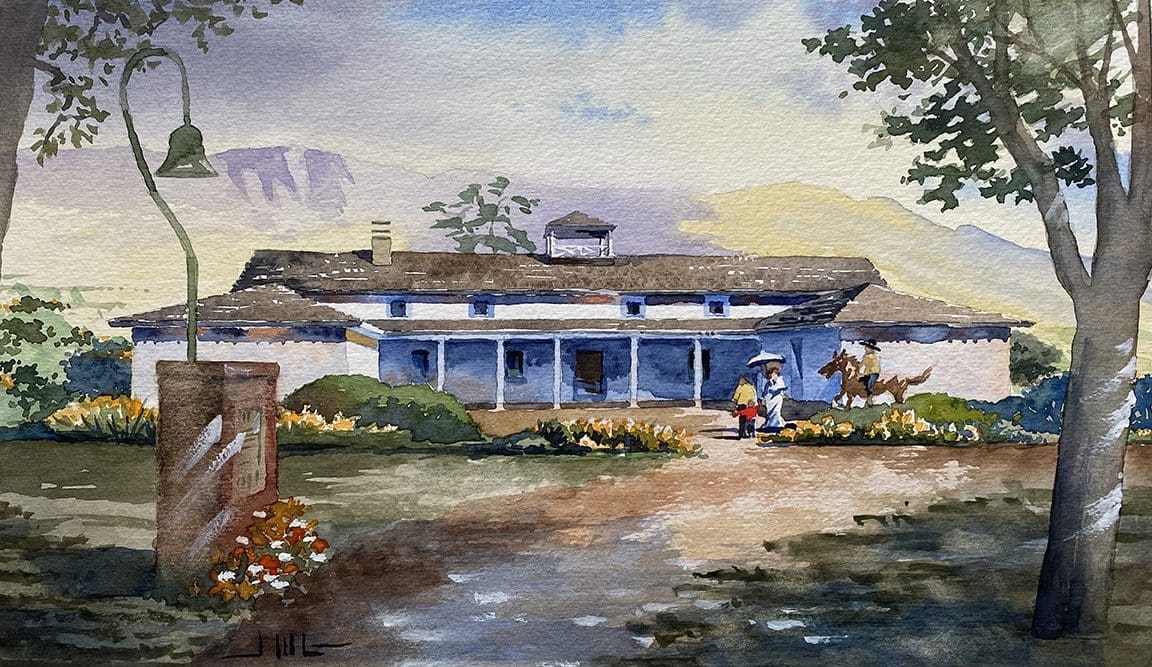 This is a watercolor painting I did recently for my sweetheart….So what better time to post it on the internet than Valentine’s Day ! It’s a historic structure in Central California which has a lot of personal significance….My wife, Susan Lynn Dana, is a direct descendent of William Goodwin Dana, who constructed this home in 1837….The following is a description borrowed from “historycenterslo.org”: “The Dana Adobe or “Casa de Dana” is a historic
landmark in Nipomo, California, lying about 25
miles south of San Luis Obispo. It was one of the
earliest adobe dwellings built in San Luis Obispo
County and became the celebrated home
of William Goodwin Dana, his wife Maria Josefa
Carrillo Dana and their very large family. William
Dana was a wealthy Boston sea captain who
settled first in Santa Barbara, where he courted
and married Maria Josefa in 1828. In 1837,
Mexican California Governor Juan Alvarado
granted Rancho Nipomo to Captain Dana, over
50,000 acres, as a reward for his loyalty. Dana
employed many native Chumash laborers and
others to build the adobe between 1837 and his
death in 1858, a tumultuous time in Alta California. The Dana
adobe and Rancho Nipomo also served as an
important exchange point on the first official U.S.
mail route between Monterey and Los Angeles.” Regarding the watercolor painting, I really enjoyed working on it….Some of the challenges were capturing the hills in the background which are soft and gorgeous in the distance, and concentrating more on the landscape than the building itself–something that I don’t usually attempt because frankly, my job is typically focused on the architecture….It’s actually liberating to shift the balance away from buildings, and focus one’s attention on the natural beauty that surrounds….I wanted to keep the background and the house itself light and bright on the value scale, then frame those elements with darker richer tones in the foreground trees, landscape, and historic El Camino Real monument….This artwork is hand-drawn and painted in the watercolor technique by Jeffrey Michael George, Architectural Illustrator. Jeffrey lives in Chico, California and creates many architectural illustrations for projects located in all parts of the great state of California including the San Francisco bay area.
Color Renderings of Florida Urban Infill Projects
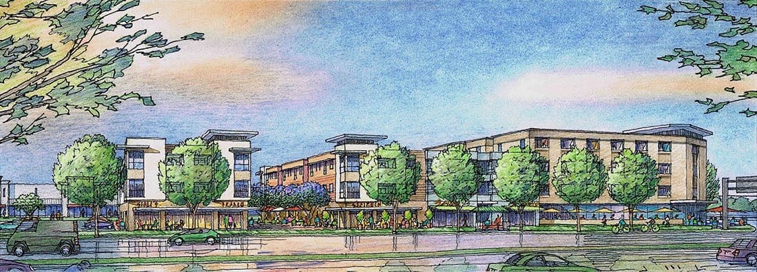
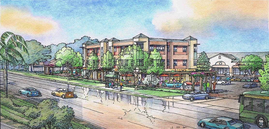 As an architectural illustrator, I work on many different types of projects….some are residential, some small, some all-encompassing….there’s a tremendous variation in the subject matter I am asked to draw….Recently I created these two illustrations shown here as finished pieces…These renderings were part of an effort to show what could be done to revitalize two existing retail centers located in Fort Myers, Florida….Both sites were situated along major traffic corridors so as time has passed, more people, more cars, more transit–this has created greater demand for retail and commercial on these corridors….I was commissioned by Johnson Engineering of Fort Myers, Florida to help imagine what these sites could look like with new structures added, something called “urban infill”….I worked with Laura DeJohn and Christine Fisher of Johnson Engineering in developing the ideas….Starting in Google Earth, they built a simple “block massing” of the proposed structures–then they handed that off to me….Working in SketchUp, I gave the building blocks more form and relief, as architects do, trying for a “Coastal Contemporary” style of architecture….Then I proposed a couple of perspective angles with which to view the new buildings in context, and shared those with Johnson Engineering….Once we agreed on the best view angles, I developed more detail by hand in the buildings, the roof shapes, the cars and people and landscaping….I traced the layouts with pen, then added color using pastel and color pencils, trying to capture the character of the beautiful Florida skies after a light tropical rain….With these renderings, if I have done my work successfully, when someone looks at them, their eye will immediately go to the subject–the new buildings–hopefully with a feeling of revitalization and excitement, lots of people grabbing their coffee, talking on their way to work, maybe running for the bus….real life stuff….These illustrations were created by Jeffrey Michael George in the color pencil technique….Jeffrey Michael George works with many California architects (and some in Florida) as a freelance illustrator, creating architectural renderings in color pencil and watercolor which bring their design ideas to life !
Watercolor Painting of Monkey Face Rock, Chico, California
I’ve been painting a series of watercolors recently of places of interest in my hometown of Chico, California…..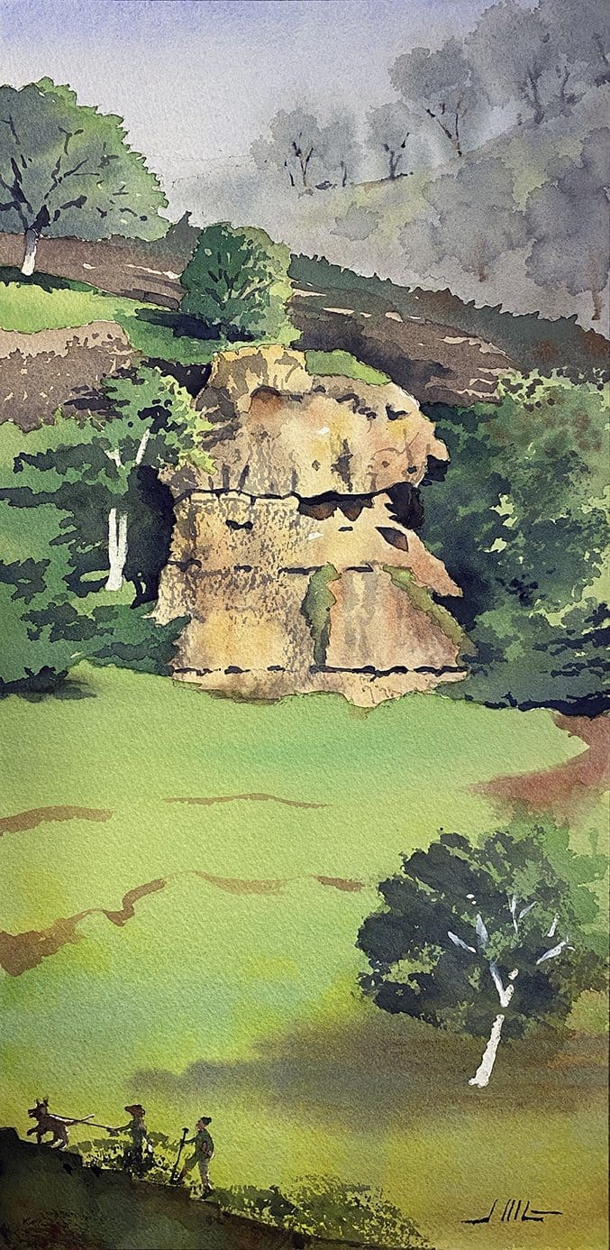 One of the latest is the painting shown here of Monkey Face Rock (named for obvious reasons) located in Upper Bidwell Park….It’s a well-known spot to the active people of Chico–a hiking destination along the North Rim Trail, reachable by most day hikers with a gradual climb of about 300 feet….from the top, you have a great view of the Central Valley, from Mount Lassen to the Sutter Buttes….As most of you know I am almost always drawing buildings–it’s my thing, but it was fun and refreshing to paint something non-architectural for a change….No straight lines, no reflecting glass, no tile roofs–just green grass, oak trees, and rock….Wow–this thing was done in no time! I’m kidding a little, but it was a bit less complicated than my usual architectural subject….The challenges were to get the effect of distance to the background hills, to get the rock to have the right shape and texture, and to set it apart from the surrounding trees and rock with the right amount of contrast….Most of the painting was done in what watercolorists call “wet in wet”, but there is some “dry brush” here and there….a limited palette–a few complementary colors used over and over, but reserving the Rock’s colors strictly for the Rock itself, so it is differentiated from everything else in the painting….Compositionally, one of the things I liked about this painting is that the lower half has very little detail or interest to it–and that’s intentional–just let the Rock shine and take center stage….This artwork is hand-drawn and painted in the watercolor technique by Jeffrey Michael George, Architectural Illustrator. Jeffrey lives in Chico, and creates many architectural illustrations for projects located in northern California and the San Francisco bay area.
Architectural Renderings of Atherton Residence Under Construction
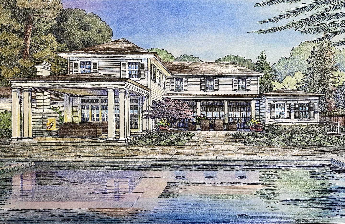
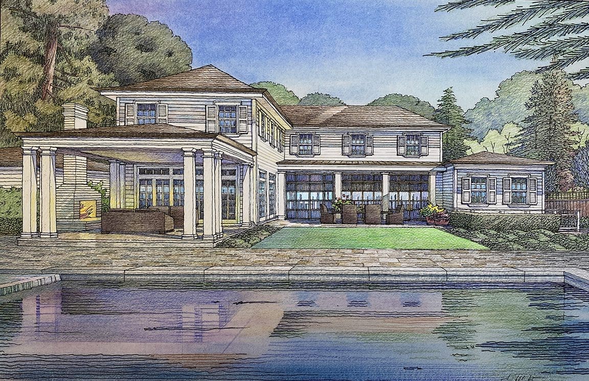
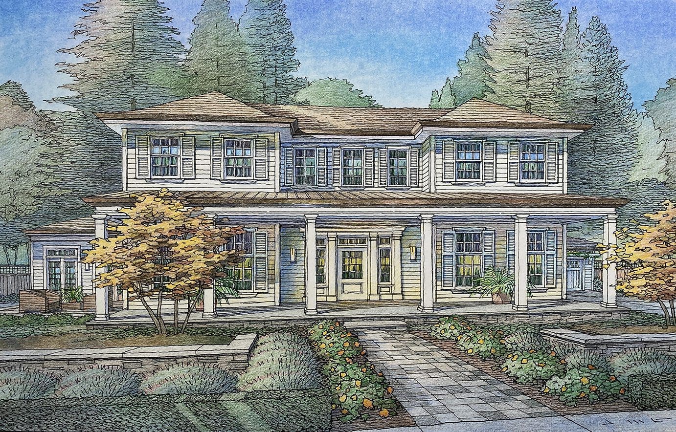 This article will feature a couple of architectural illustrations I did recently for a home under construction. I was commissioned by the real estate agent, Mary Gullixson, representing the property to show the project as it will appear when completed, which is anticipated to be in March of this year. I developed these two views–a front and rear–loosely based on construction photos of the half-completed structure. Some elements you see here in these views, such as landscaping, pool, outdoor furniture, paving stones, were totally invented by me in order to get the “finished look” the client wanted from me. Kind of fun, really….as an artist I find it more enjoyable to create these elements myself, as opposed to simply following a set of plans, calling out every detail with exactitude. Frankly, it’s more engaging for me as the artist–although sometimes this method brings challenges. It works out if the client and the artist are thinking along the same lines as to whether the landscape design is formal or informal, symmetrical or asymmetrical, etc. After some phone conversations with the client, I proceeded with adding landscape that was pretty formal, but not hedged or rigid, balanced but not equally symmetrical. The house design particularly in the front is fairly symmetrical, so I thought the planting should diverge from a strict formality. Basically this approach was well-received and worked well to complement the house design. Although, in the rear view, my first attempt showed paving and low ground cover between the pool and the house. Subsequently the client wanted to change the ground cover to lawn, and to remove the small tree shown in front of the house to the left. Using Photoshop, I was able to draw the alternative lawn idea, scan it and superimpose it onto the rendering digitally in that area of the overall illustration. If you look at the two Rear View illustrations below, you will see the two versions of rear landscape I just mentioned. These illustrations are hand-drawn and colored in the color pencil technique by Jeffrey Michael George, Architectural Illustration. Jeffrey creates many architectural illustrations for projects located in the San Francisco area, including San Mateo, Palo Alto, Menlo Park, Woodside, Portola Valley, Atherton, & Los Altos Hills.
Watercolor Painting of Senator Theater in Chico, California
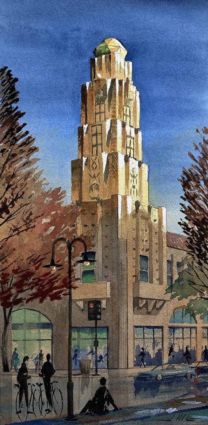 Have you ever noticed that ray of sunlight as it catches the side of a building in the late afternoon? I tried to capture that phenomenon in this watercolor painting I just finished….that all-too-fleeting moment when the sun is low in the sky, and shines in such a way that it showcases the subtle sculptural elements of a building’s facade….This is the Senator Theater in downtown Chico, California….a building that I have admired from an architectural standpoint for years….it turns out that the structure was designed by Timothy Pfleuger, a prominent San Francisco architect of his time….the Roaring 20’s for the most part….the design is Art Deco which was very popular in that era, combined with some more romantic Spanish California tendencies….red clay tile roof, white stucco, ornate corbels, fluted columns, and bas-relief sculptural decoration at the tower….I think the segmented arches are a unique touch which links the Romantic with the Deco….Getting back to my painting of this landmark, I chose to focus on the tower corner element….Large trees frame the view which provide that focus, and block out the rest of the building’s facade in the distance….and having limited the viewpoint to just the tower, I can accentuate the tower even further by treating all the foreground elements so that they are largely obscured by shade….as an artist, I just want the viewer to enjoy the play of sunlight and feel the warmth of a summer day….take in the magnificence of the Art Deco tower that graces the downtown–supported by the human elements like the bicyclists and the Civic Center Park seat wall in the foreground, and the massive Sycamore trees, which are such a part of the Chico experience….Big trees, bikes, and lots of summer sunshine are the essence of downtown Chico….This artwork is hand-drawn and painted in the watercolor technique by Jeffrey Michael George, Architectural Illustration. Jeffrey lives in Chico, and creates many architectural illustrations for projects located in northern California and the San Francisco bay area.
Architectural Renderings of Veterans Housing for Menlo Park, California
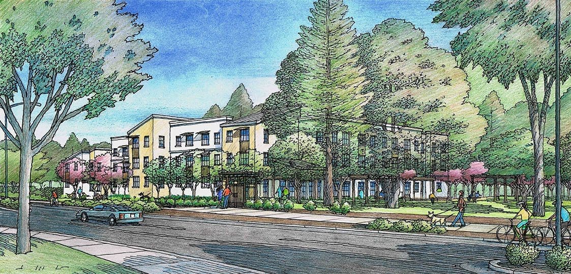
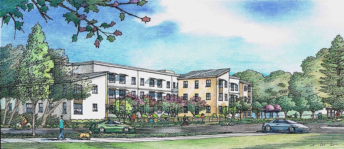 Featured here are two renderings I did recently of a proposed housing project for Menlo Park, California. When built, this housing facility will occupy a portion of the Department of Veterans Affairs campus on Willow Road. The architect is VMWP, or Van Meter Williams Pollack of San Francisco, California–and my client. Due to my involvement with VMWP over some 30 years, I was asked to lend my hand in illustrating this building’s design–and most importantly, the landscaping surrounding the building that was envisioned. Two perspective views were requested, both looking at the new structure from Willow Road–one view from the East and one from the West. These are pedestrian eye-level views–viewpoints one would experience while walking, riding, or driving along Willow Road. The Menlo Park community was keenly interested in what they would see from the roadway, especially since the site has been vacant for many years. So change is coming–and they want to be assured that the proper attention is being given to softening the impact of that change. Hopefully not a stark change, but instead, a welcome addition to their neighborhood. As the consultant charged with illustrating the project, I was given the landscape design created by Jett Landscape + Design of Orinda, California. Referring to these drawings, I incorporated the landscape design into the renderings, faithfully showing the plants and trees selected by the landscape architect in their correct locations near the building. Part of the landscape in Menlo Park is the entourage of massive, old growth trees–oaks, pines and redwoods that exist on most building sites. In these illustrations, I actually showed some transparency to these large trees–not realistic, but citing artistic license, I felt this was appropriate–if anything, these renderings diminish the softening effect of the massive grove of existing trees which will remain. These illustrations are hand-drawn and colored in the color pencil technique by Jeffrey Michael George, Architectural Illustration. Jeffrey creates many architectural illustrations for projects located in the San Francisco area, including San Mateo, Palo Alto, Menlo Park, Woodside, Portola Valley, Atherton, & Los Altos Hills.

Recent Comments