Hand Drawn Color Rendering of Park within Planned Senior Housing for Santa Rosa
Pups, people, and a Park ! View of Park Setting for Santa Rosa senior housing project….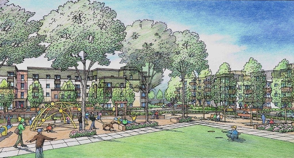
Renderings for Mixed Use Project in Redwood City, California
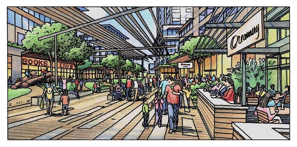
The feature of this blog is the color illustrations shown below, which are three renderings I did earlier this year for a development proposal to be located in downtown Redwood City, California. The development firm, Lowe Real Estate, found me on the internet. They saw some of my illustration work that I posted of a similar project, and gave me a call to discuss.  Lowe is headquartered in Los Angeles and has several offices within California. I worked with Jesse Tejeda from Lowe’s Oakland location. The project was what I would call urban renewal. Taking a large block or two in downtown Redwood City and completely starting over-creating a mixed use development that would have elements of residential, office, retail, commercial, and public space. Jesse’s team had been putting together their ideas, which were at the stage of building massing, location, and financing numbers.
 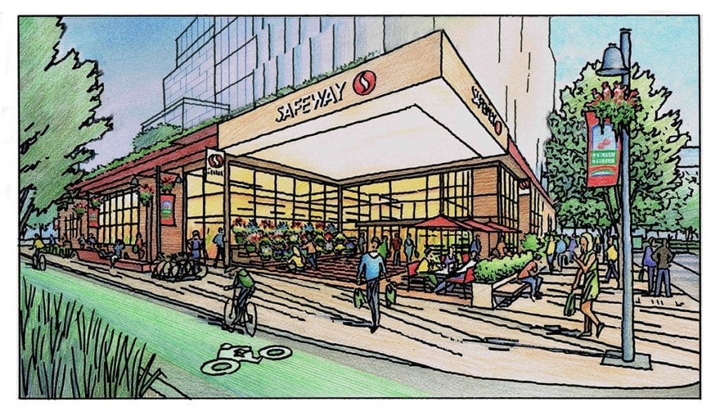 Any presentation possibilities were strictly digital and mostly culled from stock images put together to roughly describe the scope and character of the project. Jesse and Lowe decided that they needed to communicate to their audience in a more personal way-with some hand-drawn illustrations that would more effectively describe their ideas. They had three subjects in mind to illustrate, a pedestrian-friendly and entertainment-oriented CalTrain station, a Safeway superstore below their office building, and a retail-oriented walking street for shoppers and pedestrians. I was given a rough perspective background and lots of photo images to serve as the starting point for each of the three views. I employed a drawing technique that works well for projects that are in the idea stage. As you can see I draw with a very bold freehand pen line work, and then color over the top of that. The rough character of this type of illustration has a way of communicating the “in process” stage of the project-as if to say “This is kind of what we’re thinking-nothing’s settled yet”….Here’s the Train Station, here’s the Safeway, and here’s the Walking Street….
Color Rendering of Senior Housing with Community Center in Santa Rosa
Another one of the five renderings I created for this senior housing project in Santa Rosa, California….Architecture by Van Meter Williams Pollack of San Francisco….This view shows the apartments on the left, and the community center on the right….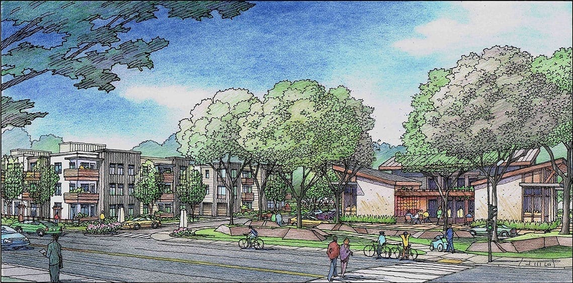
My Color Pencil Rendering Process from Start to Finish
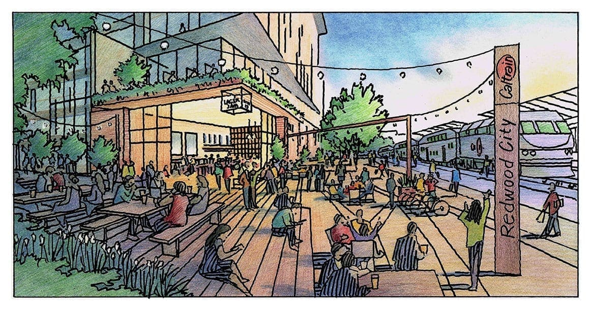
Here is one of three color illustrations I created in February 2020 for a project proposed for Redwood City, California. 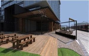 My client was Lowe Real Estate of California, a development firm located in Oakland, California. Lowe had been using some digital images–computer-generated renderings–to promote and describe their project. I have included that image here for reference. The location of the building is adjacent to the Redwood City CalTrain Station and platform. My challenge was to show the new development as a lively, busy, and entertaining space–mostly outside of the building in the plaza and platform area you see here in the digital photo. The client wanted the retail establishment to be a brewery/restaurant or coffee house/restaurant with ample outdoor seating and dining. So I started by drawing an overlay on tracing paper to add the entourage–people, furniture, landscape, signage–that would achieve their goals. Below on the right is that overlay….with notes to explain my ideas for the final…
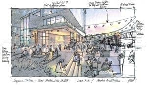 With approval of this sketch overlay and any modifications, my next job is to trace over this layout to create a final black and white line drawing. Once this is completed, I send it to the client via email for their approval and/or comments….At this stage, it’s basically the final rendering–just not colored yet.
 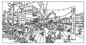 Usually changes are minimal, and the client and I discuss color and materials for the final coloring. I make a print of the final black and white line drawing, and I apply color to it–either color pencil or watercolor. In this particular case it is color pencil, with some pastel for the sky and underlayer. When the color is complete on the original, I make a color scan of the rendering at 300 dpi, usually in jpg format, and send this to the client via email as an attachment. The client can then use the file I send to incorporate into a presentation, or print for public display.
Hand Drawn Color Pencil Rendering of Proposed Faculty Housing for College in Oakland, CA.
This is the last of four conceptual renderings I did earlier this year for Rick Williams of Van Meter Williams Pollack of San Francisco….The project shows proposed improvements to an existing Oakland college.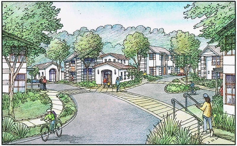
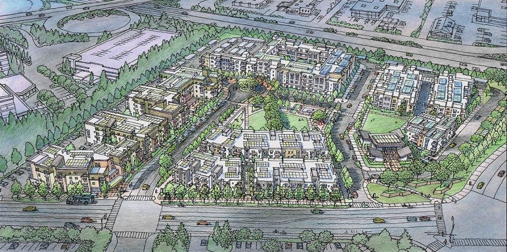
Overall Color Illustration of Housing Project for Santa Rosa
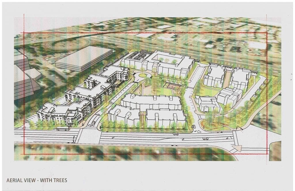 By including more detail in the subject area (the site) and less in the surrounding area (the context), the artist can effectively focus the viewer’s eye toward the subject. It’s a subtle distinction, but it is an important one. As an illustrator, you are telling the minimum amount of information about the surroundings–just enough to orient, describe, and evoke. And, on the other hand, you tell a bigger story about the subject–the new buildings, new streets with park areas, trees, people and cars, showing all of those elements in more detail with slightly more vibrant colors. How the artist treats the sunlight is another tool in the arsenal. By putting direct sunlight onto the project and casting clouds over the context, the artist can again emphasize the meaning and intent of the rendering–to show the new project in its best light, and describe it honestly in the process. This image at the bottom is one of five illustrations I did earlier this year for a potential housing project to be located in Santa Rosa, California. The Architect is Van Meter Williams Pollack of San Francisco. Most architects today study and design their projects using CAD programs both in 2D and 3D. Within the 3D studies, they are able to view the design in perspective from any angle they choose–and such was the case with this architect and project. The architect supplied me with this perspective background which has the basic massing for the project and the site with streets. With this as my starting point, I begin to add architectural detail and entourage to the layout using some direction from the architect. I can do a lot of this by hand without much in the way of layout these days–because I have done this many times and the architect and I are closely aligned mentally and so familiar with each other.
Color Rendering of Oakland College Conceptual Plan
Rendering #3 of 4 for this Oakland School Conceptual Plan….
Architectural Illustration in Watercolor for San Jose Mixed Use Project
Little Watercolor Illustration of Mixed Use Project currently undergoing design and planning for San Jose, California…..One of six renderings I did for the project earlier this year….This one shows the proposed hotel at twilight from a major intersection….Architectural design is by Ken Rodrigues + Partners of Mountain View, California….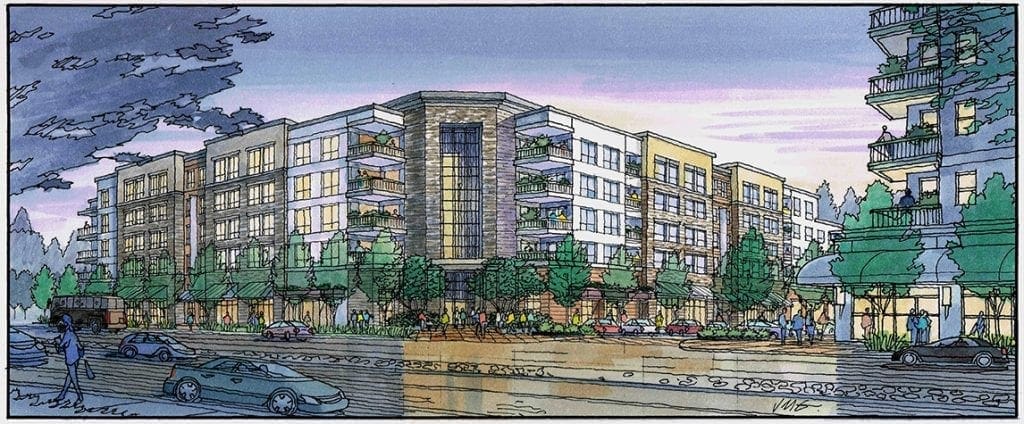
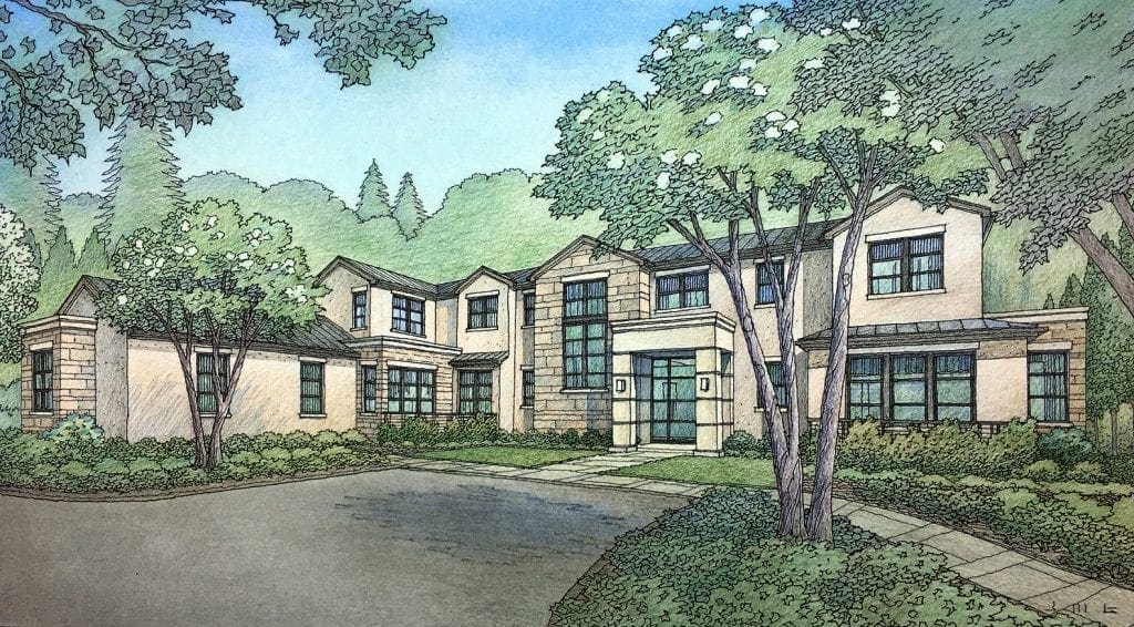
Front Perspective and Aerial Rendering of Los Altos Hills Custom Residence
This architectural illustration is one that I finished earlier this year for a San Francisco Bay Area architectural firm. Pacific Peninsula Architecture of Menlo Park, California creates designs for both client-driven residential projects as well as speculative home ventures, mostly in Northern California. 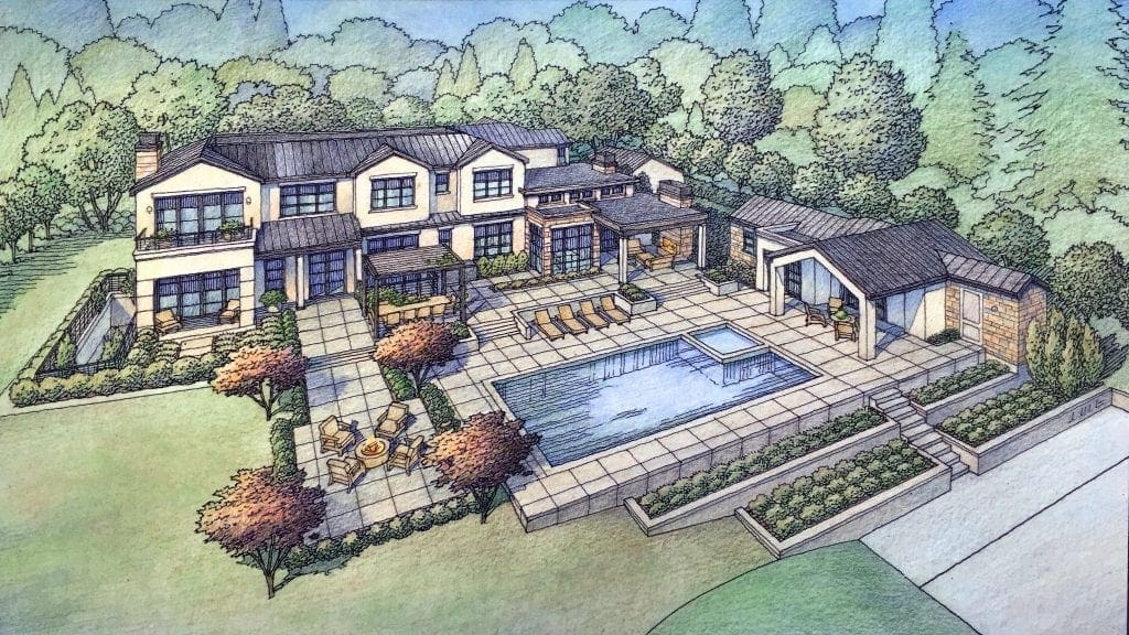 This one had a client for whom it was designed, taking into account their particular needs and desires. Located in Los Altos Hills, California, this is a very large residence including a large subterranean level to increase indoor space while remaining in compliance with site setbacks required by local ordinances. The renderings for this project and others like it are created in the color pencil technique and are fairly large. Typically each illustration is 12 inches by 22 inches on illustration board. I draw a black and white line drawing of this view first, then print it onto a vellum, which is then dry mounted onto illustration board. Then color media is applied slowly-starting with chalk pastel, then color pencil over that. If there are any pure whites within the drawing, then those areas are simply uncolored areas. The darker areas of the rendering are built up with successive layers of color pencil, sometimes using multiple color pencils within the same area in order to achieve the right color and character for the material you are trying to show. This particular design was mostly cement plaster with some ledgestone accents, a zinc metal roof with minor built-up flat roof areas and few precast lintels and sills. My tendency is to keep all colors in a somewhat neutral range due to the neutral color scheme dictated by the design. So, the greens in the landscaping, the trees, even the water in the pool and the colors of the sky are not brightly colored-instead more muted tones to complement and support the main subject-the architecture.
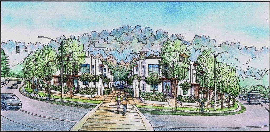
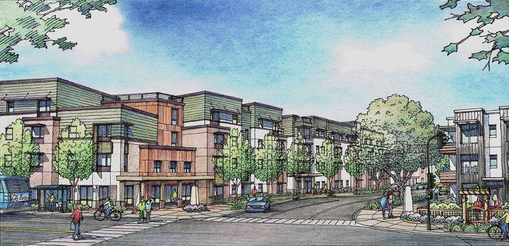
Color Pencil Rendering for Santa Rosa Housing Project
View of Main Entry into a large senior housing project proposed for a large site in Santa Rosa, CA. Design is by Van Meter Williams Pollack Architects of San Francisco, CA.
Recent Comments