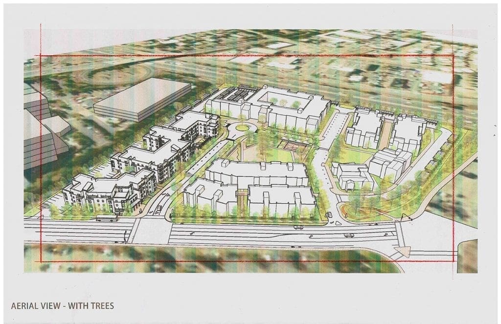
 By including more detail in the subject area (the site) and less in the surrounding area (the context), the artist can effectively focus the viewer’s eye toward the subject. It’s a subtle distinction, but it is an important one. As an illustrator, you are telling the minimum amount of information about the surroundings–just enough to orient, describe, and evoke. And, on the other hand, you tell a bigger story about the subject–the new buildings, new streets with park areas, trees, people and cars, showing all of those elements in more detail with slightly more vibrant colors. How the artist treats the sunlight is another tool in the arsenal. By putting direct sunlight onto the project and casting clouds over the context, the artist can again emphasize the meaning and intent of the rendering–to show the new project in its best light, and describe it honestly in the process. This image at the bottom is one of five illustrations I did earlier this year for a potential housing project to be located in Santa Rosa, California. The Architect is Van Meter Williams Pollack of San Francisco. Most architects today study and design their projects using CAD programs both in 2D and 3D. Within the 3D studies, they are able to view the design in perspective from any angle they choose–and such was the case with this architect and project. The architect supplied me with this perspective background which has the basic massing for the project and the site with streets. With this as my starting point, I begin to add architectural detail and entourage to the layout using some direction from the architect. I can do a lot of this by hand without much in the way of layout these days–because I have done this many times and the architect and I are closely aligned mentally and so familiar with each other.
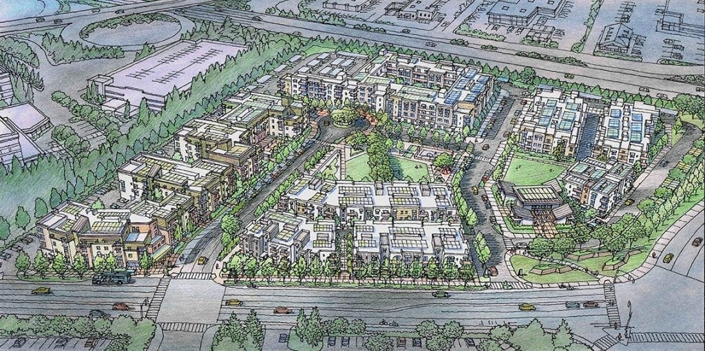
Recent Comments