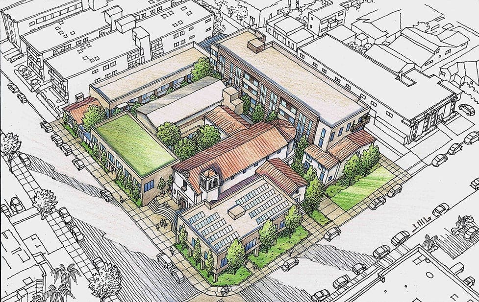
 This color rendering I recently completed for an existing church in Southern California is another example of how to illustrate proposed changes to a property. My client for this project is Shelter Architects of Pasadena, California. They did the architectural design for the property, which involves renovating older buildings on the site, and building some new buildings in order to upgrade and modernize the facility. The church occupies most of a city block in an urban area of Los Angeles, so an overall view from above the site seemed to be the best angle to describe the architect’s design. But what’s interesting about the rendering itself is that we decided to color only the church property–and leave the surrounding neighborhood context uncolored. Obviously, the church property becomes a focus for the viewer, due to the color. As always there is a black and white original drawn of the rendering prior to applying the color, which I have included here. Normally I would intentionally tone down the coloring of the surrounding area in the rendering, and accentuate the church property with clearer, brighter colors to distinguish it from the background. But in this instance we achieved the same effect by coloring only the subject of the drawing, and leaving the surroundings in black and white. There is economy of time and effort with this method, too. Once the black and white drawing is finished and approved by the client, that’s all that’s necessary for a good portion of the rendering. I have also included a copy of the CAD perspective which the architect provided in the beginning. Could they have simply used this CAD drawing to show their ideas to the church audience ? Of course, but that brings up the question of how well a technical drawing engages the audience–and the answer is, not very well. Something hand-drawn with people, trees, and landscape always engages the audience to a much greater extent than a purely technical, digital image.

Recent Comments