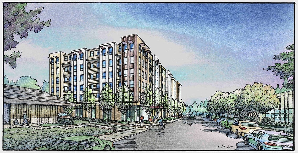
The subject today is a rendering project envisioned for Redwood City, California by the San Francisco architectural firm of Van Meter Williams Pollack LLP. Completed within a couple of weeks this past summer, we needed to show a potential housing structure in two different ways, as there were two design schemes under consideration by the architect and client. Based on a perspective view which the architect supplies, I first draw a freehand line drawing of Scheme 1. 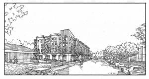 This gets color applied, creating one complete rendering representing the Scheme 1 version of what’s being considered for the site, set within the existing site context.
 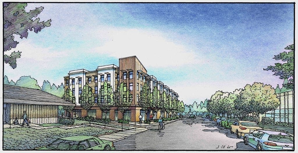 For Scheme 2 which is a larger building, I begin by drawing the Scheme 2 building in black and white, then color that building–scanning it when it’s fully colored. Using Photoshop, I paste the Scheme2 building over the Scheme 1 building in the first rendering, saving this as a new version.
 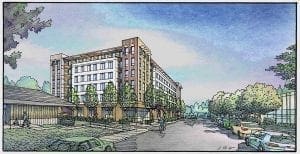 As it turns out, the client had issues with the design of Scheme 2, and a third design was developed. So I drew a new version of Scheme 2 which I titled Scheme 2 Take 2.
 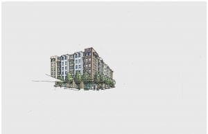 Once that building was independently colored similar to the previous, it was scanned and superimposed onto the site–over the previous buildings. Obviously you make the process more efficient by always drawing the smaller of the design scheme buildings first and making that your first rendering, upon which the subsequent renderings are based. In the end you have two complete renditions (or in this case three really) that can be shown to the audience for description, comparison, and review. Since the entourage and context surrounding the buildings is always the same, you are certain that the audience is comparing apples to apples, as we like to say. The last full image shown here is the finished rendering representing Scheme 2 Take 2 in full color.
Recent Comments