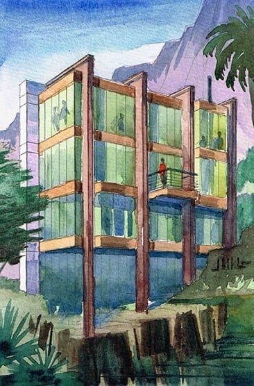
 The image on the left is a small watercolor rendering I did today in order to work out the design of a house sited on a hillside. I just recently worked out the rear design of the house in rendering form. Drawing always allows me to think in more detail on an idea in my head. As you may know, for an architect, house designs swim around constantly in your head, until they intrigue you enough to draw or paint the idea. And in doing so, the architect is faced with certain realities and physical details which forge the rough idea into something a little smoother and well-defined. This is a 3-story house on a hillside, and you are looking at the rear elevation of the house. As opposed to the front of the house which has no windows, the rear of the house is mostly glass to take full advantage of the gorgeous views off of the hillside. Private bedroom spaces are on the uppermost level, Living spaces with balcony on the center level, and guest quarters below. Glass sits within a metal framework–main structure is the steel buttresses which are L-shaped of CorTen Steel, then metal panels for the horizontal structural spandrels between the glass floors.
Recent Comments