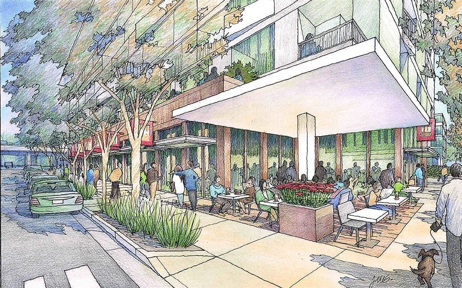
 In this article I would like to feature a very conceptual project envisioned for Sacramento, California. I was commissioned by Mogavero Architects of Sacramento to illustrate their vision for the redevelopment of a prime urban block in their city. The architect had some basic massing in mind for the buildings, with the site being adjacent to the midtown freeway crossing known as Business 80, which is elevated and cuts across the city. I met in person with the architect at their office, and we talked about three perspective views to adequately describe the main points of the design. The uses were mixed–residential, commercial, and institutional. In the first rendering, we wanted to show the commercial element, which would be located on the less busy intersection away from the freeway overpass. A sidewalk cafe with outdoor seating under a large corner canopy at street level. We wanted to keep the canopy light overhead and simple, and we wanted to show a realistic entourage of people walking and enjoying this coffee spot along the way. Trees were shown transparently so we could also indicate the scale and character of the building above.
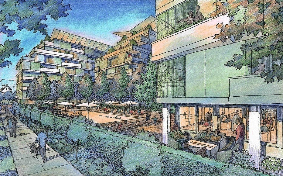
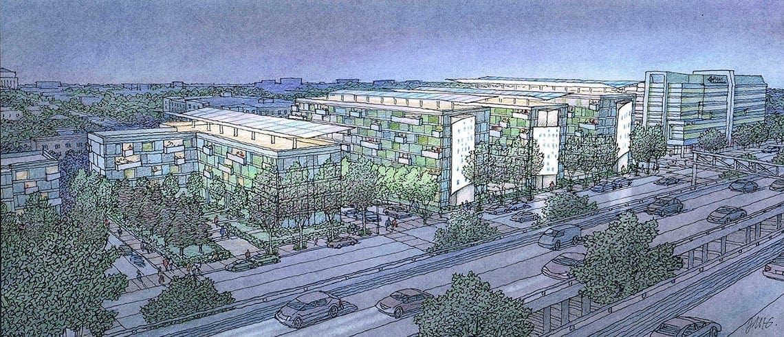
  In the second view, we wanted to tell the story of the institutional facet of the project. Since the housing would have a large pool area and recreation room, we focused on that for the second rendering. Taken at twilight, this view would be able to show the pool, common gathering space, and housing units in the multi-story tower above without going into too much detail, since it wasn’t really designed in detail at this early stage. Twilight views are good for this purpose–they give you the general idea of scale and character–without a preponderance of detail. For the third and final rendering, we wanted to show the entire development as it would be seen from the elevated freeway. We chose a night view–again for similar reasons. Much of the detail is obscured–and only the desired features are emphasized by using the lighting judiciously to highlight certain elements, and downplay others. We chose to feature the large metal screens along the front of the block facing the freeway that filtered the windows from the traffic. These architectural screens would be uplit at night, and the light that comes through them would be filtered and a little fuzzy. As an artist, the idea is to show just enough, without getting into details that have not been thought out. If the project becomes more of a reality, there will be plenty of time to make all of those decisions.
Recent Comments