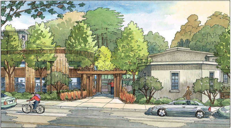
These watercolors are small (11 x 17 or smaller)….As an artist you need to make sure to leave some white and light tones….Also keep variation of color and shape in the trees and plants–even some orange and brown in the trees, as odd as that may sound–it makes the landscape appear more realistic….Next time you look at the trees in nature, you’ll see that they are not necessarily green….The architectural rendering below illustrates the design concepts of Van Meter Williams Pollack, a San Francisco architectural firm. This illustration is one of many Jeffrey has done for San Francisco architects and their many design projects around the Bay Area. The rendering is in the freehand pen and watercolor technique and is by Jeffrey Michael George,Architectural Illustrator. The drawing shows a new development, which is envisioned for an urban area in San Francisco, California. Jeffrey works with many San Francisco Bay Area, Sacramento, Peninsula, and South Bay architectural firms as a freelance consultant to bring their designs to life in the form of full color perspective renderings.

Recent Comments