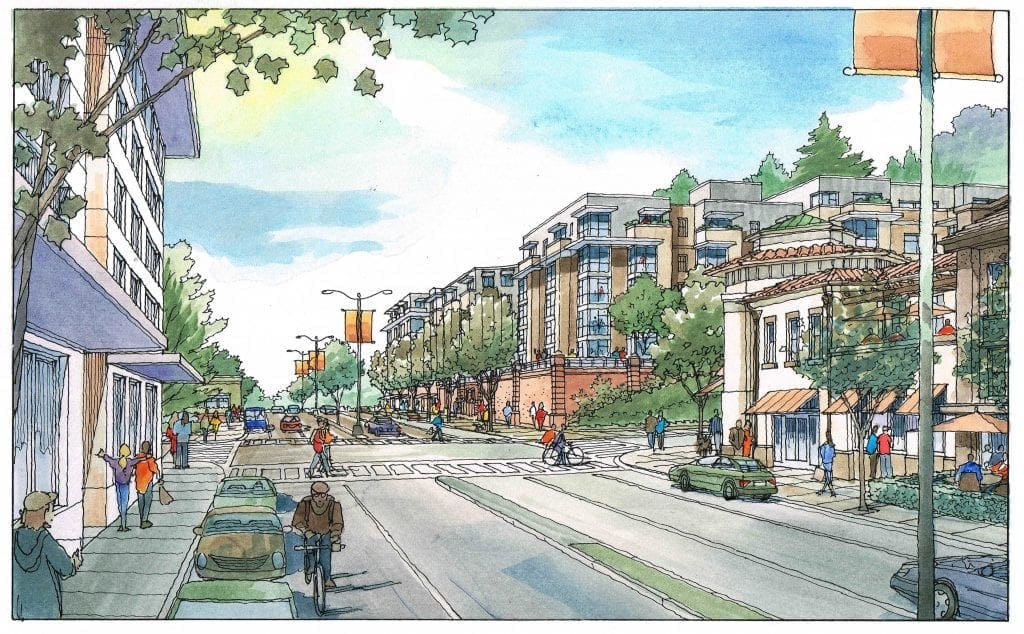
Here is a series of watercolor illustrations I did in 2016 for Van Meter Williams Pollack Architects of San Francisco, California. These images show the architect’s ideas for adding more housing to the California College of the Arts campus in Oakland. This first view is along Broadway, one or the major streets adjacent to the campus. These renderings are intended to show the new buildings and additions in some detail, but mainly to communicate the overall scale and massing of the architect’s design, while including existing buildings and features that are recognizable to the audience–essentially to show a future snapshot if the project were actually built. It’s difficult for the audience to look only at an architect’s plans and elevations, and come away with a clear understanding of how the project would fit in with the neighborhood. So, these renderings serve as a valuable tool of explanation. The second view is also along Broadway, but it taken looking down the major thoroughfare in the opposite direction, from the far corner of the new housing shown in the center of the first rendering. Again there is shown existing context to explain the location, size, and massing of the new building with respect to the existing, with which most are very familiar. The third view is taken from a side street to the building, but a prominent location from which the new addition will be visible–and this rendering shows that clearly. The fourth view is taken from a balcony of one of the new housing units, looking down toward a couple of fine older houses which are a cherished part of the campus. As the artist I try to use a light touch with these illustrations. In the end, the architect (who presents the artwork in a public forum) tells me that they are quite effective. When presented with hand-drawn artwork like this, the audience is receptive, and becomes engaged in a dialogue about the project–something that often does not happen with digital imagery. Purely digital artwork fails to engage the viewer much of the time, giving the audience the mistaken impression that the project is decided already–and I don’t like what I see, particularly the details. Hand-drawn artwork lends the correct impression–that the project is a work in progress, and that we should all talk about it and come to an agreeable conclusion on it.


Recent Comments