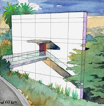
 The image on the left is a small watercolor rendering I did today in order to work out the design of a house sited on a hillside. More accurately, I worked out the front design of the house in rendering form. Drawing always allows me to think in more detail on an idea in my head. As you may know, for an architect, house designs swim around constantly in your head, until they intrigue you enough to draw or paint the idea. And in doing so, the architect is faced with certain realities and physical details which forge the rough idea into something a little smoother and well-defined. This is a 3-story house on a hillside, and you are looking at the front elevation of the house. The bridge takes you to the entry door and of course, the rest of the house. You enter on the second floor, with the house spaces being above and below as well. If it looks like the only thing on the front of the house is the entry, you are correct. Simplicity and honesty are good things. I like the idea of celebrating them–there is a peace of mind in that. Ideas for the rest of the house are swimming, and I hope to get something down on paper to illustrate everything you do not see in this view. As opposed to the front of the house which has no windows, the rear of the house is mostly glass to take full advantage of the gorgeous views off of the hillside. I’m looking forward to getting my ideas for the rest of the house down on paper soon. Please check in again–and maybe I’ll have a new rendering posted for the back of the house !
Recent Comments