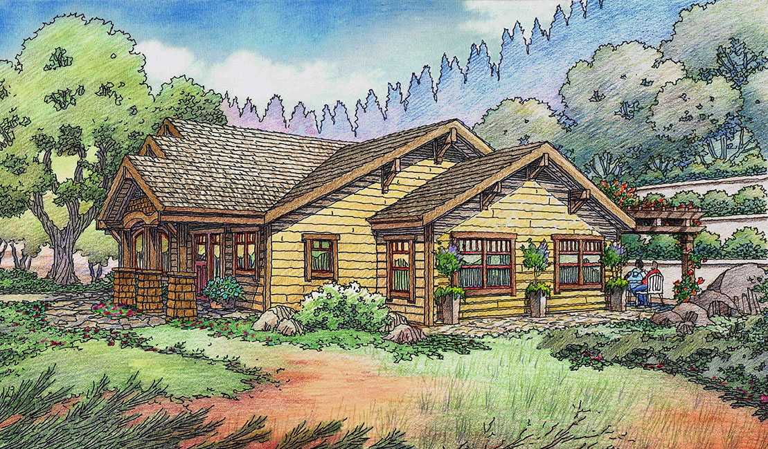
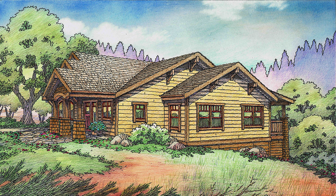
Here is an example where Photoshop makes a lot of sense within my industry ! The upper drawing was done by drawing and coloring a portion of the previous rendering (right side of image)–only what changes. These illustrations show the same house–one on a downhill lot, and one on an uphill lot….the portion that changes is superimposed over the portion of the old image which changes using Photoshop….everything else remains. This 3-D visualization in perspective was commissioned by a longstanding client of Jeffrey’s illustration business: Carol Young of Auburn, CA. Jeffrey does many illustrations for a number of architectural clients in the South Bay, San Francisco, Bay Area Peninsula, and Sacramento areas of northern California.


Recent Comments