Hand-Drawn Color Rendering of Improvements to Oakland School
Quick color Sketch Rendering of four I did recently for an Oakland school….Design Ideas by Van Meter Williams Pollack Architects….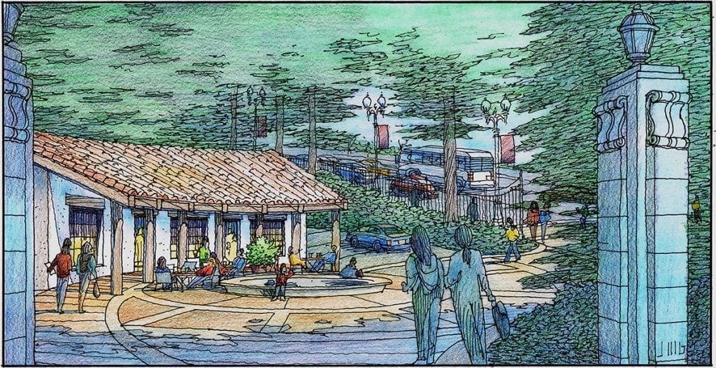
Watercolor Rendering of Mixed Use Project in San Jose
Mixed Use Project designed by Ken Rodrigues + Partners of Mountain View, CA. Illustration by Jeffrey Michael George in watercolor technique.
Watercolor of Hillside House designed by Jeffrey Michael George
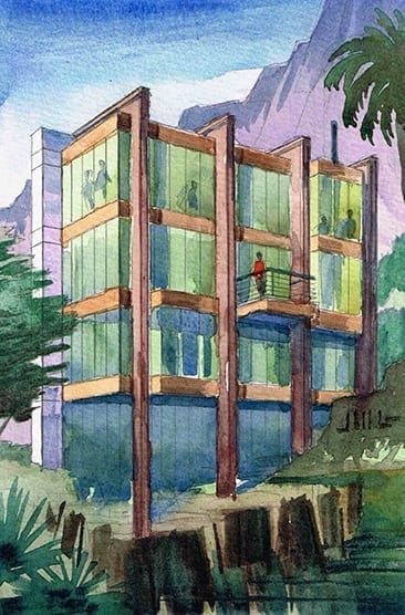 The image on the left is a small watercolor rendering I did today in order to work out the design of a house sited on a hillside. I just recently worked out the rear design of the house in rendering form. Drawing always allows me to think in more detail on an idea in my head. As you may know, for an architect, house designs swim around constantly in your head, until they intrigue you enough to draw or paint the idea. And in doing so, the architect is faced with certain realities and physical details which forge the rough idea into something a little smoother and well-defined. This is a 3-story house on a hillside, and you are looking at the rear elevation of the house. As opposed to the front of the house which has no windows, the rear of the house is mostly glass to take full advantage of the gorgeous views off of the hillside. Private bedroom spaces are on the uppermost level, Living spaces with balcony on the center level, and guest quarters below. Glass sits within a metal framework–main structure is the steel buttresses which are L-shaped of CorTen Steel, then metal panels for the horizontal structural spandrels between the glass floors.
Color Rendering of Housing Project for Santa Rosa, CA
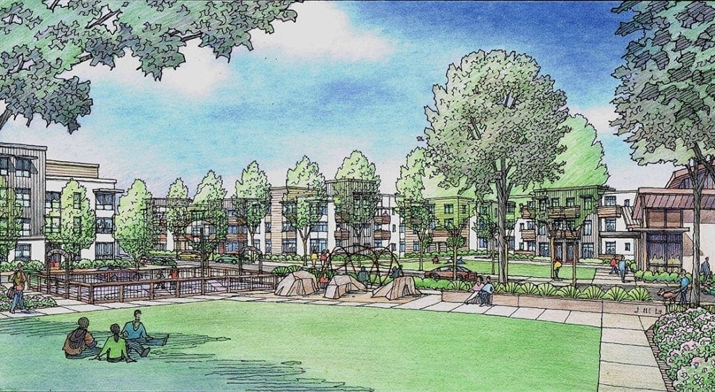
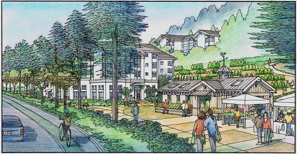
Color Pencil Rendering of Growers Market for Oakland
Below is my color pencil rendering showing a growers market for a neighborhood in Oakland–this drawing technique is a quick and simple one for me !
My Recent Watercolor Rendering of Active Plaza in San Jose
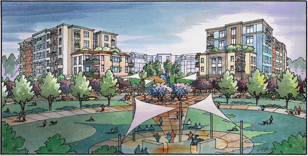
This is a rendering I completed recently for a project in San Jose, California. What you see has been designed by Kenneth Rodrigues + Partners of Mountain View, CA. with landscape elements designed by
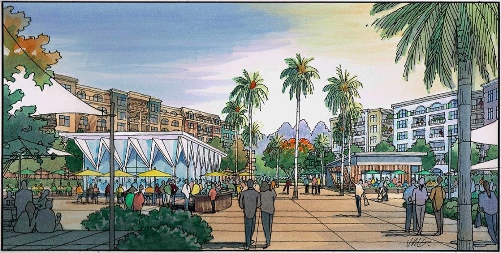
Guzzardo Partnership, Inc. of San Francisco. These consultants-in this case the architect and the landscape architect-do the important design work and share it with me, the illustrator, so I can bring it all together in a meaningful way which describes the nature of the project to the public audience. The location for this project is a prominent corner of major streets in San Jose. Replacing what is presently an older shopping center which is single-story, this new development would be comprised of two-story condos, a four-story assisted living center, a five-story hotel, and six-story residential over commercial and retail-which is part of what you see here. As an illustrator for this project, my mission was to create a lively, sunny, and inviting plaza space with lots of outdoor seating for drinking and dining or just lounging and people-watching. I tried to use the landscaping and trees as framing elements which would both soften the architecture and lend a park-like feel to the plaza. I also tried to capture the modern-day activities to show in the social scene–people on their cell phones, waiting to meet up with friends, enjoying the outdoors with a meal or libation once they have gotten together-hopefully a realistic slice of life snapshot of modern life in 2020. As you can see, there are two pavilion buildings of a commercial/retail nature that sit in the plaza. These are intended to be focal elements in the composition.By keeping the contrast greatest in these areas of the drawing, the eye tends to go there, which creates focus and lends importance to the elements you are attempting to highlight. Bright color is a similar tool to draw attention. The brightest colors here are the umbrellas and the blooming trees in the landscape. They will get noticed before the background architecture and support landscape-by intention.
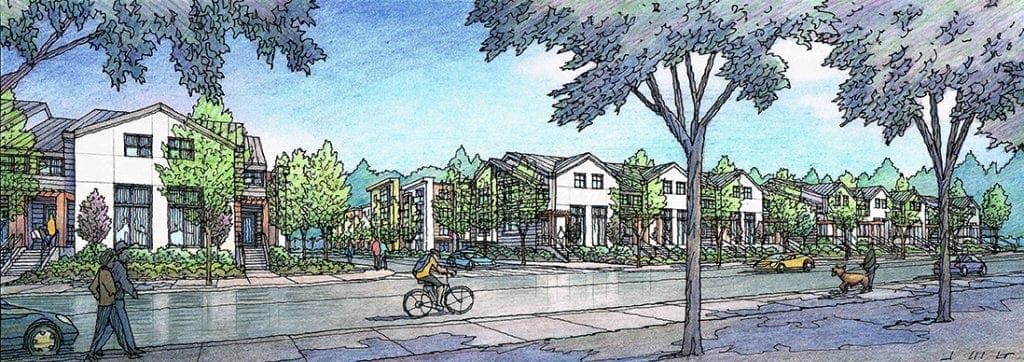
Street View Rendering of Proposed Residential Project for City South of San Francisco
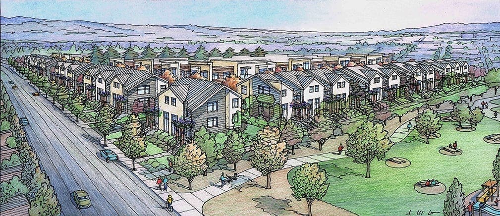
My Aerial Rendering of Large Residential Project in San Mateo
A color pencil rendering I did earlier this year for MBH Architects in Alameda for a large residential project located in San Mateo, CA.
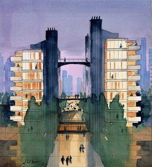
Watercolor Sketch of Wright Inspired Towers Designed by Jeffrey Michael George
My Sketch for the Day–Inspired by the designs of Frank Lloyd Wright and Paul Rudolph, these urban towers are asymmetrically balanced and joined with pedestrian bridges to heighten social interaction and circulation….I built a small SketchUp model for the basis of this rendering….the painting is 7″ wide by 8 ” high on watercolor paper….
Watercolor Rendering of Hillside House Designed by Jeffrey Michael George
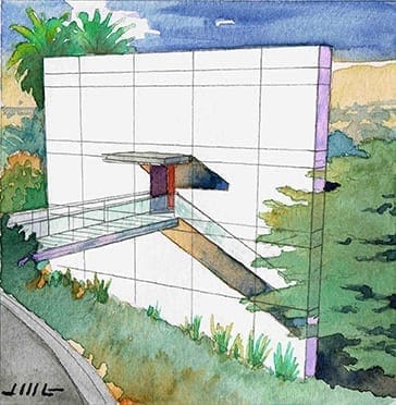 The image on the left is a small watercolor rendering I did today in order to work out the design of a house sited on a hillside. More accurately, I worked out the front design of the house in rendering form. Drawing always allows me to think in more detail on an idea in my head. As you may know, for an architect, house designs swim around constantly in your head, until they intrigue you enough to draw or paint the idea. And in doing so, the architect is faced with certain realities and physical details which forge the rough idea into something a little smoother and well-defined. This is a 3-story house on a hillside, and you are looking at the front elevation of the house. The bridge takes you to the entry door and of course, the rest of the house. You enter on the second floor, with the house spaces being above and below as well. If it looks like the only thing on the front of the house is the entry, you are correct. Simplicity and honesty are good things. I like the idea of celebrating them–there is a peace of mind in that. Ideas for the rest of the house are swimming, and I hope to get something down on paper to illustrate everything you do not see in this view. As opposed to the front of the house which has no windows, the rear of the house is mostly glass to take full advantage of the gorgeous views off of the hillside. I’m looking forward to getting my ideas for the rest of the house down on paper soon. Please check in again–and maybe I’ll have a new rendering posted for the back of the house !

Recent Comments