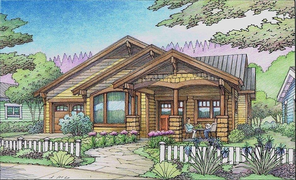
Architectural Rendering of Cottage
Just finished last week….
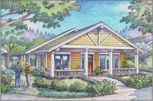
Blue Cottage with Wood Trim for Senior Living
Last Friday I finished this color pencil rendering of one of the cottages planned for a retirement community in Auburn, California. The project is Rincon Del Rio, and it will be a large development for senior residents in the Sierra foothills. Having done many renderings for this project over the years, I have a pretty clear understanding of the developer’s intentions for this age-in-place community. This particular housing unit–one of three different models in the Cottage category. These will be individual homes of about 2,300 square feet with most of the essential living quarters located on the main floor, although there is an upper level with interior stairs. Tricky part of this rendering is the blue color which always poses a challenge with the sky treatment.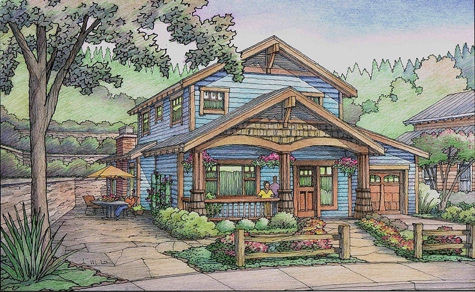
New Cottage Rendering for Residential Project
Yesterday I finished this color pencil rendering of one of the cottages planned for a retirement community in Auburn, California. The project is Rincon Del Rio, and it will be a large development for senior residents in the Sierra foothills. Having done many renderings for this project over the years, I have a pretty clear understanding of the developer’s intentions for this age-in-place community. This particular housing unit–one of three different models in the Cottage category. These will be individual homes of about 2,300 square feet with most of the essential living quarters located on the main floor, although there is an upper level with interior stairs. 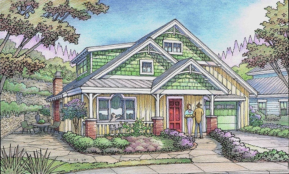 My main focus for this blog post is to discuss the illustration from the viewpoint of the illustrator. Although I was given free license to choose the color scheme for the home, I actually used the color choices suggested by the architect for this model–Michael Kent Murphy of Auburn, California. With green being one of the two colors, this presents a challenge, since green is a common landscape color. If you’re not careful as an illustrator, the main subject of the drawing–the house–can blend too easily with its background and foreground. So it helps to use only the “house green” on the house, using greenish colors of a different variety in the landscape. That was my intention on this illustration. In this way, your first look at the rendering leaves no doubt what you’re supposed to be looking at–the house. Another challenge presented by these house colors is the white trim. Similarly, it helps to keep the white elements of the rendering limited to the house, largely. In that way the impact of the white trim is enhanced–since it doesn’t compete with other white elements in the landscape which might steal its thunder. These two challenges and their solutions are not unique to this exercise and are something fairly common for many illustrations. If you keep these issues in mind as you are coloring the end result will be more effective and more successful.
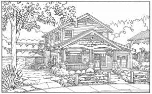
Black & White Freehand Architectural Perspective Line Drawings
Over the next two days, I will be adding color to these freehand felt pen drawings….
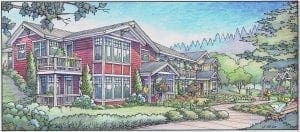
Architectural Rendering of Condos in Rincon Del Rio Development
New Color Rendering just completed late last week for the Rincon Del Rio project planned for Auburn, CA…..
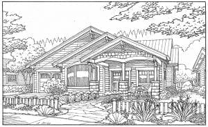
Color Rendering of Bungalow in Pocket Neighborhood
Just finished the color for this rendering this week ! This color pencil illustration in perspective was commissioned by a longstanding client of Jeffrey’s illustration business: Carol Young of Auburn, CA. This perspective view shows one of the proposed bungalows for Rincon del Rio. Jeffrey does many illustrations for a number of architectural clients in the South Bay, San Francisco, Bay Area Peninsula, and Sacramento areas of northern California.
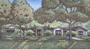
Color Pencil Rendering of New Custom Residence for Atherton, CA
Perspective Renderings show the exterior of an architectural project—as it will be seen once it’s completed—kind of a future glimpse, if you will. Usually taken from a pedestrian eye level, an exterior rendering will indicate the materials and architectural finishes of the building, along with landscaping, trees, people, cars, and any surrounding existing context one would see. Sometimes these renderings are required to be part of a project’s submission for approval. They can also be very useful in communicating the “look and feel” that a finished project will have—well before its actual construction. These illustrations not only show the structure, but all the building’s detail, with shades and shadows—indicating the effect of sunlight on the building. Exterior renderings can be informative to the design process—allowing for review and reflection of all of the decisions regarding massing, architectural detail, landscaping, materials, color—all the major elements which are part of the design process. The process of creating an exterior perspective rendering begins with the architect’s plans and elevations. Once this information is input to a 3D CAD program, perspective views can be generated to be used as the basis for the rendering. Once a viewpoint is chosen, details and entourage, including landscaping and people, can be added to the chosen image. Upon approval, a freehand line tracing is done and submitted for the client’s approval. Finally, color is added, either color pencil or watercolor, based on information supplied by the architect or client. Once color is finished, a digital scan is usually made from the finished artwork and sent to the client. Original artwork can also be sent to the client, if desired. Although exterior renderings can be computer-generated, hand-drawn and hand-colored renderings are more successful in capturing the life and spirit of a place or building. This is partly due to the fact that the public responds more favorably to hand drawings and paintings as opposed to their computer-generated counterparts.
Black & White Line Drawing of Atherton Residence
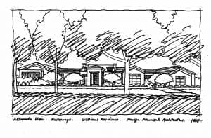
Above is the first rough sketch of this proposed residence designed by Pacific Peninsula Architecture of Menlo Park, CA. This sketch with trees and landscaping serves to illustrate the limits of the drawing and the major elements of the drawing, taken from the chosen viewpoint in perspective. Not a finished product at all–these sketches are tossed away–but are an important first step toward the eventual finished rendering.
Finished Watercolor Rendering of Residential Project near San Francisco
I just completed this watercolor rendering of a proposed residential project near San Francisco, CA. The architect is Van Meter Williams Pollack Architects of San Francisco. I have been posting the progress of this rendering each day since I did the first sketch. 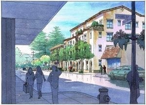 There are basically four stages to my rendering process–a 3D computer model, then a rough sketch, then a more detailed black and white tracing, then the color–in this case, watercolor. With this rendering project, the architect–my client–provided me with the 3D CAD model and gave me the perspective angle selected to be the best for marketing purposes. I then print that perspective view at 11 x 17 inches, then add people, cars, trees, streetlamps, etc. using Google Earth as a reference for the existing elements that are around the site now. I do a quick sketch of all that using a transparent sketch paper–just loose freehand felt pen. I throw that sketch on the scanner and send it via email to the architect for approval. Usually we tweak a few things to get it just right–either architectural details or entourage elements. The next step is a freehand–but more detailed and carefully-drawn–felt pen line drawing, tracing the outlines basically like a coloring book. That drawing gets scanned and sent to the architect for approval to go ahead and add color. More than any other phase of the process, the color phase is where the artist’s vision comes into play in a big way. In this rendering, my goal was to keep all of the light and white areas of the painting in the subject itself–the four-story building which is the subject here. In doing so, the viewer’s eye will naturally focus on the building. All of the foreground elements and the adjacent buildings and trees are support elements–they should all be shown–but shown quietly with cooler, more neutral colors and tones. If I had included bright spots of white or color in the surroundings, the composition would have lost its focus, and these elements would have become distractions to my intended feature–the bright, sharp building in the center !
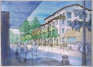
Architectural Watercolor Rendering in Progress

Recent Comments