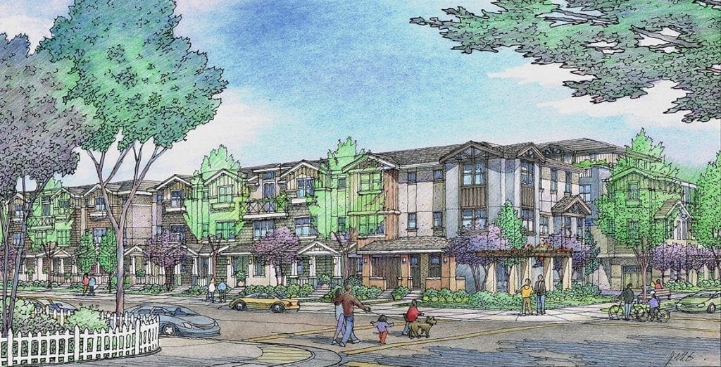
Architectural Rendering of New Design for Townhouses near San Francisco, CA….
Just finished in color pencil yesterday–new design for townhomes on the Peninsula south of San Francisco….
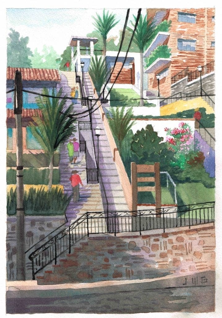
Travel Watercolor of Olas Altas in Puerto Vallarta
One of my vacation watercolors….
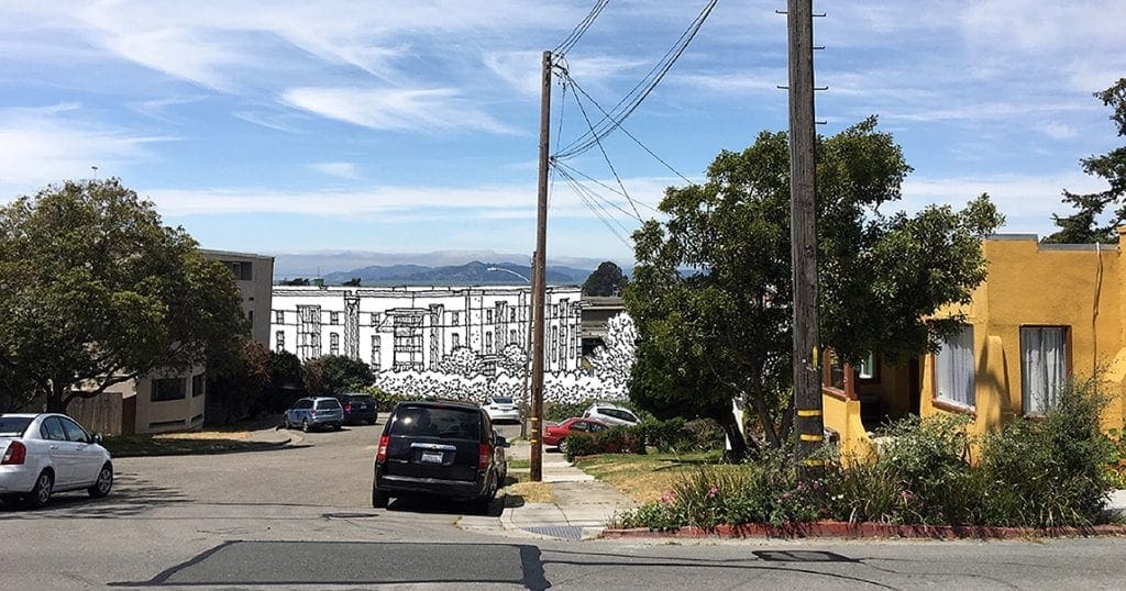
Architectural Photomontage of New Building with Context
Here’s another one from my bag of tricks….take a photo, sketch the new building, then put the two together in Photoshop….Even without color, it gives the neighbors the idea….
If you look closely, you can see the Golden Gate Bridge in the background….
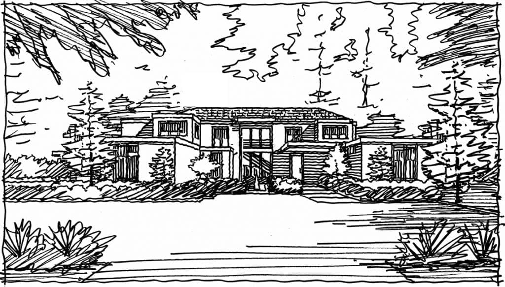
Rough Sketch for Front Perspective Rendering of Atherton, CA. Residence
Starting a front rendering of this custom home in Atherton….
Color Rendering of Renovation and Addition to Atherton Residence
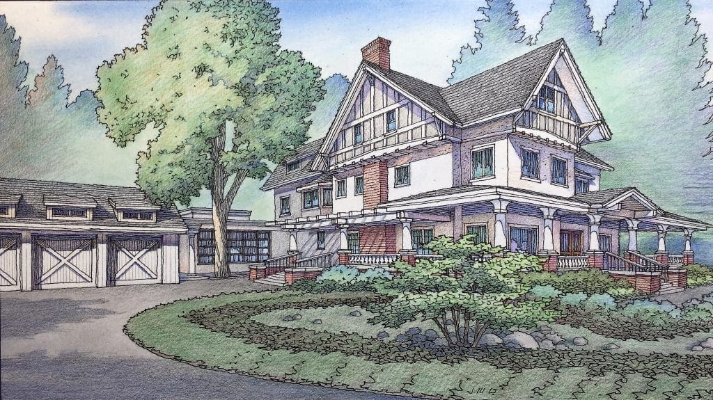 As promised, finished in color late last week….
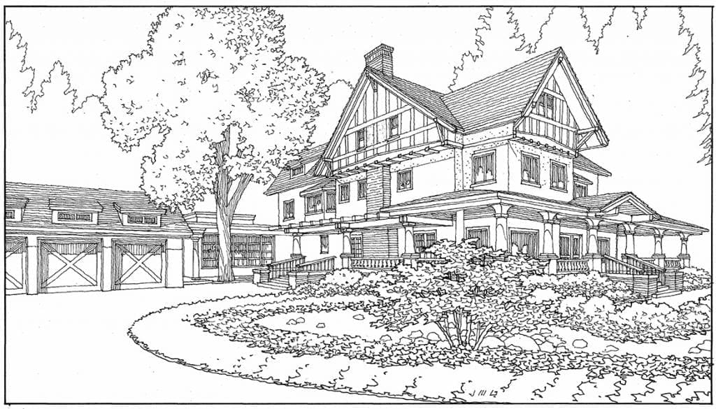
Line Drawing in Perspective for Bay Area Home Renovation
Next up for color….this home renovation and addition for the San Francisco Peninsula….
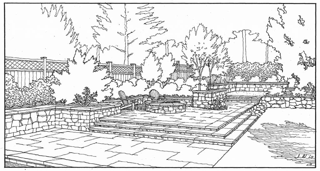
Freehand Line Drawing of Landscape Improvements
A quick freehand felt pen sketch to show a client some backyard improvements….
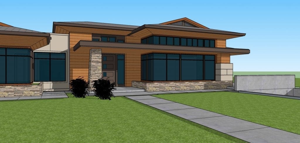
CAD 3D Model Perspective of New Custom Residence
Been putting a lot of hours into this model of a custom home designed by Garcia Teague Architects of San Jose, CA….
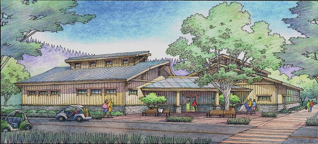
Color Pencil Rendering of Pool Building Like Barn
Just finished this Indoor Pool Building designed to look like a big barn–planned for Rincon del Rio senior community near Auburn, CA….
Watercolor Rendering of Art Museum Designed by Jeffrey Michael George
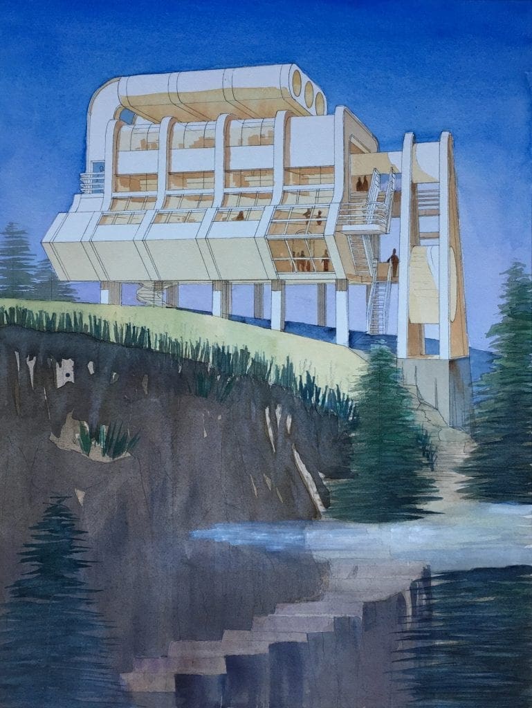 This is a watercolor rendering I painted in 2019. It’s a conceptual illustration of an art museum that I designed for a hilltop site. The forms were conceived originally with much inspiration from a Chevy Big Block engine. Subsequently, a great deal of architectural thought was devoted to making the building work as a functioning art museum with all the requirements therein. Basically, it’s a two-story structure with generous volumes and a great deal of interior light. A post and beam building structure was integrated with the original massing to account for the structural means of support. There is an internal spiral staircase that drops down below as an additional element of ingress and egress. The three-story exterior staircase on the right is the main circulation element. By going outside when you travel from one level to another, the art observer has a built-in opportunity to cleanse their palette on the way to looking at more artwork. While the visitor is faced with a considerable trek to arrive at the museum via a rocky hillside, they are rewarded with spectacular views once they do arrive at their destination. Inspiration from two sources: the artwork within, and the beautiful vistas of the surroundings.
As a rendering exercise, most of the bright and white areas of the painting were reserved for the subject–the building. The surrounding sky and foreground landscape have mostly dark tones so that the building stands out. I wanted to keep the interior of the museum looking light and warm, so there are no cool colors shown here throughout the interior space as you look through the glass. Although this is a large painting for me, it was accomplished in a fairly short period of time, due to the many other illustrations I was working on at the same time. About 8 to 10 hours from start to finish, for this 24 x 36 inch original. As my college art instructor used to say “Use a big brush and work quickly”.
Recent Comments